
Branch: a ligature serif for wedding suites and quiet branding work
Design style
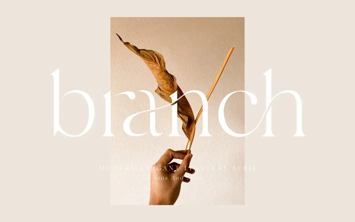
Branch sits in that crowded but persistent niche of the ligature serif: a text-weight face with connecting strokes built in, meant to read as half calligraphy, half typesetting. The letterforms carry a light, evenly modulated stroke with a bracketed, low-key serif structure — nothing sharp, nothing especially mannered. What gives it its character is less the individual letter than the joins Sans & Sons have drawn between them, which let lowercase pairs flow into each other rather than sitting as discrete, spaced units.
It’s a style that leans on restraint. There’s no exaggerated swash energy here, no attempt at a script substitute. Branch reads as a serif that happens to connect, not a script dressed up as a serif, and that distinction matters for how it should be used. It’s closer in temperament to a refined stationery face than to a flourish-heavy invitation script.
Character set and features
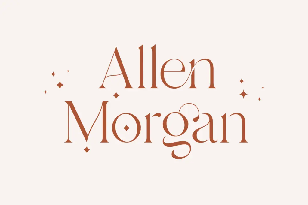
The set includes alternates, ligatures, and PUA encoding, which means the extra glyphs are reachable even in software without OpenType feature support — a practical inclusion given how many buyers of a font like this are working in Canva or similar tools rather than InDesign. Multilanguage coverage is included, though the brief doesn’t specify which scripts or diacritics, so anyone setting non-English text should check the glyph list before committing.
The ligature set is the reason to buy this over a plainer serif. Used well, it breaks up repetitive letter combinations and adds a handwritten irregularity to otherwise mechanical typesetting. Used carelessly — stacking ligatures across a whole paragraph, or applying alternates without a plan — the effect tips into visual noise. This is a font that rewards someone willing to spend ten minutes swapping glyphs by hand rather than trusting automatic substitution to do all the work.
At body-copy sizes the connecting strokes start to compete with the counters, and legibility softens noticeably below what you’d want for anything longer than a line or two. This is squarely a display and short-text face, not a paragraph setter, and it doesn’t pretend otherwise.
Use cases
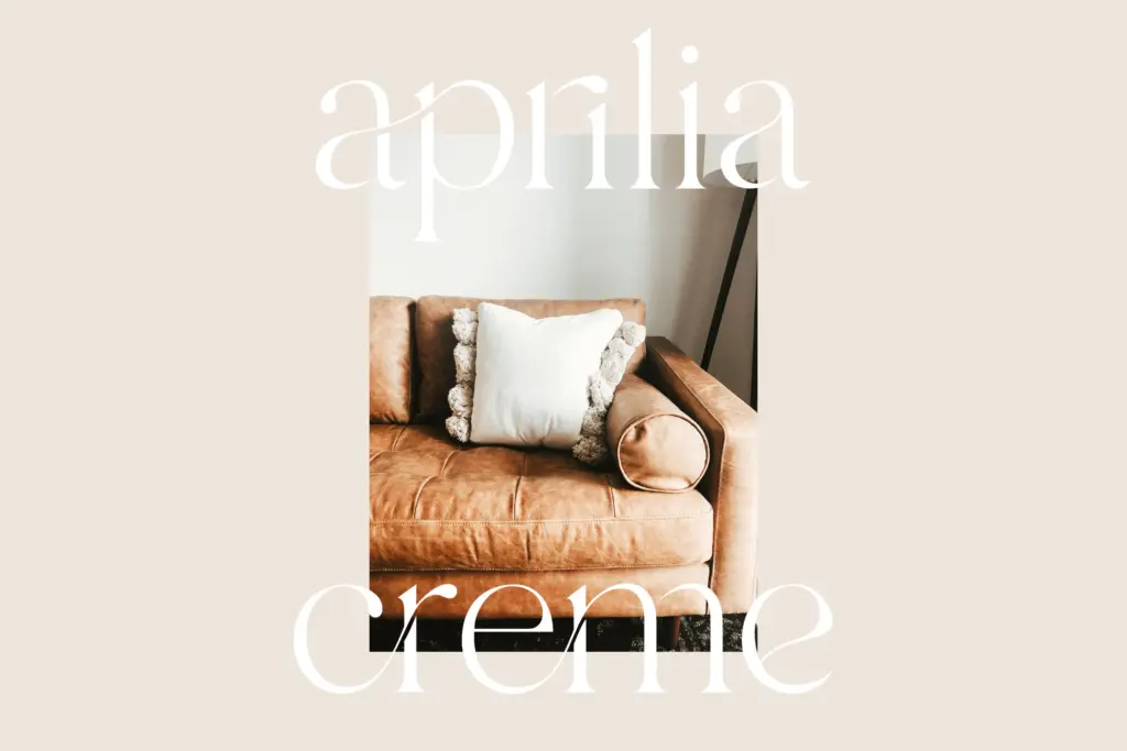
Branch’s obvious home is the wedding stationery market it’s clearly built for: invitation headlines, monograms, names on a place card, the opening line of a menu. It also works for logotypes and masthead lettering where a brand wants something with warmth but not the full commitment of a script. Packaging labels, boutique signage, and editorial pull-quotes are reasonable extensions of the same logic — short strings, generous size, room for the ligatures to do their job without crowding.
It’s less suited to anything requiring dense text or strict uniformity across a long document. Multi-line paragraphs, tabular data, or any context where the reader needs to move fast will expose the font’s display-first construction. Treat it as a headline and accent typeface, pair it with a plain, unrelated body font for supporting text, and it earns its keep. Ask it to do a body font’s job and it won’t hold up.
What we liked, and what we didn’t
Strengths
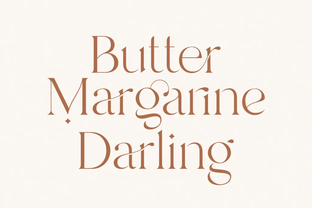
- Ligatures add handwritten irregularity without tipping into a full script
- PUA encoding makes alternates accessible even outside OpenType-aware software
- Restrained letterforms make it easy to pair with a plainer body typeface
Trade-offs
- Legibility drops off quickly below display sizes, limiting it to short text
- Overusing the ligature set can create visual clutter without careful glyph selection
Branch is a competent ligature serif built for short, decorative text rather than reading copy. The joins between letters give it warmth without pushing into full script territory, but that same construction limits it to headline and accent use. Buyers should plan on hand-picking alternates rather than relying on automation to make it sing.
Verdict

Tmfonts reviews typefaces in depth — every font is tested in real branding, editorial and screen layouts before a word gets written. 555+ fonts reviewed and counting.