
Have Heart: a two-font marker script for quick, authentic hand-lettering
Design style
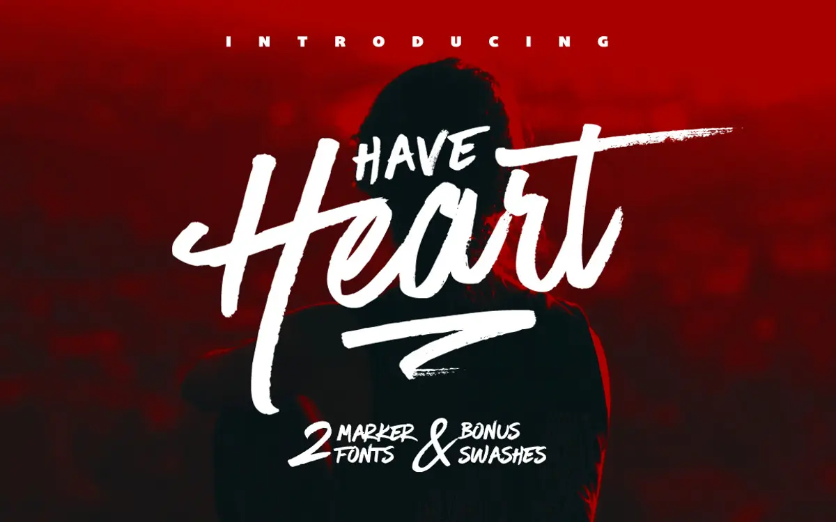
Have Heart reads as marker pen on paper, not a script smoothed into vector perfection. The strokes carry the slight pressure changes and rounded terminals you get from a real brush-tip marker, and the joins between letters have the loose, slightly uneven rhythm of someone lettering by hand rather than a font engine simulating it. That looseness is the whole appeal. Nothing here is trying to look formal or bridal in the traditional calligraphic sense; it’s closer to the hand-lettering you’d see on a hand-drawn logotype or a packaging label, warm and a bit scrappy in the best way.
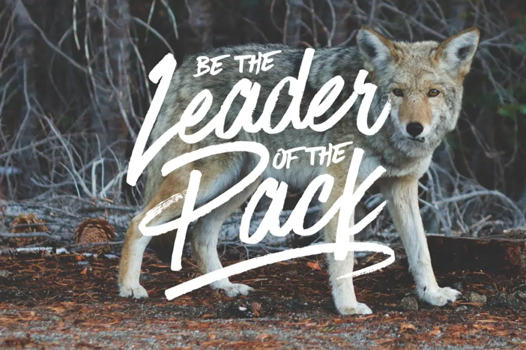
The set is really two typefaces built to sit on top of one another. Have Heart One is the primary lowercase-driven script, with upper and lower case, and it’s designed to pair with Have Heart Two, an upper-case-only companion with a slightly different weight and posture. Layer the two and you get the effect of a lettering artist mixing a script pass with a print pass, which is a smart way to fake variety without asking a single font to do too much.
Character set and features
Have Heart One is the fuller of the two, with a complete upper and lowercase set, a generous punctuation range, numerals, and support for international languages. It also includes stylistic alternates on several lowercase letters, accessible through the Glyphs panel in Illustrator or the Stylistic Alternates menu in Photoshop, which is useful for breaking up repeated letters in a word or avoiding awkward collisions between neighbouring strokes.
Have Heart Two is deliberately more limited: uppercase only, basic punctuation, numerals, and the same international language support. Used alone it works as a companion display face rather than a body script. The third piece, Have Heart Swash, is a set of twelve standalone hand-made swash marks rather than a full alphabet, meant as connecting flourishes or sentence-ending marks layered into a composition rather than typed as running text.
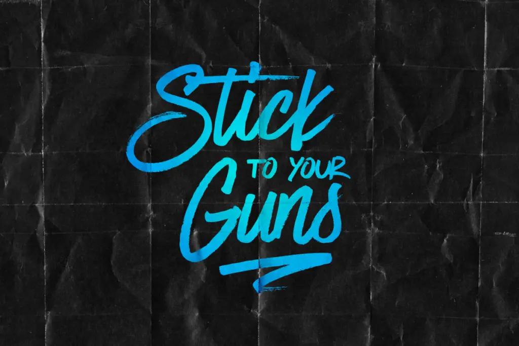
Because this is a marker script and not a formal connecting cursive, letter spacing needs attention. The natural unevenness that makes it feel handmade also means kerning pairs will occasionally need manual nudging, especially in all-caps combinations using Have Heart Two, or wherever a swash is dropped in next to a letterform it wasn’t drawn to touch.
Use cases
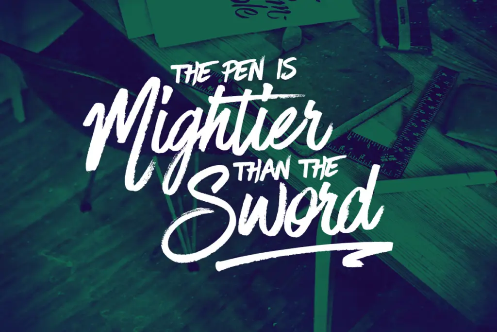
This is a design toolkit more than a single-purpose display font. The pairing of the two Have Heart weights suits logotypes, packaging, and branding work where a hand-lettered mark needs to look bespoke rather than typed. It also does well in short editorial moments — a magazine pull quote, a poster headline, a greeting card — where the marker texture reads at a glance and doesn’t need to hold up at length. It is not built for body copy or long-form setting; the irregularity that gives it character becomes fatiguing past a line or two.
Wedding stationery and invitation work is a reasonable fit given the alternates and swash set, though designers wanting a more traditional, ornate calligraphic feel should look elsewhere — this leans casual and contemporary rather than formal. Where it earns its keep is anywhere a brand wants to look handmade without commissioning actual hand-lettering for every asset.
What we liked, and what we didn’t
Strengths
- Two complementary weights let you layer a script and print pass for a genuine hand-lettered composition
- Stylistic alternates in Have Heart One help avoid repetitive or colliding letterforms
- Twelve bonus swashes give extra finishing detail without cluttering the base character set
Trade-offs
- Loose, uneven spacing means manual kerning is often needed, especially with swashes and all-caps combinations
- Not suited to body text or long-form setting; the handmade texture tires the eye past a line or two
Have Heart delivers a convincing marker-pen hand-lettered look through its two-font pairing, and the alternates and swashes add real flexibility for branding work. It's not built for long text or formal elegance, so it suits short, punchy display use rather than everything a script font might be asked to do.
Verdict

Tmfonts reviews typefaces in depth — every font is tested in real branding, editorial and screen layouts before a word gets written. 555+ fonts reviewed and counting.