
Winter Is Coming: a vintage-lettering serif family with script and shadow variants
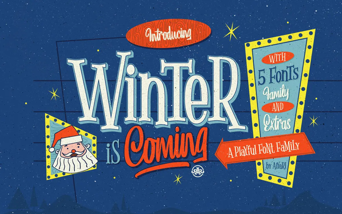
Design style
Winter Is Coming is built around a mid-century hand-lettering feel, the kind of lettering you’d find on old winter postcards and product tins from the 1950s and 60s. The serif is the anchor of the family: sturdy, slightly condensed strokes with rounded terminals and small irregularities that read as hand-drawn rather than mechanically drafted. It’s not trying to be a clean revival serif — the joins are looser, the curves have a bit of wobble, and that’s the point.
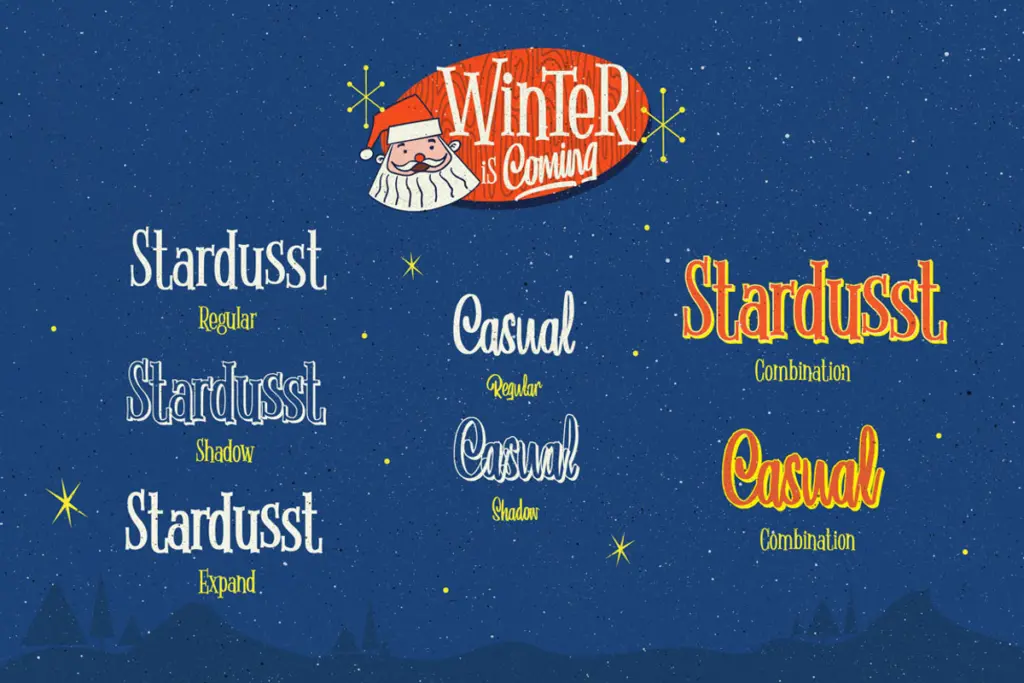
Alongside the base serif you get a shadow version and an expanded version, both drawn to sit as layers or standalone display treatments. The script companion leans looser and more casual, with connected strokes that read as brush-influenced rather than pointed-pen formal. It’s a rougher, friendlier script than the kind built for wedding stationery — more apparel tag than engraved invitation.
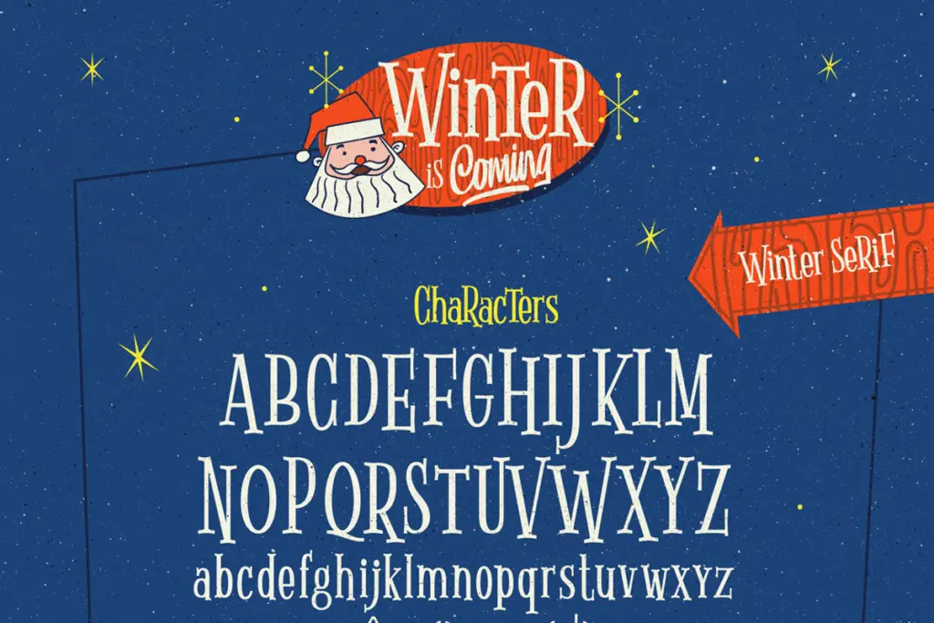
Character set and features
The family uses OpenType stylistic alternates, stylistic sets, contextual alternates, ligatures, and a set of ornaments. In practice this means the serif and script styles can vary letter shapes as you type, which helps break up repetition in short lines of text — useful in logotypes and headlines where the same letter might otherwise appear twice in an obvious way. The ornaments and the separate Extras files (delivered as vector art alongside the fonts) function as decorative flourishes and seasonal graphics rather than typographic characters, so they’re best treated as a small illustration kit that ships with the fonts.
Because this is a display-oriented, hand-lettered design, it needs software that actually reads OpenType features — Illustrator or InDesign, not a basic word processor — or you’ll only see the default glyphs and miss the alternates that give the family its character. At small sizes the serif’s texture and the script’s looseness both lose definition; this is not a typeface built for body copy or long-form reading. It wants space, size, and a short line count.
Use cases
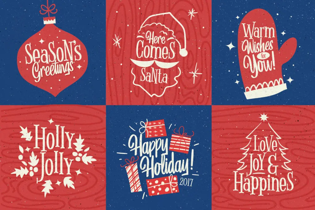
This family is suited to seasonal and lifestyle work: greeting cards, winter-themed packaging, apparel graphics, posters, and short editorial pieces where a nostalgic, handmade tone fits the brief. The shadow and expanded serif options give some built-in versatility for headline work without reaching for a second typeface — layer the shadow version behind the solid serif for a dimensional logotype, or use the expanded cut for wide banner headlines. The script pairs naturally with the serif for a two-line lockup, following the seller’s own suggestion to mix upper and lowercase in the serif for texture.
Where it doesn’t stretch is corporate or minimal branding, UI work, or anything needing a light, neutral voice — the personality is baked in and can’t be dialed back. It’s also squarely a winter/holiday-flavoured face; using it outside that seasonal register will feel like a mismatch. Buyers looking for a flexible, all-season workhorse should look elsewhere, but for a specific nostalgic, cold-weather aesthetic, the family delivers a fairly complete toolkit in one purchase.
What we liked, and what we didn’t
Strengths
- Shadow and expanded serif variants give built-in options for layered, dimensional headline treatments
- Stylistic alternates and contextual alternates help vary repeated letters in short logotype-length text
- Bundled vector extras add seasonal ornament without needing separate illustration work
Trade-offs
- Texture and looseness in both serif and script styles break down at small sizes, so it's unsuitable for body text
- The nostalgic winter tone is narrow and doesn't adapt well outside seasonal or lifestyle branding
Winter Is Coming is a decorative, hand-lettered serif and script bundle with a clear seasonal identity. It handles headline and packaging work for winter-themed projects well but isn't built for reading text or year-round branding.
Verdict

Tmfonts reviews typefaces in depth — every font is tested in real branding, editorial and screen layouts before a word gets written. 555+ fonts reviewed and counting.