
Hazel Shore Font Free Download
Is Hazel Shore free to download?
Hazel Shore is a commercial font sold on Creative Market, so the full version needs a paid license. Get it from the official listing: Hazel Shore font download.
Need something free? These serif fonts from Google Fonts are free for personal and commercial use:
Design style
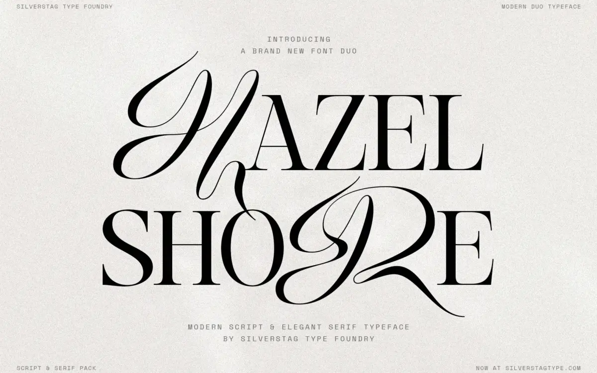
Hazel Shore is a high contrast display serif drawn alongside a matching italic and a separate flowing script, and the point of the whole package is that the three were built together rather than assembled from a foundry’s back catalogue. The serif has the usual markers of the genre: thin hairlines against heavy stems, sharp bracketing on the serifs, and a vertical stress that gives it a fashion-plate stiffness. It reads as a modern take on the high-contrast display serif rather than a revival, with none of the eccentricity that some faces in this category lean on for character.
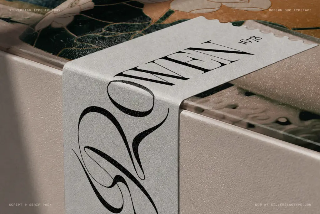
The script is where the design earns its keep. It’s drawn to share x-height, cap height and proportions with the serif, which means you can drop a script capital into a word set in the serif and the baseline, weight distribution and letter width don’t lurch. That’s a harder trick than it sounds — most serif-script pairings are stylistically compatible but not structurally matched, so a swapped letter looks bolted on. Here it looks intentional, at least on the combinations the foundry demonstrates. The script itself carries long entry and exit strokes, which is pleasant in isolation but means it needs air around it; cramming it against other letters undoes the calligraphic illusion.
Character set and features
The serif is the deep end of this family: 901 glyphs, 124 ligatures, old style and tabular figures, fractions, superscripts and subscripts. That’s a serious OpenType build, and it means the font can do quiet, functional work — running text with proper figure alignment, footnote-style superscripts — not just headline duty. The italic gets its own 111 ligatures rather than inheriting the roman’s, which suggests actual attention was paid to how italic letters connect rather than a mechanical slant.
The script leans on contextual alternates to manage its joins, swapping in different entry and exit forms depending on neighbouring letters. This is standard practice for connecting scripts and it works as advertised in most software that supports OpenType features, but it’s worth knowing the script depends on that support — paste it into an app that ignores contextual alternates and the joins will look mechanical rather than handwritten. Language support across 100-plus languages on the serif and italic is a genuine practical asset if you’re setting anything beyond English.
Use cases
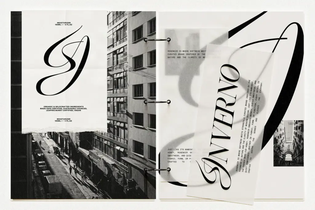
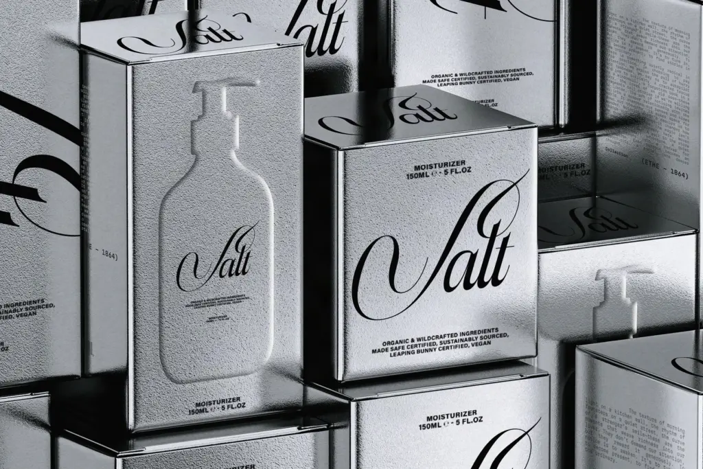
This is a branding and packaging typeface first. The single-letter-swap trick is built for logotypes, monograms and short set pieces — a brand name, a product label, a magazine masthead — where you want one accent of script without committing to a full script logo. It suits fashion and beauty work, boutique packaging, invitation suites, and editorial covers where a headline needs some visual tension.
It is not a body text face and isn’t trying to be, despite the old style figures and ligature depth. The high contrast strokes thin out at small sizes, and the script’s long strokes need generous tracking to avoid collision. Reserve it for display sizes and let the serif’s fuller feature set carry any supporting text.
What we liked, and what we didn’t
Strengths
- Serif and script share cap height and proportions, so single-letter swaps look drawn rather than pasted together
- Deep OpenType build on the serif with old style and tabular figures, fractions and 124 ligatures
- Separate italic ligature set shows real attention beyond a mechanical slant
Trade-offs
- High contrast strokes and the script's long entry strokes limit it to display sizes, not text
- Script's contextual joins depend on OpenType feature support, so results vary by software
Hazel Shore does one clever thing well: a script and serif drawn to share proportions so a single swapped letter doesn't break the word. It's a strong pick for branding and packaging headlines, less useful once you need actual body copy.

Tmfonts writes independent reviews of typefaces: what each font does well, where it falls short, what it suits, and where it is sold.