
Catchy Mager Font Free Download
Is Catchy Mager free to download?
Catchy Mager is a commercial font sold on Creative Market, so the full version needs a paid license. Get it from the official listing: Catchy Mager font download.
Need something free? These serif fonts from Google Fonts are free for personal and commercial use:
Design style
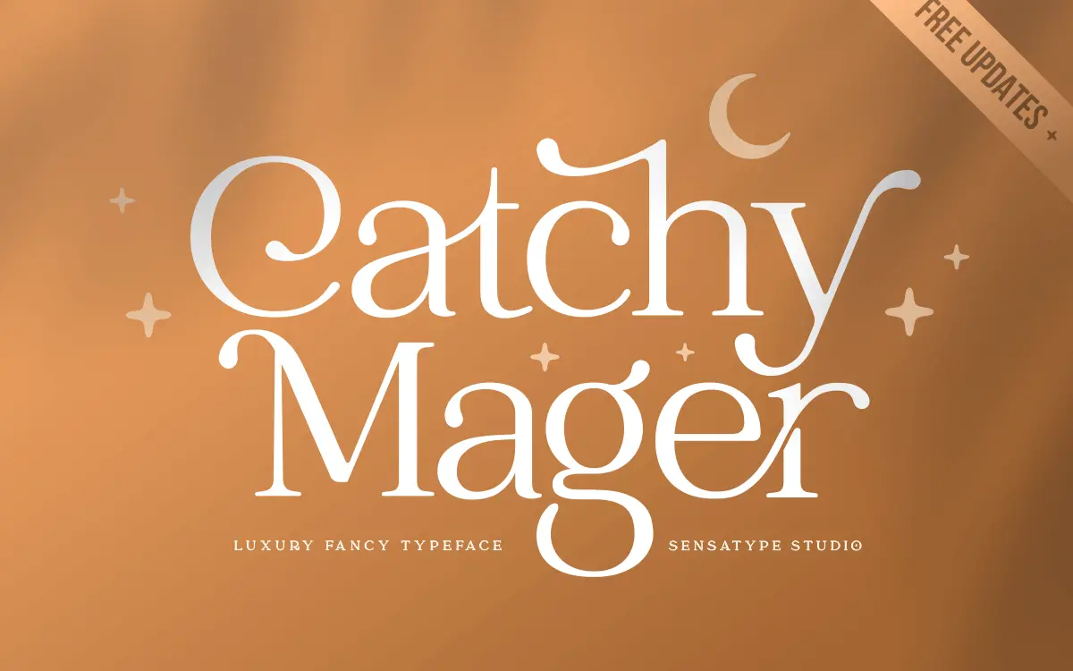
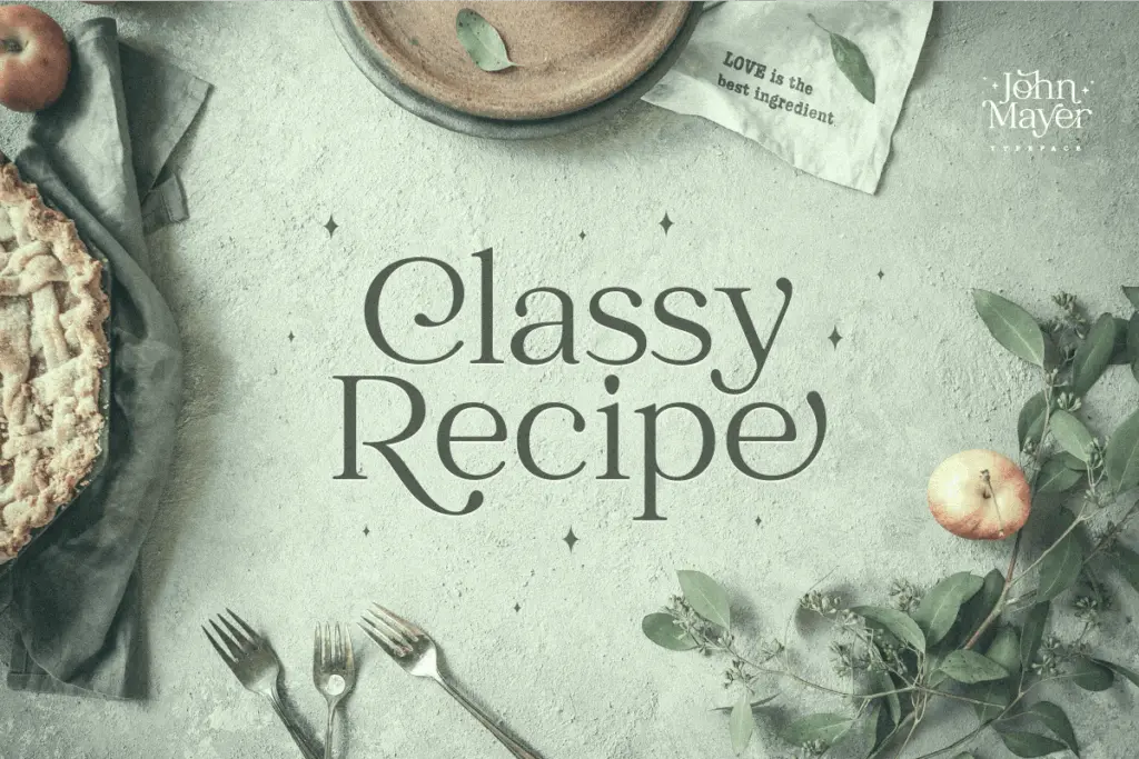
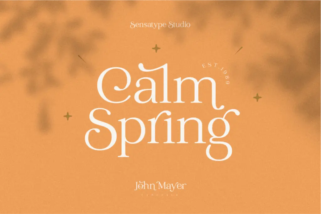
Catchy Mager reads as a serif built primarily as a logotype tool rather than a text face. The letters carry the bracketed serifs and moderate contrast of a classic serif skeleton, but the drawing has been loosened up with flourished caps and a set of connecting ligatures that push it closer to a signature style than a book face. Every uppercase letter gets a decorative treatment, and a handful of lowercase letters follow suit, so the rhythm of a word shifts noticeably depending on which letters land where a cap falls.
The overall mood is dressy rather than restrained. Terminals swing out, strokes taper unevenly on purpose, and the spacing between letters is tight enough that the ligatures read as intentional joins rather than accidents. It’s the kind of drawing you’d expect from someone who has sat through client requests for “elegant but different” and built a face specifically to answer that brief, one word or short phrase at a time.
Character set and features
The set covers uppercase and lowercase, numerals, punctuation, and a broad range of multilingual symbols, so basic language coverage beyond English shouldn’t be an issue. The standout is the ligature list: pairs like ab, ah, am, an, ar, ch, em, en, fl, fi, and several others are built as single joined forms rather than left to the browser or app’s own ligature substitution to guess at. That’s a real point in its favour if you’re setting short phrases and want the joins to look deliberate rather than default.
What’s missing from the brief is any indication of weight variation or a companion regular/alternate style for longer copy. This looks like a single-weight, single-style font built around its fancy caps and ligatures, which means the character set does one job well rather than flexing across several registers.
Use cases
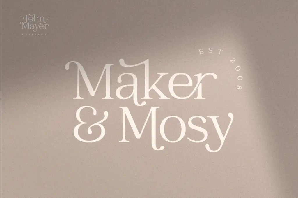
This is a logo and wordmark font first. Short brand names, monograms, and single-line taglines are where the ligatures and flourished caps earn their keep — set one word large and the joins between letters become the design rather than a distraction from it. It also suits packaging labels, invitation lockups, and social graphics where a few words need to look considered rather than typed.
It’s not built for paragraphs. The flourishes and tight joins that make a wordmark distinctive will fight legibility the moment you’re setting a sentence or a block of body copy, and the lack of a plainer companion style means there’s nowhere to retreat to within the family itself. Treat it as a display and branding tool, pair it with a quieter face for supporting text, and keep the word count low wherever it appears.
What we liked, and what we didn’t
Strengths
- Prebuilt ligatures for common letter pairs like ch, en, and fl give joined words a deliberate, considered look
- Fancy treatment on uppercase letters makes single-word wordmarks and monograms feel distinctive
- Broad multilingual symbol support beyond the core alphabet
Trade-offs
- No plainer weight or alternate style included for setting anything longer than a few words
- Tight spacing and flourished terminals make it unsuitable for body copy or small sizes
Catchy Mager is a single-purpose logotype font: strong ligatures, flourished caps, and a clear sense of what it's for. It won't do double duty as a text face, and there's no simpler companion style included to fall back on for supporting copy.

Tmfonts writes independent reviews of typefaces: what each font does well, where it falls short, what it suits, and where it is sold.