
Manic Font Free Download
Is Manic free to download?
Manic is a commercial font sold on Creative Market, so the full version needs a paid license. Get it from the official listing: Manic font download.
Need something free? These handwritten fonts from Google Fonts are free for personal and commercial use:
Design style
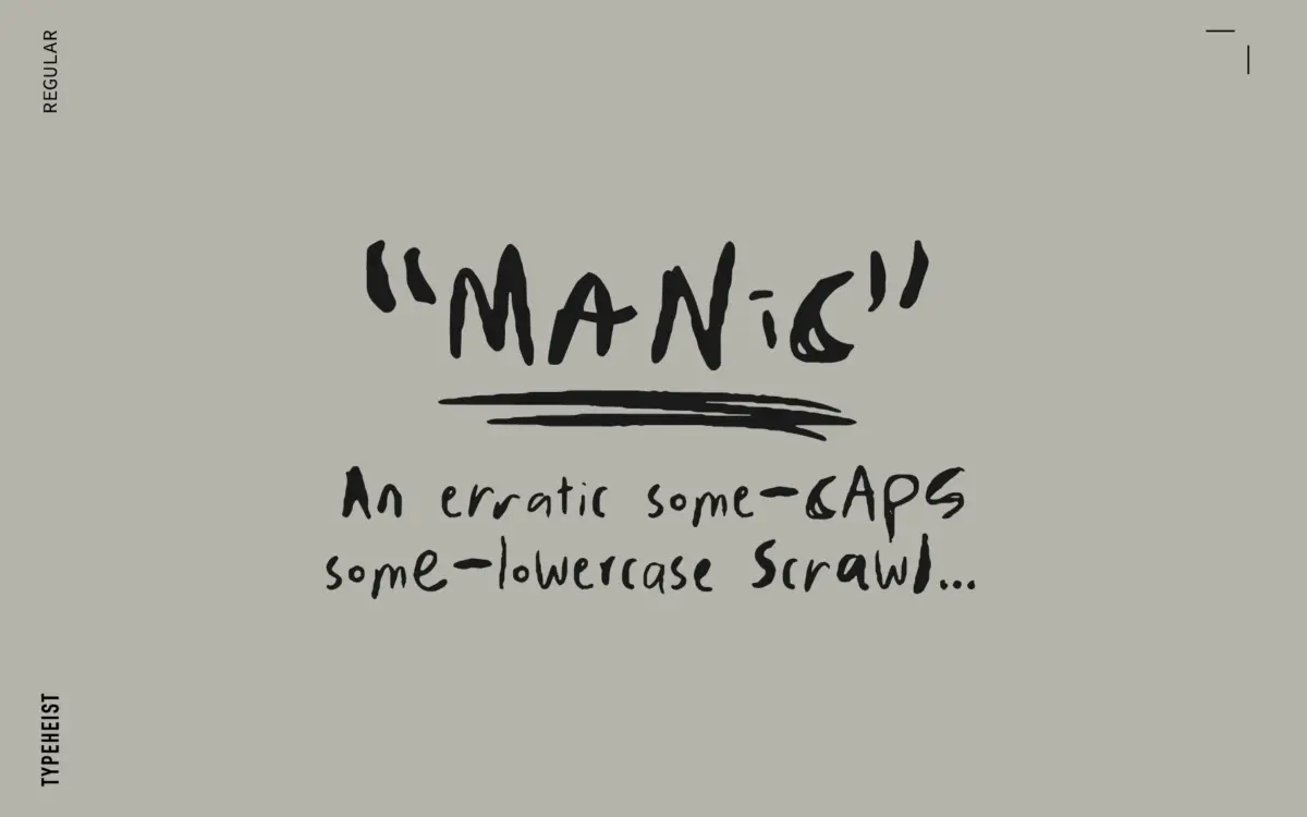
MANIC reads as a scrawl first and a typeface second, which is exactly the point. The letterforms mix caps and lowercase within a single case-agnostic system, so a word set in MANIC never settles into the tidy rhythm you’d expect from a handwriting font. Strokes wobble, baselines drift, and the whole thing looks closer to a note scribbled in a hurry than anything drawn with a ruler in mind. That’s a deliberate choice, not a flaw in execution — the roughness is consistent enough that it reads as style rather than accident.
Four variations of the alphabet ship in the package (Regular plus three Alternates), each with its own degree of scrawl. Switching between them, or mixing them within a layout, changes the personality of the piece without changing the underlying voice. A Sketches style adds a rougher, more textured pass for anyone who wants the handwriting to look even less finished. It’s a font built around variation rather than a single fixed letterform, which suits its brief.
Character set and features
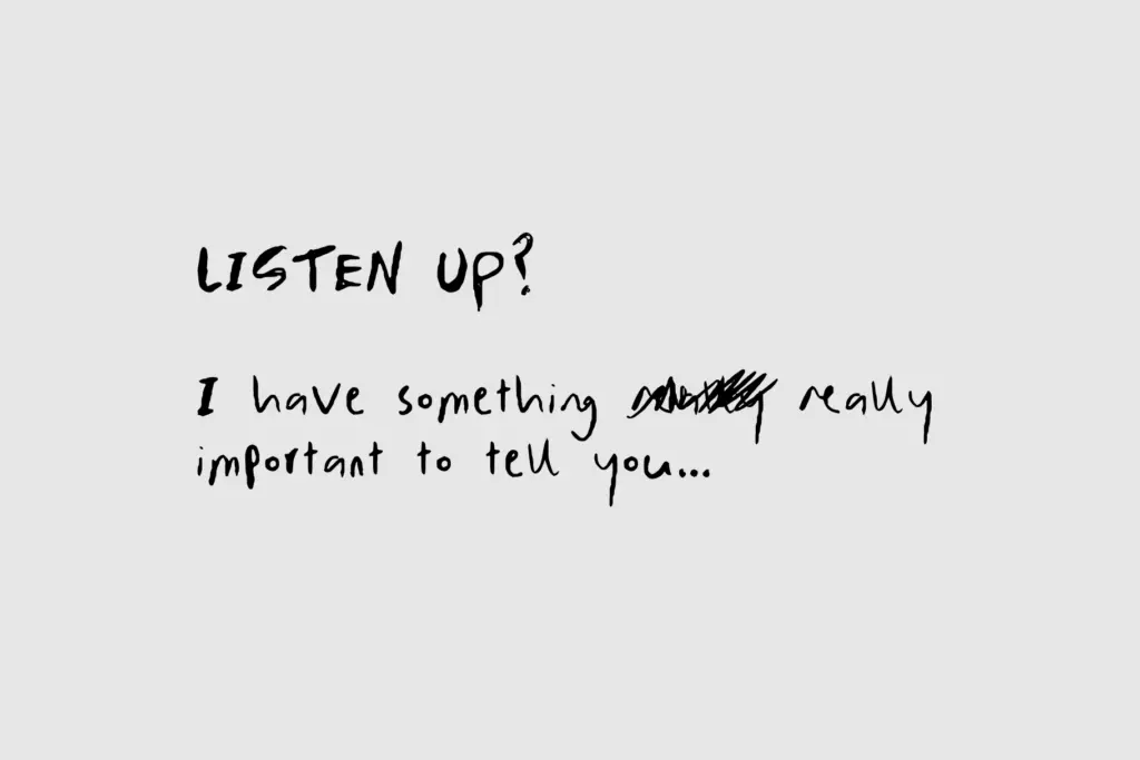
The headline feature is the ligature set — over 100 of them, including double-letter combinations in both cases. That’s a meaningful number for a handwriting font, because double letters (the two Ls in “hello”, the two Ss in “class”) are exactly where mechanical repetition gives away that a font is a font rather than actual handwriting. With ligatures handling those combinations, MANIC avoids the obvious tell of identical letter pairs sitting side by side.
Standard English characters are covered, along with accented characters for non-English use, so the font isn’t limited to a narrow language set. An Embellishments pack in SVG and PNG format is bundled alongside the font files themselves — flourishes and marks meant to sit around the type rather than as part of it, useful for anyone building out a fuller composition rather than typing straight text.
Because the alternates and ligatures rely on OpenType features, getting the full effect depends on software that supports them properly. Set in a program that ignores stylistic alternates, MANIC will still look like handwriting, but a flatter, more repetitive version of it — worth checking before committing to a layout.
Use cases
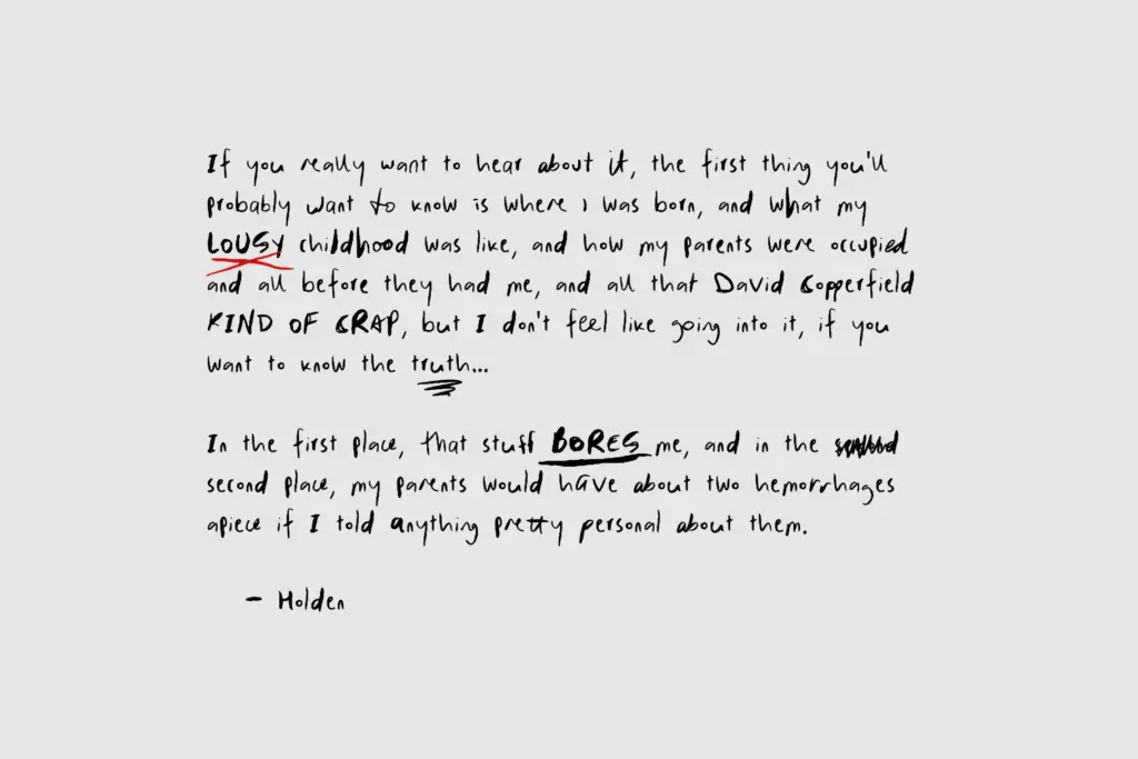
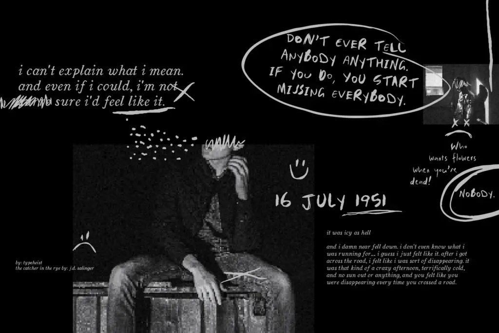
This is a font for moments that want to look unpolished on purpose: gig posters, streetwear graphics, packaging for a brand that’s trading on rawness rather than restraint, social posts that need to look dashed off rather than designed. The messiness is the message, so it works best where a slick script would feel wrong.
It’s less suited to anything requiring calm, sustained reading — body copy, long-form editorial, anywhere a reader needs to move through text without effort. Handwriting fonts this loose are also not the choice for a client who wants legibility guaranteed across every device and rendering environment; the more alternates and ligatures you lean on, the more testing that decision needs. Used for short bursts — a headline, a logotype, a single scrawled line — it does its job well.
What we liked, and what we didn’t
Strengths
- Over 100 ligatures, including double-letter pairs, disguise the repetition that gives away most handwriting fonts
- Four distinct alphabet variations plus a Sketches style give real range without leaving the font's core voice
- Bundled embellishments in SVG/PNG extend the font into layout elements beyond the letterforms
Trade-offs
- The intentional messiness makes it unsuitable for anything beyond short headlines or display text
- Full effect depends on OpenType alternate and ligature support, so results vary by software
MANIC commits fully to looking like real, hurried handwriting, and the ligature set does real work hiding the usual repetition tells. It's a font for short, loud, deliberately rough moments, not for anything that needs to be read comfortably for long.

Tmfonts writes independent reviews of typefaces: what each font does well, where it falls short, what it suits, and where it is sold.