
Peach Sangria Font Duo Free Download
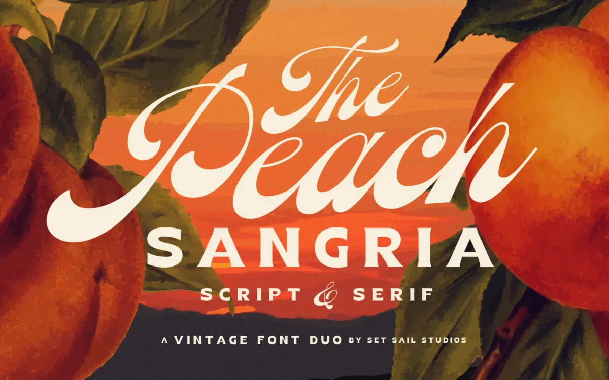
Is Peach Sangria Font Duo free to download?
Peach Sangria Font Duo is a commercial font sold on Creative Market, so the full version needs a paid license. Get it from the official listing: Peach Sangria Font Duo download.
Need something free? These script fonts from Google Fonts are free for personal and commercial use:
Design style
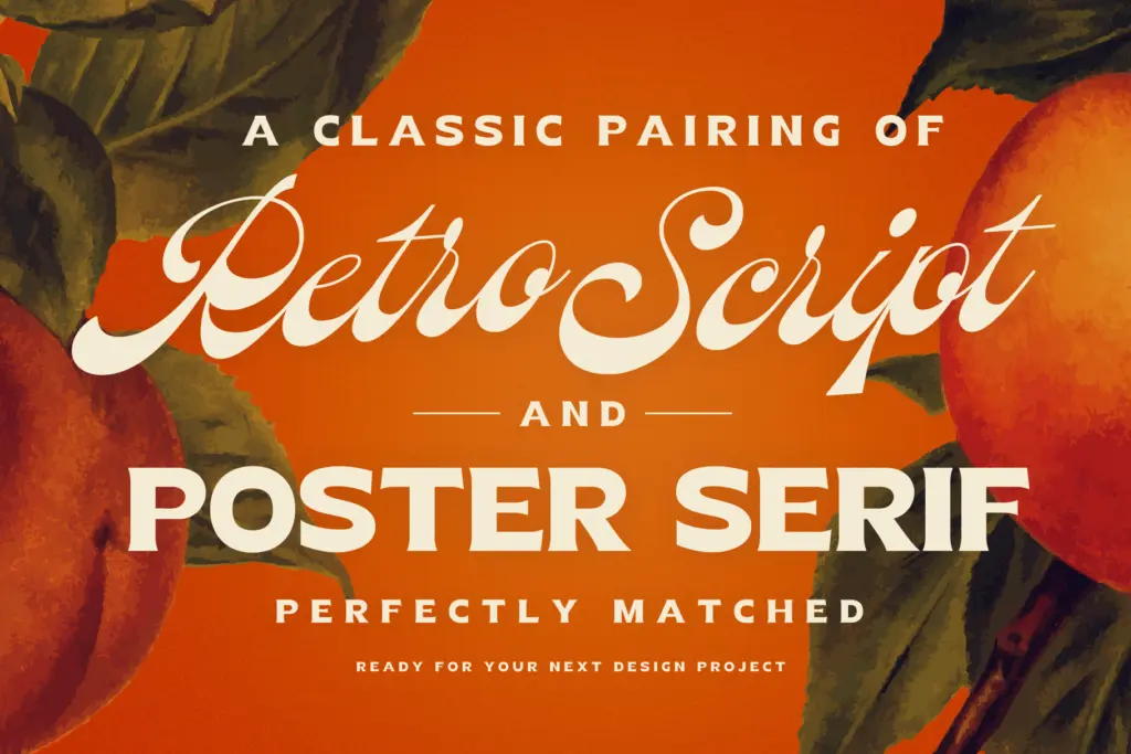
Peach Sangria is a two-font set built around a single retro idea: a connecting script with weight sitting low in the letters, paired with a blocky uppercase serif for contrast. The script is the clear centrepiece. Its bottom-heavy structure means the thick strokes fall toward the baseline rather than through the middle of the letter, which gives it a slightly retro, hand-lettered quality rather than the more even swing of a copperplate-style script. The connections between letters are loose and confident, not fussy, and the overall rhythm reads as vintage-market or soda-fountain rather than bridal-invitation delicate.
The companion serif is deliberately plain in construction — thick slab-like strokes, generous counters, no real contrast between thick and thin. It’s built to be shouted rather than read closely, which is exactly the job a poster serif is supposed to do. Together the two fonts lean on the same era: the script for flourish, the serif for weight and structure. Neither pretends to be a standalone workhorse text face, and that’s fine, because that isn’t what either one is for.
Character set and features
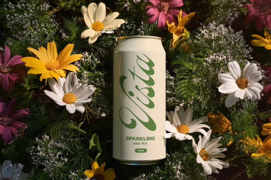
The script includes a full set of uppercase, lowercase, numerals and punctuation, so it can carry a complete phrase or headline without needing a stand-in for missing characters. Seven lowercase alternates are included, accessed either through Stylistic Alternates or a glyphs panel, offering a version of certain letters without the entry stroke — useful for word-starts or for breaking up repetition in longer settings. It’s a modest alternate set, not an exhaustive one, but it’s enough to avoid the flat, robotic look that plagues cheaper scripts run without any variation.
The serif, by contrast, is uppercase-only, with numerals and punctuation but no lowercase. That’s a real limitation to flag: it’s not a font you can use for a sentence of body copy, only for short bursts of capital-letter text — a word, a line, a stat. Language support is broad across Western and Central European diacritics, which matters if a project needs French, Polish, or Turkish characters, but doesn’t change the fundamental scope of what these two fonts can do.
Use cases
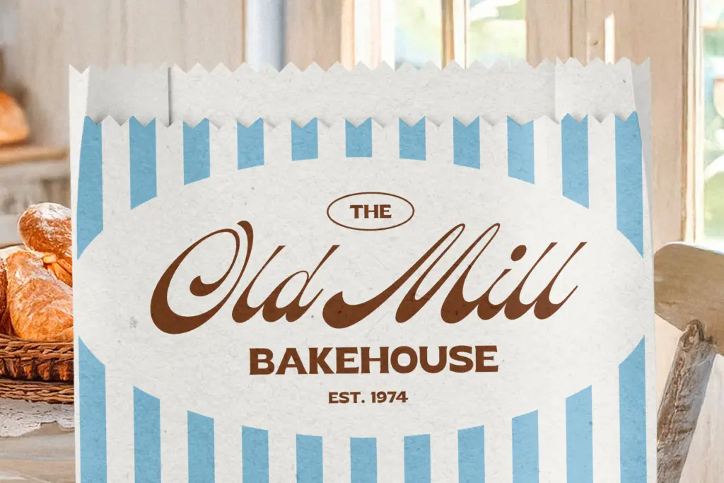
This duo is built for short, decorative compositions rather than long-form layout: logotypes, product labels, market signage, drinks menus, badge-style branding, the kind of vintage packaging where a script wordmark sits above a chunky supporting line. Wedding stationery is a reasonable use if the couple wants something with more personality than a formal calligraphic script — Peach Sangria reads more
What we liked, and what we didn’t
Strengths
- The bottom-heavy script has genuine retro character rather than generic swash-and-loop styling
- Seven lowercase alternates give enough variation to avoid repetitive, robotic-looking words
- Broad European diacritic support makes it usable beyond English-language projects
Trade-offs
- The companion serif is uppercase-only, so it can't function as a body-text partner, only short display lines
- At small sizes or in dense settings, the script's connecting strokes and low contrast start to blur together
Peach Sangria is a competent, characterful vintage script-and-serif pairing built for short decorative work — logos, labels, badges — rather than long-form typesetting. The script has real personality and a modest but useful set of alternates; the serif is a plain, uppercase-only support player. Buy it for branding and packaging jobs, not for anything that needs a full text system.

Tmfonts writes independent reviews of typefaces: what each font does well, where it falls short, what it suits, and where it is sold.