
MidCentury Typeface Free Download
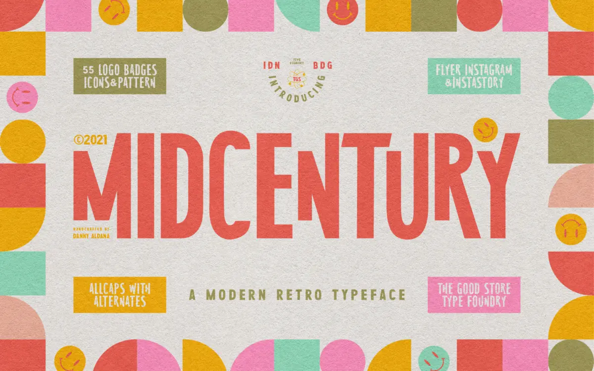
Is MidCentury Typeface free to download?
MidCentury Typeface is a commercial font sold on Creative Market, so the full version needs a paid license. Get it from the official listing: MidCentury Typeface download.
Need something free? These serif fonts from Google Fonts are free for personal and commercial use:
Design style
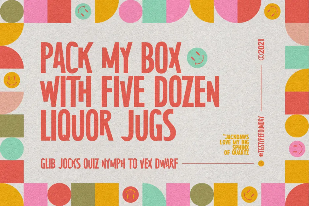
MidCentury Typeface is an uppercase-only display serif that leans hard into the poster and paperback-cover graphics of the 1950s. The letterforms carry the hallmarks of that era: slightly flared serifs, a geometric backbone, and strokes that feel cut rather than drawn. There’s a squared-off quality to the curves on letters like O and C, which gives the face a stamped, printed-in-bulk character rather than the fluid warmth of a text serif.
It’s not trying to be subtle. The letterforms are chunky and confident, built to hold their own on a cover or a badge rather than recede into a paragraph. That’s the point of a display face like this — it’s a voice, not a vehicle for long-form reading.
Character set and features
As an all-caps set, there’s no lowercase to speak of, so the typeface’s job is entirely about headline impact rather than nuance across a full alphabet. The package extends well beyond the font files themselves: alongside TTF, OTF and webfont formats, it bundles a flyer template, Instagram post and story templates, a stack of 55 logo and badge templates, background patterns, and a set of twenty mid-century icons. That’s a substantial amount of supporting material for a single purchase, and it signals the seller’s intent — this is meant to be dropped straight into a retro-branding project rather than typeset from scratch.
The open type feature reference in the package suggests some contextual alternates or stylistic variants exist, though the brief doesn’t specify exactly what they do. Buyers who want to verify swash or alternate glyph coverage should check the character map before committing to a layout that depends on it.
Use cases
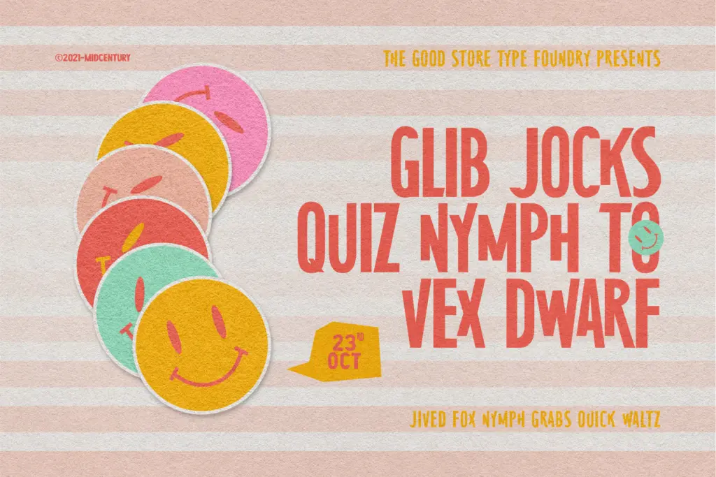
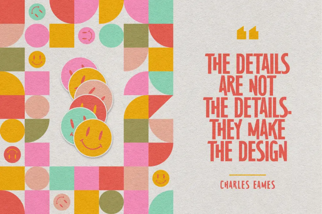
This is a font for covers, badges, posters and short punchy headlines — the kind of design work where a handful of words need to look period-appropriate and a little worn-in without literally using a distressed texture. Restaurant branding with a diner or soda-fountain angle, record sleeve pastiches, craft packaging that wants a nostalgic wink, and social posts built around a mid-century aesthetic are all reasonable fits. The bundled icon set and logo templates make it especially suited to someone building a full brand identity in one sitting rather than a typographer looking for a single well-drawn face.
It won’t do body copy — there’s no lowercase and the letterforms are too heavy and stylised for extended reading anyway. Treat it strictly as a headline or logotype tool, paired with a plainer sans or serif for supporting text. Given the all-caps restriction, designers should also budget extra kerning attention on longer headlines, since caps-only display faces can get visually dense in multi-word lines without some manual spacing work.
What we liked, and what we didn’t
Strengths
- Strong period character with flared serifs and stamped, poster-ready proportions.
- Comes bundled with logo, social, and icon templates that shortcut a full brand identity.
- Bold enough to hold up at large display sizes without extra effects.
Trade-offs
- All-caps only, so it can't handle body copy or mixed-case headlines without a companion font.
- Stylistic alternate coverage isn't clearly detailed, so buyers should check the glyph set before relying on it.
MidCentury Typeface delivers a solid, period-flavoured display face wrapped in a generous bundle of templates and icons aimed at retro branding projects. It's a one-note tool — no lowercase, no long-copy ambitions — but it does that note well for covers, badges and posters.

Tmfonts writes independent reviews of typefaces: what each font does well, where it falls short, what it suits, and where it is sold.