
Olive Village Font Free Download
Is Olive Village free to download?
Olive Village is a commercial font sold on Creative Market, so the full version needs a paid license. Get it from the official listing: Olive Village font download.
Need something free? These serif fonts from Google Fonts are free for personal and commercial use:
Design style
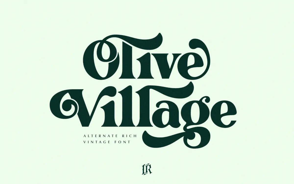
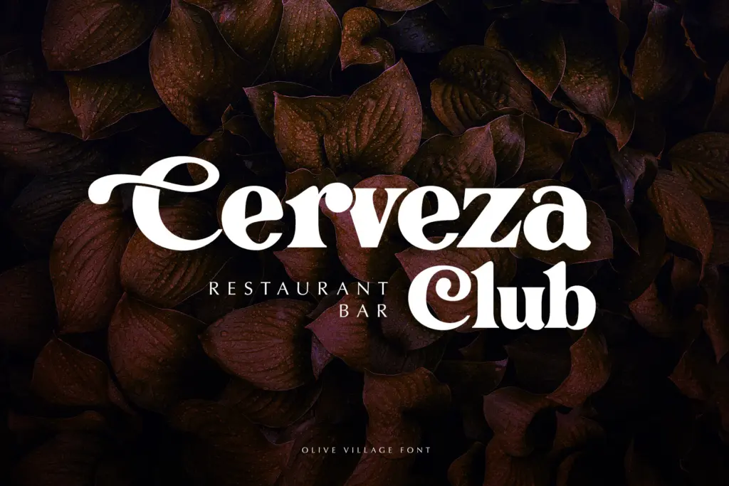
Olive Village leans hard into a particular decade. The contrast is high but not brittle — thick strokes swell into thin hairlines with a curl that reads as groovy rather than delicate. Bowls are rounded and slightly bulging, terminals often ball or flare outward, and the overall rhythm has that mid-century advertising bounce: confident, a little theatrical, never quiet. It’s the kind of serif that wants to sit on a record sleeve or a packaging label, not disappear into a paragraph.
The italic is where the vintage character really shows off. Letters lean and loop with more freedom than the upright, picking up connective flourishes that push it toward a display script feel at points. Paired together, regular and italic give you two register options from the same family — one steadier, one more exuberant — without needing to reach for a second typeface.
Character set and features
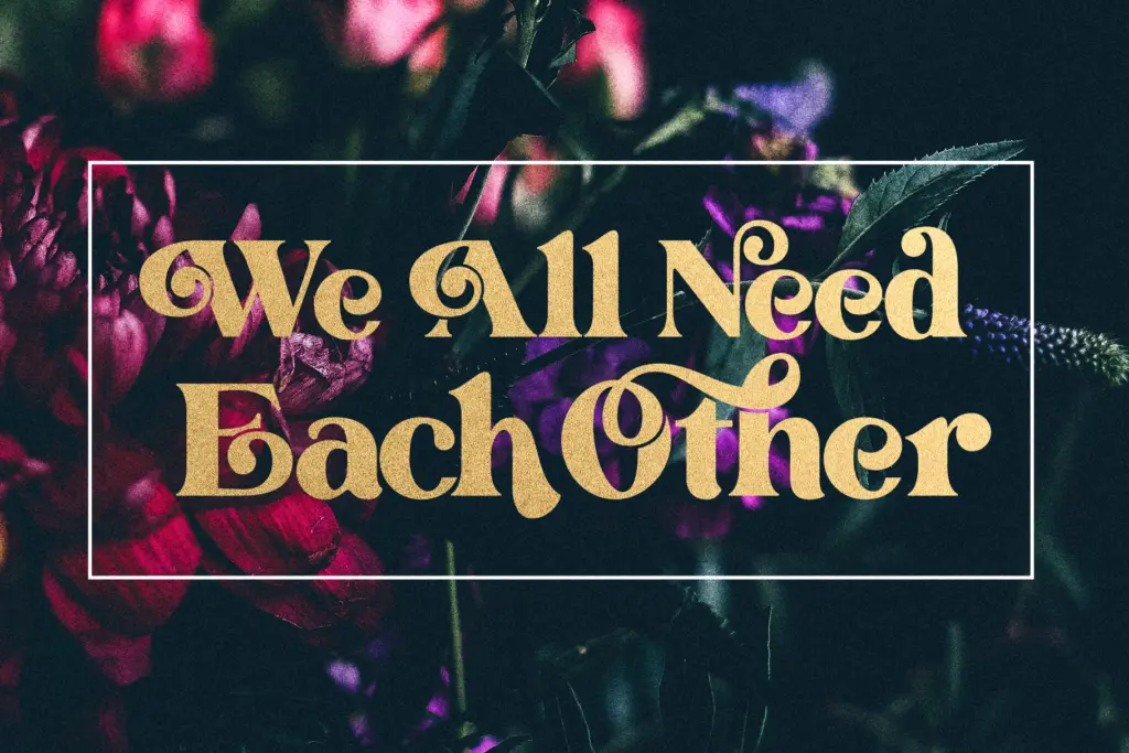
Olive Village ships with OpenType access to alternate glyphs and ligatures, which matters more here than in a typical text serif. Swapping in stylistic alternates changes the personality of a word noticeably — a single alternate ‘g’ or ‘y’ can shift a headline from tidy to properly retro. That said, using them requires software with a glyphs panel, so anyone working outside Illustrator or Photoshop, or in a simple app that only reads default OpenType features, will be stuck with the base letterforms and lose a good chunk of what makes this font distinctive. Ligatures are more forgiving — they’re accessible without special software, so common letter pairs pick up their connected forms automatically.
At smaller sizes the contrast starts working against it. The seller’s claim that it’s

Tmfonts writes independent reviews of typefaces: what each font does well, where it falls short, what it suits, and where it is sold.