
Paper Soul Font Free Download
Is Paper Soul free to download?
Paper Soul is a commercial font sold on Creative Market, so the full version needs a paid license. Get it from the official listing: Paper Soul font download.
Need something free? These script fonts from Google Fonts are free for personal and commercial use:
Design style
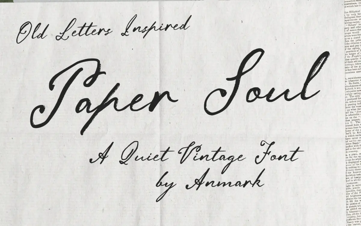
Paper Soul sits in the well-populated field of vintage-leaning scripts, but it earns its place by staying restrained. The strokes carry a moderate slant and a deliberate irregularity, as if the pen wobbled slightly between letters, which is the whole point. Rather than the confident, unbroken swing you get from calligraphic scripts built for maximum flourish, this one reads like handwriting done carefully, not performed. The letterforms are elongated and narrow, with thin, tapering entry and exit strokes that mimic a worn nib rather than a brush.
The texture is the real design decision here. Instead of smooth vector curves, the strokes have a faint roughness, a suggestion of ink soaking into paper fibre. It’s subtle rather than heavily distressed, so it doesn’t tip into a grunge aesthetic. That restraint is what separates it from a lot of vintage scripts on the market, which tend to overdo the ink-bleed effect until it becomes noise. Paper Soul keeps the texture low enough that it reads as warmth, not damage.
Character set and features
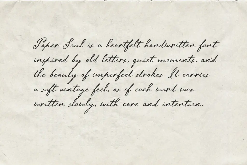
As a script built around connected, cursive letterforms, spacing and joins matter more than in most typefaces, and this is where the personality lives or dies. The moderate slant keeps the rhythm consistent across a line of text, which helps at paragraph length, though scripts like this are still better suited to short passages — a name, a line of verse, a greeting — than to long-form reading. The elongated ascenders and descenders give it a graceful vertical reach, useful for monogram work or drop-cap style treatments where a single letter needs to carry visual weight.
The seller doesn’t specify the depth of the OpenType feature set, so treat any claims of extensive alternates or ligatures with some scepticism until you’ve tested the actual file. What’s evident from the letterforms themselves is a script designed for legibility at working size rather than pure ornament — the counters stay open, and the joins between letters don’t collapse into illegible knots, which is a common failure point in handwritten scripts pushed too far toward decoration.
Use cases
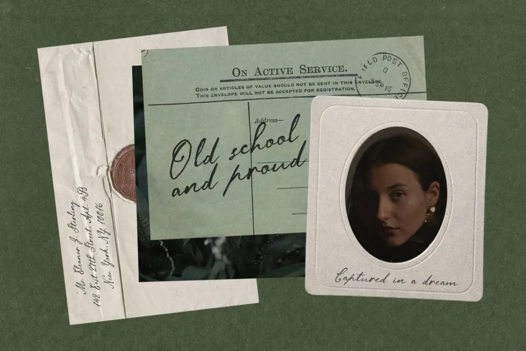
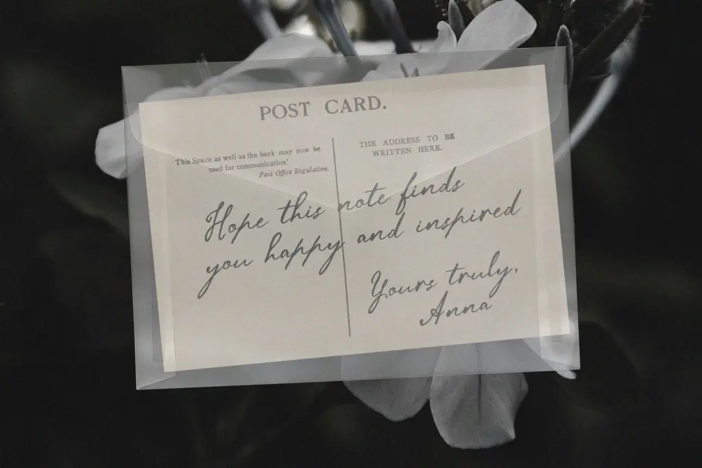
This is a font for intimate, printed-feeling work: wedding invitations, place cards, greeting cards, the kind of stationery meant to be held rather than scrolled past. Its quiet, understated character makes it a strong choice for couples or brands wanting something that feels personal rather than showy — the anti-flourish script, in a sense. It also suits short editorial moments: a pull quote, a book dedication page, a logotype for a boutique or a small literary project where warmth matters more than boldness.
It will struggle in contexts that need scale or high contrast — large signage, bold branding moments, anything competing for attention on a crowded shelf. And because the charm depends on subtlety, it needs generous surrounding space and a light hand with colour; cram it onto a busy layout and the delicate strokes simply disappear.
What we liked, and what we didn’t
Strengths
- The ink-on-paper texture is subtle enough to read as warmth rather than distress.
- Open counters and clean joins keep it legible at working sizes, unlike many decorative scripts.
- Elongated ascenders and descenders give it useful reach for monograms and drop caps.
Trade-offs
- Not built for large-scale or high-contrast branding, where its delicacy simply flattens out.
- The OpenType feature depth isn't specified, so alternates and ligatures should be verified before relying on them.
Paper Soul is a well-judged, understated script that trades flourish for warmth. It's best used sparingly — short lines, generous space — and it isn't built for scale or heavy branding work. For stationery and personal, nostalgic projects it does its job with quiet confidence.

Tmfonts writes independent reviews of typefaces: what each font does well, where it falls short, what it suits, and where it is sold.