
Tnsc Special Season Font Free Download
Is Tnsc Special Season free to download?
Tnsc Special Season is a commercial font sold on Creative Market, so the full version needs a paid license. Get it from the official listing: Tnsc Special Season font download.
Need something free? These handwritten fonts from Google Fonts are free for personal and commercial use:
Design style
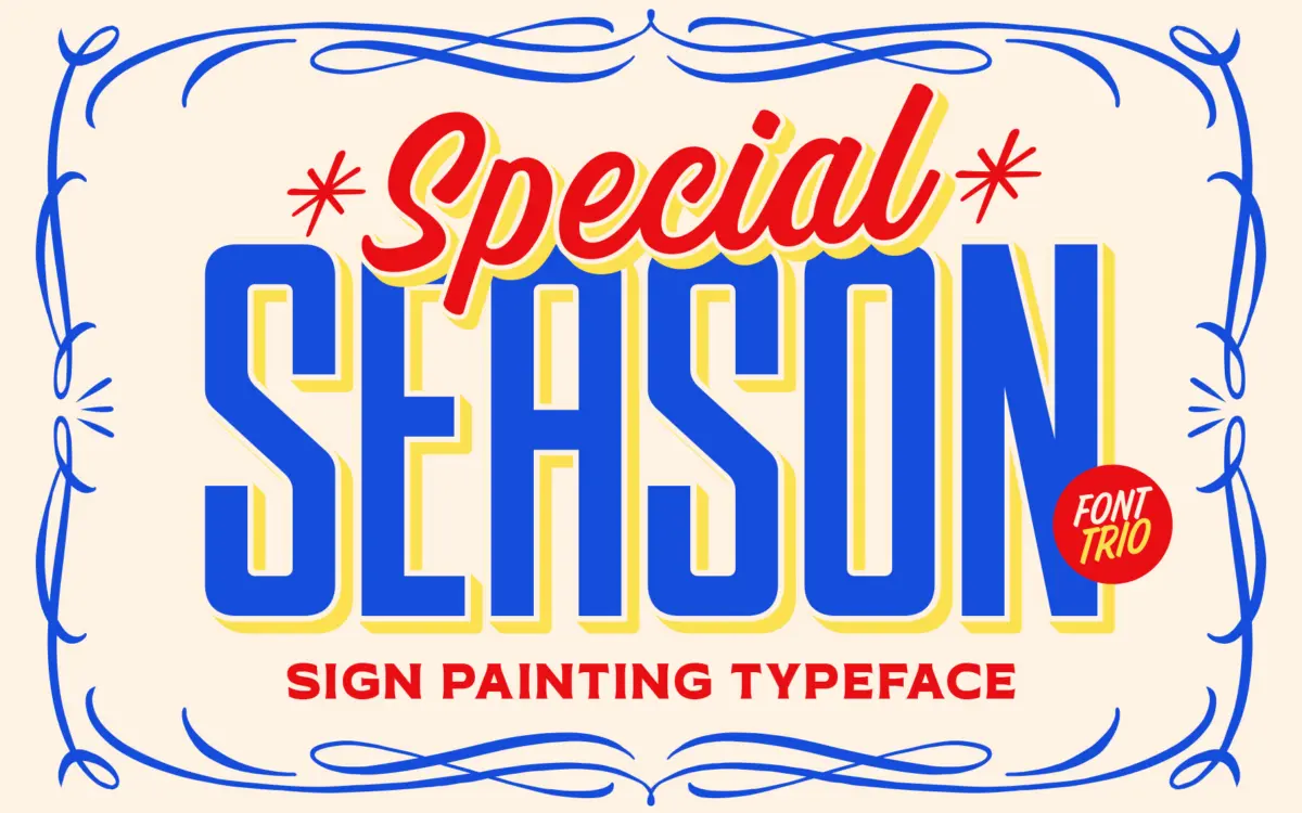
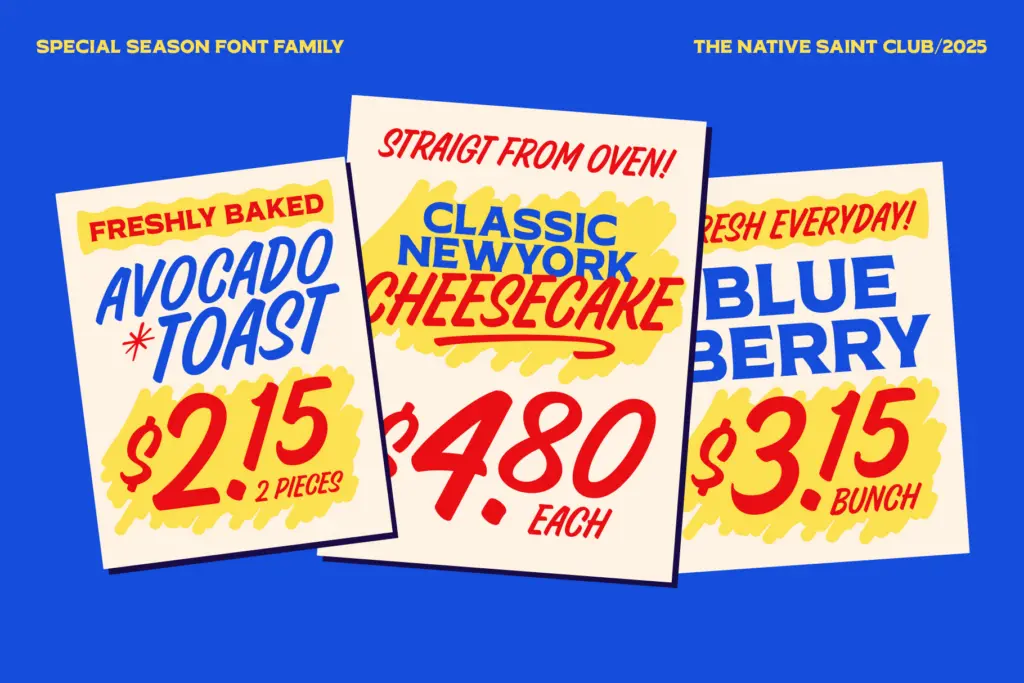
TNSC Special Season borrows its logic from hand-lettered signage — the kind painted on shopfronts and delivery trucks rather than set in a type case. The trio splits the job into three registers: a brush script for the flourish, a condensed sans for structure, and an expanded serif for weight and presence. That division is the whole idea. Instead of one typeface trying to do everything, you get three drawn to sit on top of each other, the way a sign painter would layer a headline, a subhead, and a banner line.
The brush script carries the most personality. Strokes taper unevenly, joins have a slight wobble, and the baseline drifts rather than sitting dead level — all deliberate, all in keeping with a hand-painted source. The condensed sans is the workhorse of the set: narrow counters, squared terminals, built for stacking tight lines of copy where a normal-width sans would run out of room. The expanded serif does the opposite job, spreading letters wide with slab-like feet, useful for a single word that needs to fill a banner or a can label. None of the three tries to be neutral, and none of them would work well as long-form text — that’s not what they’re for.
Character set and features
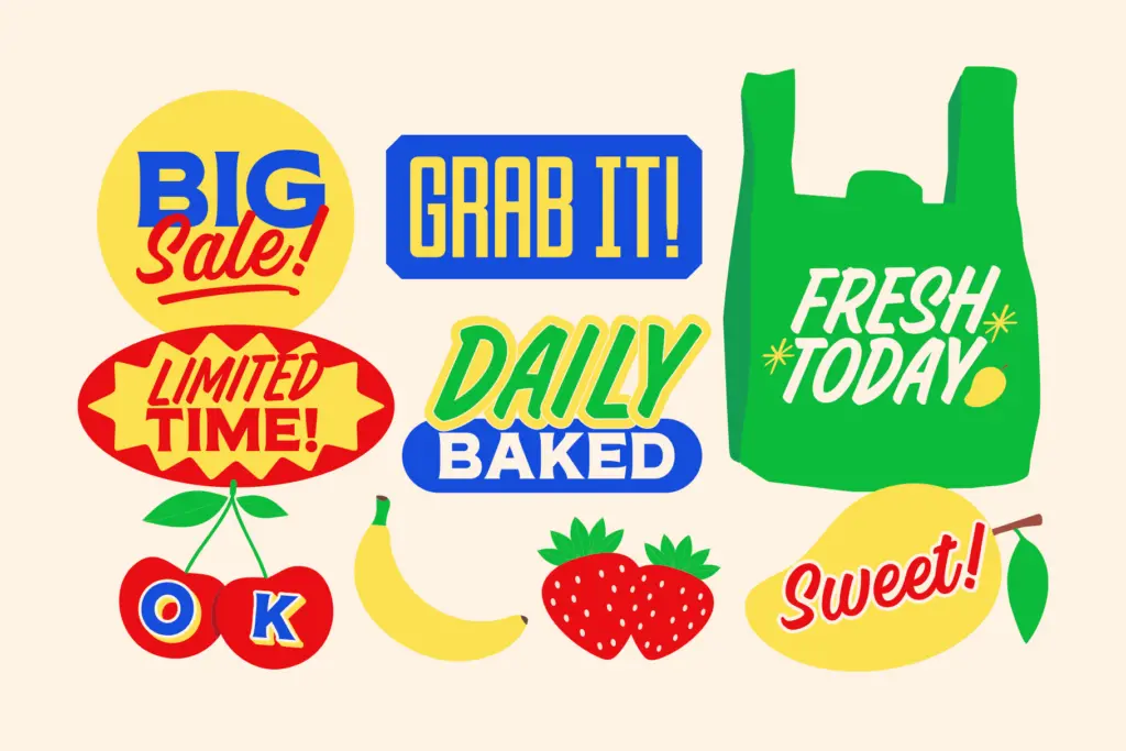
Each style comes as both OTF and TTF, which covers most software without conversion headaches. The trio is rounded out by a dedicated dingbats set — catchwords and symbols meant to sit alongside the lettering rather than substitute for it, things like small ornaments or stock phrases that a sign painter might have added as a flourish. It’s a practical addition rather than filler: a banner or vintage label often needs a
What we liked, and what we didn’t
Strengths
- The three styles are drawn to layer together, not just to match stylistically.
- The condensed sans is legible enough to carry actual copy, unlike many display companions.
- The dingbats set adds ready-made ornament without forcing you to source separate symbols.
Trade-offs
- The brush script's deliberate wobble can look busy at small sizes or in dense layouts.
- None of the three styles is suited to paragraph-length text, so this is strictly a display trio.
TNSC Special Season is a well-considered set for anyone building a sign-painted look — the three styles genuinely complement each other rather than feeling bundled for the sake of it. It's not built for text-heavy work, and the brush script needs a light hand to avoid looking cluttered, but for packaging, signage, and vintage branding it does its job with conviction.

Tmfonts writes independent reviews of typefaces: what each font does well, where it falls short, what it suits, and where it is sold.