
Dallas Font Free Download
Is Dallas free to download?
Dallas is a commercial font sold on Creative Market, so the full version needs a paid license. Get it from the official listing: Dallas font download.
Need something free? These sans serif fonts from Google Fonts are free for personal and commercial use:
Design style
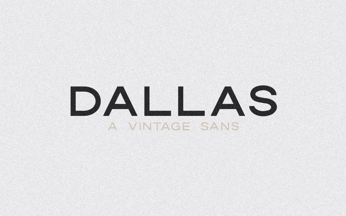
Dallas is an uppercase-only sans with the slightly squared, workmanlike look of mid-century signage lettering. The forms are geometric but not rigid — the O is a near-circle, the R has a straight leg, and the counters stay open rather than pinched. It reads as vintage without leaning on the usual retro tics like ball terminals or condensed proportions. There’s no attempt at warmth or handmade irregularity; every letter is drawn to sit cleanly on a grid, which is what gives it that badge-and-letterhead quality rather than a storefront-mural one.
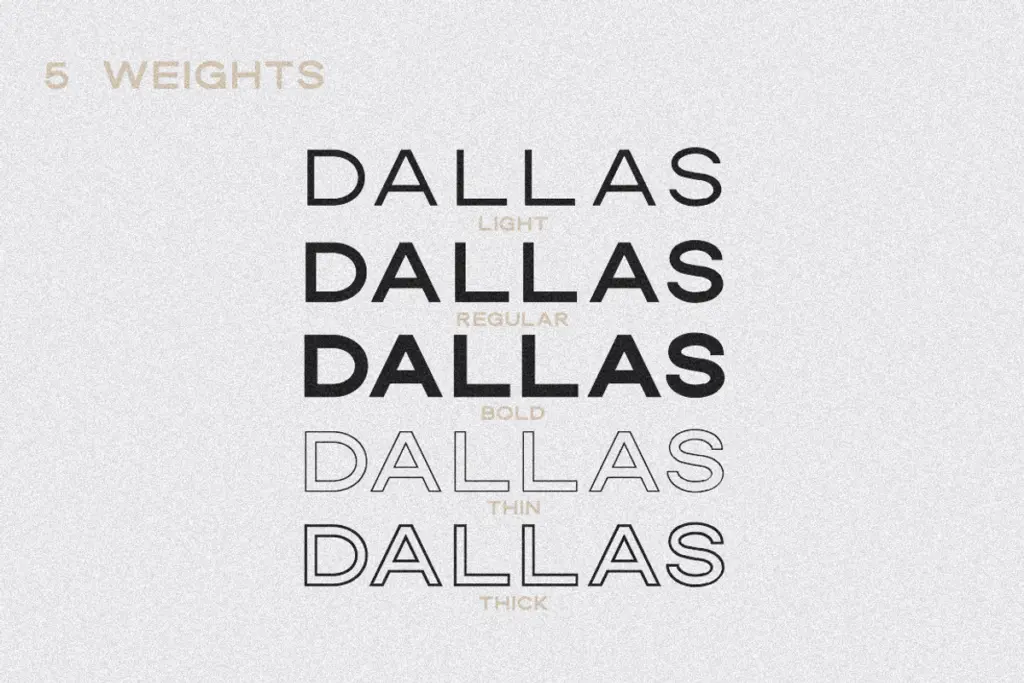
The design’s real trick is the outline pair. Dallas Outline Thin and Outline Thick are drawn to register precisely against the solid weights, so stacking an outline cap over a solid one (or vice versa) produces a convincing layered, two-color effect without any manual offsetting. That’s a genuinely useful piece of construction, not just a bonus style tacked on.
Character set and features
The set covers uppercase letters, numerals, and punctuation, with foreign language support for setting non-English text. There’s no lowercase, so anyone expecting sentence case or long-form body copy needs to look elsewhere — this is a caps-only display face by design, not by omission. Five weights are included: Light, Regular, Bold, and the two outline styles, each supplied in both TTF and OTF. That range is enough to build hierarchy within a single job — a bold headline over a light subhead — without introducing a second family.
Because there’s no lowercase and no italic, the character set is narrower than a typical sans family, and the letterforms are close enough in structure across weights that contrast comes mostly from stroke weight rather than any shift in proportion or personality. That’s fine for what it’s built to do, but it means Dallas won’t flex into softer or more editorial registers on its own.
Use cases
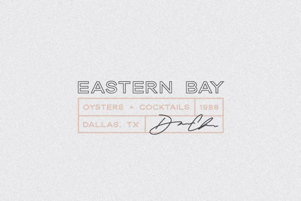
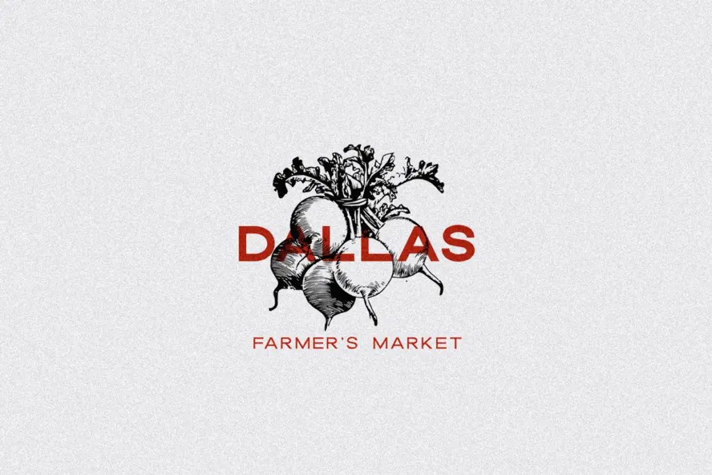
Dallas is suited to short-format work: logotypes, badges, business cards, packaging labels, and social graphics where a handful of words need to carry visual weight. The layering between solid and outline weights makes it a strong candidate for two-color badge marks or stamped logo treatments where you want depth without adding a second typeface. Wedding stationery and invitation suites that want a vintage, all-caps monogram feel would also suit it well, particularly paired with a script or serif for lowercase text elsewhere in the set.
It’s not built for paragraphs or dense information — the lack of lowercase rules that out immediately, and even short lines of all-caps setting need generous letterspacing to avoid feeling shouty. Use it for names, single words, short taglines, and mastheads, and let a companion typeface handle anything longer.
What we liked, and what we didn’t
Strengths
- Outline weights register precisely over the solids for easy two-color layering effects
- Squared, open letterforms read as vintage without relying on tired retro clichés
- Five weights across two formats give enough range to build hierarchy in a single mark
Trade-offs
- No lowercase means it can't function as a standalone text face for anything beyond short lines
- The five weights differ mainly in stroke thickness, so contrast options are somewhat limited
Dallas is a well-constructed caps-only sans that earns its keep through the outline-and-solid layering trick, making it genuinely useful for badge marks and logotypes. It won't do everything — there's no lowercase and no body-text role — but within its lane it's clean and considered.

Tmfonts writes independent reviews of typefaces: what each font does well, where it falls short, what it suits, and where it is sold.