
Paperlane Font Free Download
Is Paperlane free to download?
Paperlane is a commercial font sold on Creative Market, so the full version needs a paid license. Get it from the official listing: Paperlane font download.
Need something free? These script fonts from Google Fonts are free for personal and commercial use:
Design style
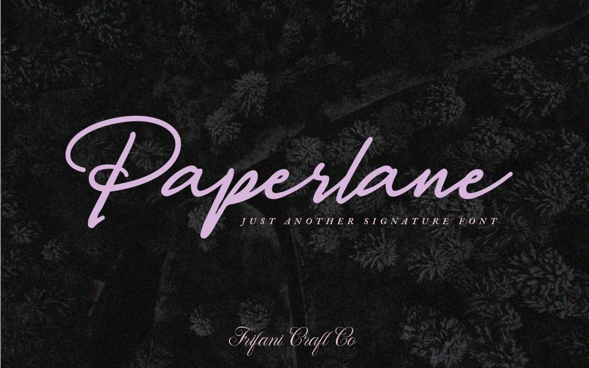
Paperlane sits in the loose, dry-brush corner of the script category. The strokes look like they were written fast with a felt-tip or a nearly-dry marker, with visible skips and thin spots where the pen pressure lets up. That’s the whole point of the design: it reads as a real hand moving across paper rather than a calligraphic system built from swashes and flourishes.
The letterforms lean forward slightly and connect in a fairly continuous run, which gives it a signature-like quality rather than a formal script. Baselines wobble a touch letter to letter, which is deliberate and part of the charm, but it means the face needs generous line spacing to avoid looking cramped when set in multiple lines. There’s no heavy contrast between thick and thin strokes here — it’s a monoline-ish script with just enough texture from the dry-brush effect to keep it from looking mechanical.
Character set and features
As a hand-drawn script, Paperlane covers the standard upper and lowercase alphabet along with punctuation and numerals, enough for short-form use like quotes, names, and product labels. The connecting letterforms mean kerning pairs matter a lot here — a few combinations sit a little tight or loose depending on the letter shapes involved, which is typical for scripts of this type and worth checking in a proof before committing to a layout.
Don’t expect an extensive alternate character system with dozens of swash variants; this is a more modest, single-weight script built around one consistent voice rather than a toolkit for elaborate custom lettering. That keeps it simple to use, but designers looking for multiple ligature options or stylistic sets to vary repeated letters will find the range limited.

Use cases
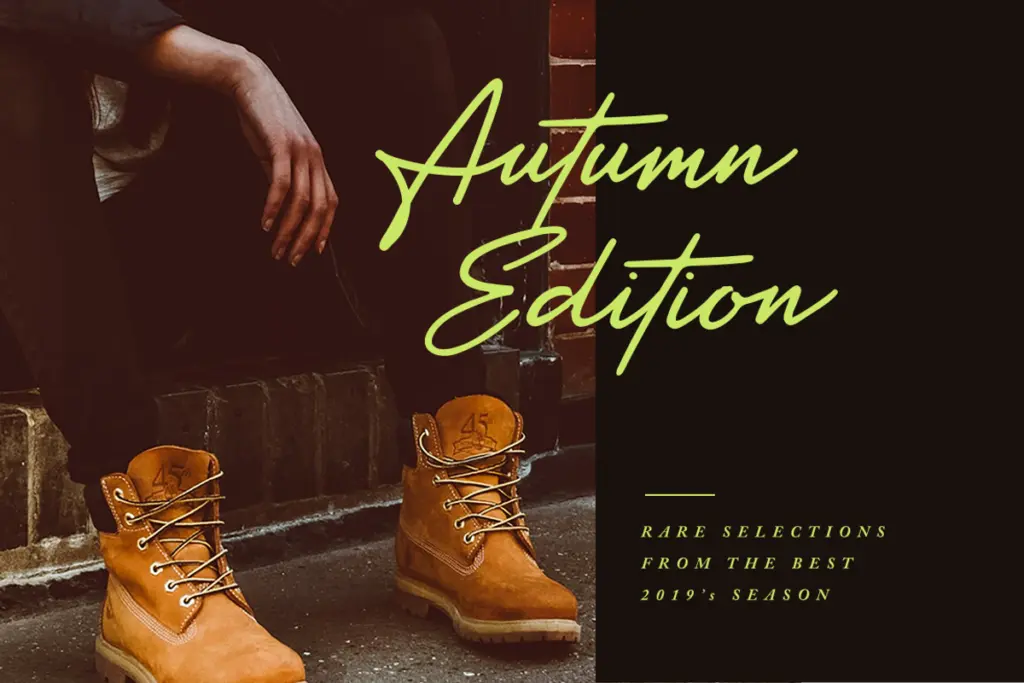
Paperlane’s natural home is short, personal-feeling text: a signature line under a logo, a handwritten-style quote card, a tag on packaging, or a heading on a stationery suite. It has the loose, casual energy of someone jotting a note rather than someone practicing formal penmanship, which suits brands that want to feel approachable — bakeries, florists, small studios, wedding stationery with a relaxed rather than ornate feel.
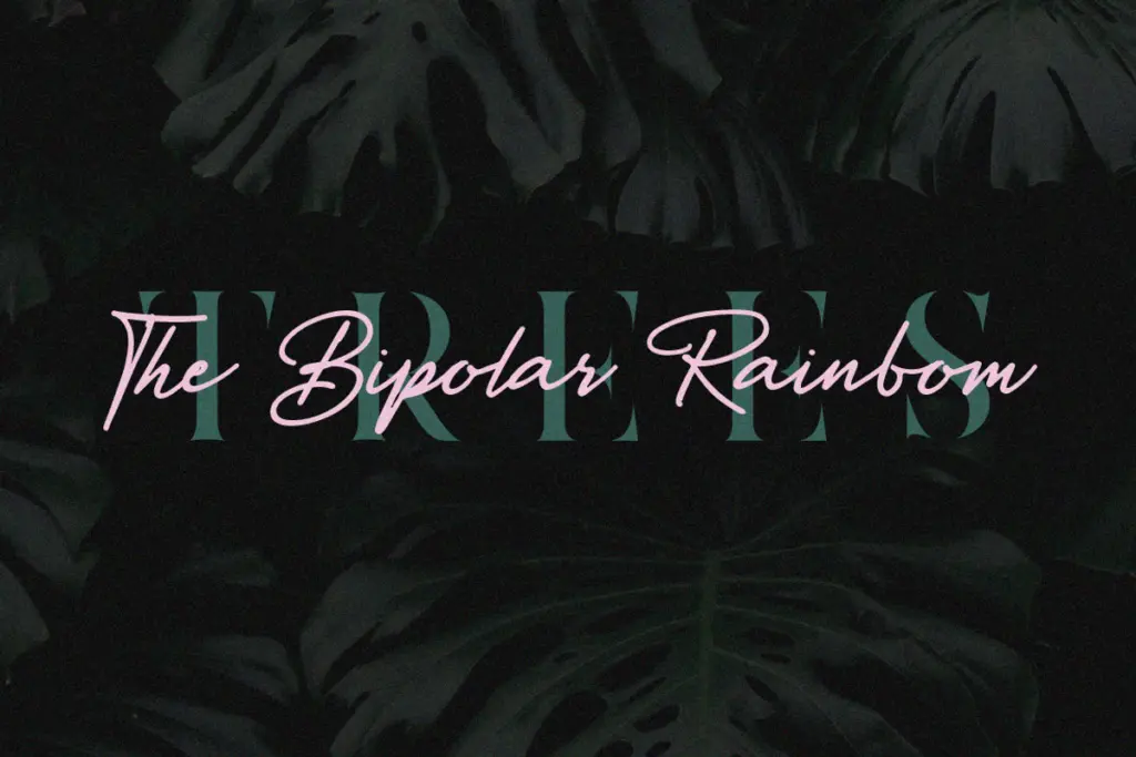
It’s less suited to long passages of text. The connected strokes and slight baseline variation that make it feel handmade at large sizes start to blur and lose clarity once you shrink it down to body copy or paragraph lengths. Keep it to headlines, short quotes, and single lines of display text, and pair it with a plain sans or serif for anything that needs to be read comfortably in bulk. It also works best against a clean background — busy textures or low-contrast color pairings will fight with the thin dry-brush strokes and make the letters harder to trace.
Overall, this is a font for a specific job: quick, informal, handmade-looking marks rather than a do-everything script. Used within that scope — logos, cards, short editorial callouts — it does its job cleanly and without fuss.
What we liked, and what we didn’t
Strengths
- Convincing dry-brush texture gives it a genuinely handwritten feel rather than a stiff calligraphic one.
- Works well as a compact signature-style mark for logos and product labels.
- Simple, single-weight character set that's easy to drop into a layout without fuss.
Trade-offs
- Limited alternate characters and ligatures mean little variation across repeated letters.
- Legibility drops quickly at small sizes or in multi-line paragraph settings.
Paperlane is a competent, casual hand-drawn script that does one thing well: short, signature-style text with a genuine handmade feel. It's not built for long-form setting or elaborate lettering work, so keep expectations to headlines, quotes and branding marks.

Tmfonts writes independent reviews of typefaces: what each font does well, where it falls short, what it suits, and where it is sold.