
Souvenir Jacket Font Free Download
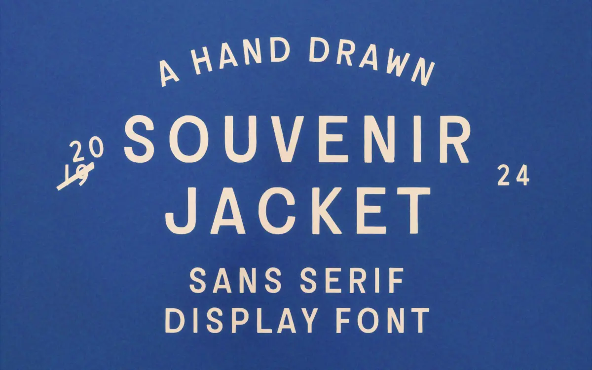
Is Souvenir Jacket free to download?
Souvenir Jacket is a commercial font sold on Creative Market, so the full version needs a paid license. Get it from the official listing: Souvenir Jacket font download.
Need something free? These sans serif fonts from Google Fonts are free for personal and commercial use:
Design style
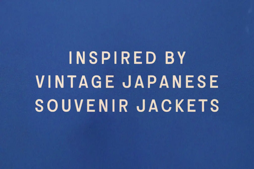
Souvenir Jacket takes its cue from the embroidered souvenir jackets soldiers brought home after WWII, and that reference actually shows up in the letterforms rather than just the marketing copy. The strokes have a slightly ropey, stitched quality — not literal embroidery texture, but the kind of irregular thickening and thinning you get when someone is working a needle through canvas rather than a pen through paper. Terminals are blunt and a little uneven, corners round off unevenly, and no two instances of the same letter are quite identical in weight distribution. That inconsistency is the point: it reads as handmade rather than digitised-and-smoothed.
It’s built as a sans, and structurally it behaves like one — no serifs, moderate stroke contrast, upright posture — but the ink-trap-like fill at junctions and the worn edges give it more warmth than a typical geometric or grotesque sans. It sits closer to a hand-lettered logotype face than a text-oriented sans, and it wears its imperfections deliberately, which is worth knowing going in.
Character set and features
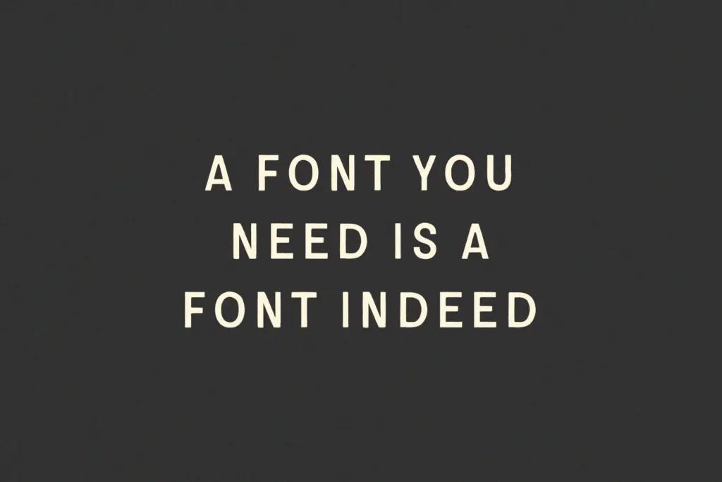
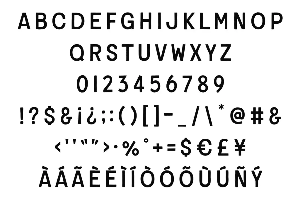
The set is uppercase only, plus numerals and essential punctuation. That’s a real constraint: there’s no lowercase, so anything beyond short lines of text has to be composed entirely in capitals. For titles, badges, and short branding marks this isn’t a problem — a lot of vintage-inspired display faces work this way — but it rules out body copy despite the seller’s suggestion that it’s suited to it. Treat this as a headline and mark-making font, not a paragraph font.
The brief lists linguistic support across more than 50 languages, which is useful if you’re working with diacritics or extended Latin character sets in branding contexts, though without a lowercase that support is naturally limited to what capitals and accented capitals can do. There’s no mention of ligatures, alternates, or stylistic sets, so what you see in the uppercase alphabet and numerals is what you get — no swash variants to lean on if you want more variety within a single word.
Use cases
This is a font for short, punchy applications: logotypes, patch and badge designs, apparel graphics, packaging call-outs, poster headlines, and anything trying to evoke mid-century Americana or military-surplus nostalgia. The embroidered-jacket reference is specific enough that it will read clearly in contexts where that visual language already makes sense — streetwear, outdoor brands, vintage-revival packaging — and less clearly if dropped into something that has no relationship to that aesthetic.
Because it’s uppercase-only and fairly textured, it needs room to breathe. Cramped, small-scale uses will blur the stitched detailing into mush; give it generous size and spacing and the handmade quality reads as intentional rather than sloppy. Pair it with a clean, quiet body typeface for supporting text, since Souvenir Jacket itself isn’t built to carry paragraphs.
What we liked, and what we didn’t
Strengths
- The stitched, uneven stroke quality feels genuinely hand-drawn rather than filtered digital texture.
- Strong fit for military-surplus and mid-century Americana branding where the reference is legible.
- Broad language coverage in the capitals is useful for international branding work.
Trade-offs
- No lowercase means it can't function as a body or paragraph font despite the seller's claim.
- The rough terminals lose clarity at small sizes, so it needs generous scale to read well.
Souvenir Jacket delivers a genuinely specific, hand-worked texture that suits patches, logos, and vintage-leaning headlines well. Its uppercase-only set and rough finish limit it firmly to display use, so don't expect it to do double duty as a text face.

Tmfonts writes independent reviews of typefaces: what each font does well, where it falls short, what it suits, and where it is sold.