
Jalisco & Marlowe Font Free Download
Is Jalisco & Marlowe free to download?
Jalisco & Marlowe is a commercial font sold on Creative Market, so the full version needs a paid license. Get it from the official listing: Jalisco & Marlowe font download.
Need something free? These display fonts from Google Fonts are free for personal and commercial use:
Design style
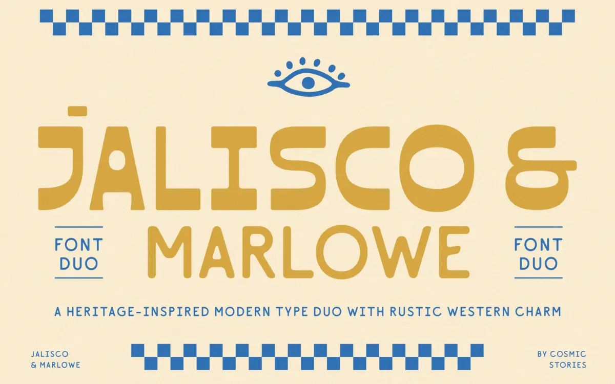
Jalisco & Marlowe is a two-face pairing built around a familiar branding formula: one loud display face, one quiet companion. Jalisco is the loud one — an all-caps sans with high contrast between thick and thin strokes, borrowing its posture from vintage sign painting and western-saloon lettering rather than from any classical serif model. The contrast is the whole personality here. Strokes swell and taper in places you wouldn’t expect from a sans, giving it a hand-painted quality without actually being a script.
Marlowe is the counterweight, a rounded, low-contrast sans with soft curves and open apertures. It reads as generically friendly rather than distinctive, which is the point — it’s there to carry paragraph text and supporting copy without competing with Jalisco’s swagger. On its own, Marlowe wouldn’t be a memorable typeface. Paired underneath Jalisco, it does its job.
Character set and features
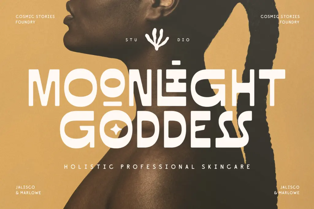
Jalisco ships with discretionary ligatures and stylistic alternates, which matter more here than in most display faces because the letterforms are so geometric that repeated letters can start to look mechanical in a word mark. Swapping in an alternate on a repeated vowel or consonant breaks that rigidity. The multilingual support covering Western, Central and Eastern European character sets is a genuine plus if you’re working across European markets — it’s easy to overlook until you need an ogonek or a caron and the font doesn’t have one.
Because Jalisco is all-caps only, there’s no lowercase to worry about, which simplifies the design but also limits it — you’re locked into capital-letter compositions for anything set in that face. Marlowe presumably fills the lowercase gap for running text, though it’s worth checking its own alternate and ligature set separately, since the brief doesn’t detail much beyond its role as a companion face.
Use cases
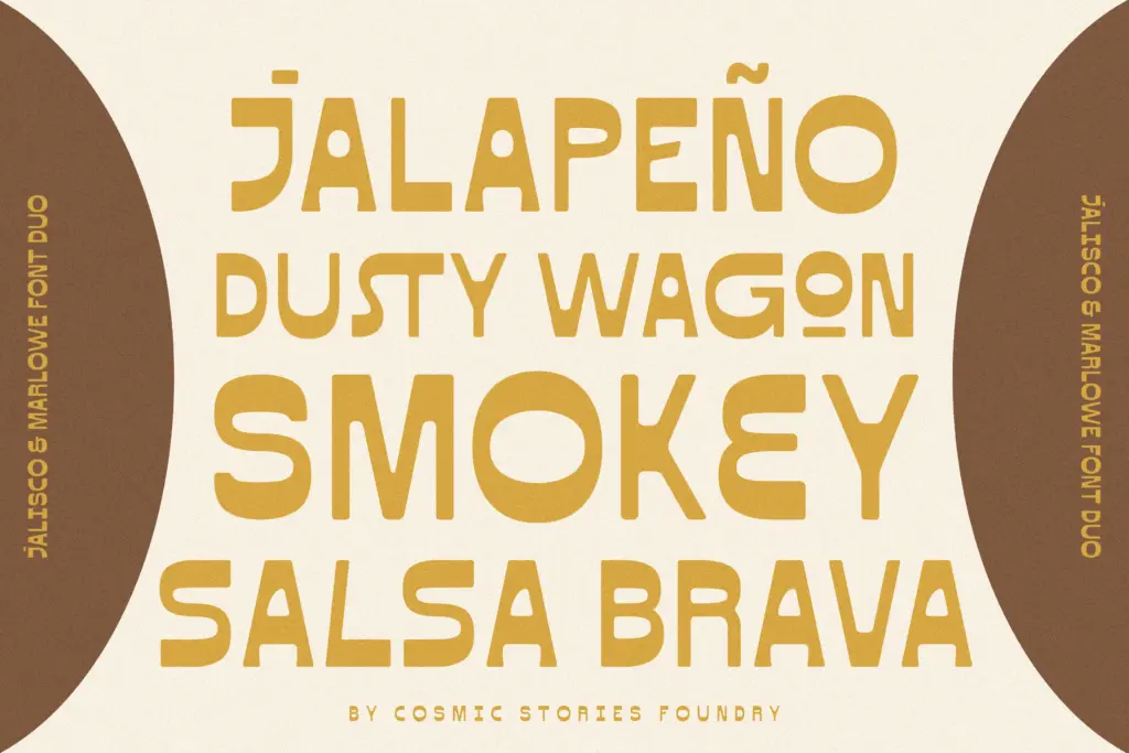
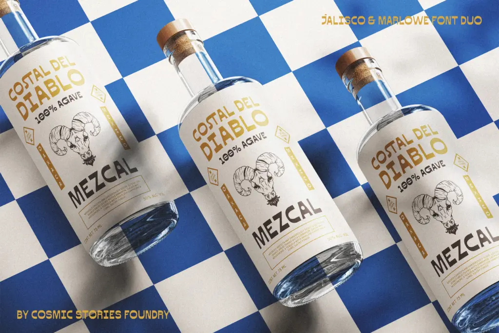
This is a branding kit more than a general-purpose type family. Jalisco belongs on labels, logotypes, packaging bands, and short headline treatments — craft beer, small-batch spirits, artisan food packaging, anything trading on a rustic or western-adjacent identity. It will struggle at small sizes or in long headlines; the contrast that makes it interesting at 60pt turns into visual noise below that. Marlowe picks up the slack for body copy, ingredient lists, or subheads where legibility matters more than character.
Together they’re well suited to boutique branding, rustic packaging, and editorial spreads with a sun-bleached, heritage feel — the kind of project where a client says “vintage but not dusty.” They’re less useful outside that lane: corporate identity, tech branding, or anything needing a neutral voice will find Jalisco too costumed and Marlowe too plain to stand alone. It’s a duo built for a specific mood, and it does that mood well, but don’t expect it to stretch much further.
What we liked, and what we didn’t
Strengths
- Discretionary ligatures and alternates keep repeated letters in Jalisco from looking mechanical
- High stroke contrast gives Jalisco a hand-painted, sign-written character rare in an all-caps sans
- Multilingual support across Western, Central and Eastern European sets extends its practical reach
Trade-offs
- Jalisco is all-caps only, which limits it to short headline and logotype work
- Marlowe is legible but generic, offering little distinctive character of its own
Jalisco & Marlowe is a competent branding-kit duo: a characterful high-contrast display cap face backed by a plain, legible companion sans. It excels in a narrow lane — rustic, western, artisan packaging — and doesn't pretend otherwise. Don't expect it to do body-heavy editorial work or anything outside its heritage mood.

Tmfonts writes independent reviews of typefaces: what each font does well, where it falls short, what it suits, and where it is sold.