
the impressionist Font Free Download
Is the impressionist free to download?
the impressionist is a commercial font sold on Creative Market, so the full version needs a paid license. Get it from the official listing: the impressionist font download.
Need something free? These script fonts from Google Fonts are free for personal and commercial use:
Design style
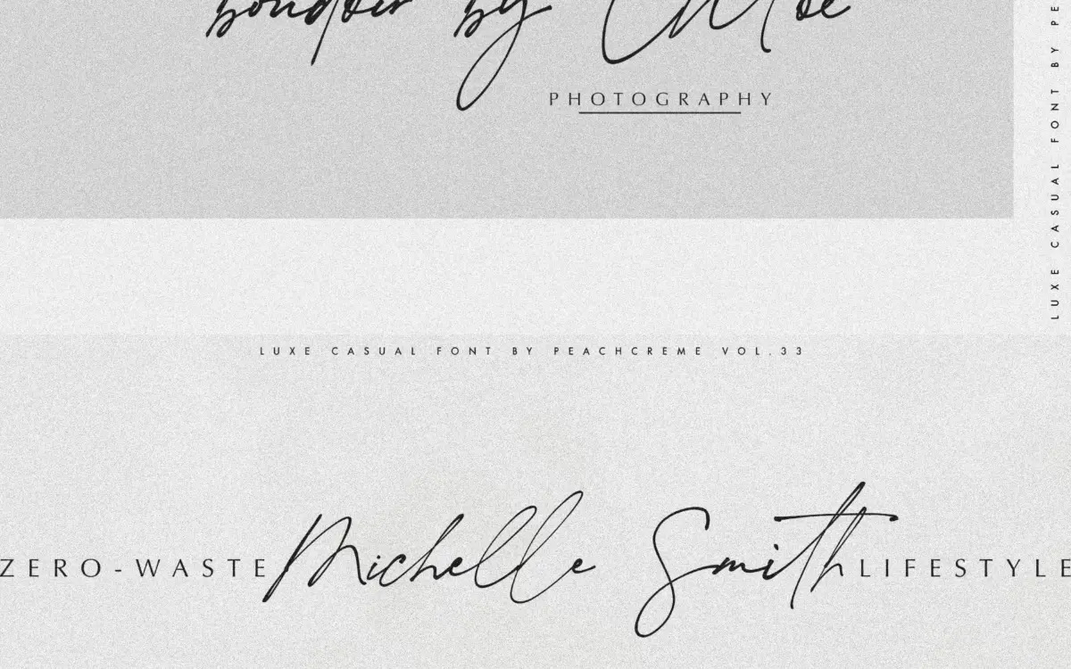
The Impressionist is a brush-driven script built around a wet-ink texture — strokes that thicken and thin unevenly, with pooling at the ends of some terminals as if the nib hesitated before lifting. It leans into imprecision on purpose. The seller’s own description admits some letters may be hard to read, and that’s an accurate warning rather than false modesty. This is a mood font first, a communication tool second.
The letterforms slant with a loose, almost impatient rhythm. Connections between letters aren’t uniform; some joins are long and looping, others clipped short, which gives the face a handwritten unevenness rather than the machined consistency you get from most calligraphy scripts. It reads as a single gestural pass rather than a constructed alphabet, which is the point, but it also means the baseline wanders more than scripts built for body text ever should.
Character set and features
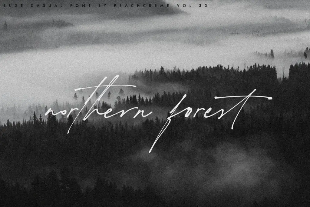
The set covers uppercase and lowercase, numerals, punctuation, and multilingual symbols, so language reach shouldn’t be a blocker for most Latin-alphabet use. The headline feature is 134 ligatures, which is a substantial number for a script this size. In practice, that volume of ligatures suggests the alphabet was drawn with the expectation that letter pairs and common combinations get swapped out rather than typed straight — the font is meant to be assembled in an OpenType-aware app, not typed cold in a plain text box. Anyone using it in software without ligature support will get a flatter, less considered result than the marketing images promise.
Texture is the other defining feature. The ink-wet effect gives every stroke a slightly irregular edge, which reads well at large sizes and photographs nicely against paper or fabric mockups. It’s less convincing shrunk down to app icons or footer logos, where the roughness can start to look like a rendering glitch rather than a stylistic choice.
Use cases
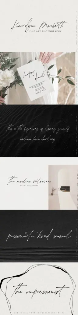
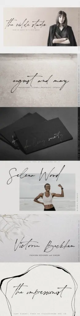
This is a font for a single accent line, not a paragraph. Think a monogram, a short wordmark, a stamp on packaging, or a line of copy on a save-the-date where the whole point is the gesture rather than the message. Fashion, beauty and fine-art branding are natural fits — anywhere a brand wants to signal handmade, painterly, or artisanal rather than corporate. Wedding stationery designers will find plenty to use here too, provided the couple’s names are short and the ligatures are engaged properly.
It is a poor choice for anything that needs to be read quickly or by everyone — instructional text, UI labels, long invitations with a lot of set copy. Pair it with a plain sans or a simple serif for supporting text; the script should stay rare and large, doing one job per layout. Treat this less as a working typeface for daily production and more as a specialty tool you reach for a few times a year, when the brief calls for atmosphere over clarity.
What we liked, and what we didn’t
Strengths
- 134 ligatures give genuine variation across letter combinations rather than a repetitive script feel
- the wet-ink texture holds up well at large display sizes and in photographed mockups
- multilingual symbol support broadens where the face can be used beyond basic Latin text
Trade-offs
- legibility drops fast below headline size, so it's unsuitable for body copy or dense text
- the loose baseline and irregular joins mean it needs careful kerning and generous spacing to avoid looking messy
The Impressionist commits fully to mood over clarity, and for a short wordmark or logo mark that trade-off pays off. Push it into anything longer and the illegibility the seller warns about becomes a real problem rather than a charming one.

Tmfonts writes independent reviews of typefaces: what each font does well, where it falls short, what it suits, and where it is sold.