
Woodlands Font Free Download
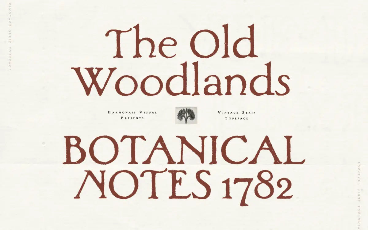
Is Woodlands free to download?
Woodlands is a commercial font sold on Creative Market, so the full version needs a paid license. Get it from the official listing: Woodlands font download.
Need something free? These serif fonts from Google Fonts are free for personal and commercial use:
Design style
Woodlands is a serif that wears its brush marks openly. Rather than the crisp geometry of a drawn serif, the strokes carry the texture of a loaded brush dragged across coarse paper: uneven edges, slight bleed at the corners, and thick-to-thin transitions that waver instead of sweeping cleanly. The serifs themselves are stubby and irregular, more implied than constructed, which is the point — this is a typeface built around imperfection rather than in spite of it.
That irregularity does real work. Letters lean slightly off their baseline, weight shifts unevenly from stroke to stroke, and no two instances of the same letter look quite identical in feel even though they’re the same glyph. It reads as handmade rather than digitally distressed, and it avoids the trap of looking like a clean serif with a texture filter slapped on top. The character comes from the drawing, not a post-processing effect.
Character set and features
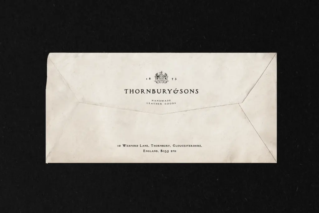
The set covers European language support plus Vietnamese, so diacritics are accounted for beyond a token accent or two — useful if a label or packaging job needs more than English. Alternates are included, which matter more here than in a typical serif: swapping a few letterforms within a word breaks up the repetition that would otherwise make the hand-painted illusion collapse. Ligatures are also part of the package, though getting the full set requires going through the glyphs panel in software like Illustrator rather than typing and letting it happen automatically — worth knowing before a deadline, not after.
There’s a single regular weight, delivered in the standard trio of formats. No bold, no italic, no light counterpart. That’s a real constraint for anyone used to building a hierarchy within one family — Woodlands does one register, and everything else in a layout needs to come from a companion typeface or from scale and colour alone.
Use cases
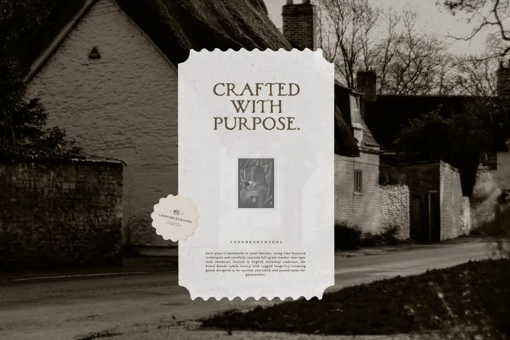
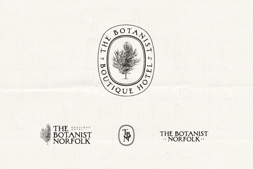
This is a display face, not a text face, and it should be treated that way. At headline and logotype sizes, the texture and irregularity read as warmth and craft. Shrink it down to body copy and the same qualities turn into noise — the uneven strokes and shifting baseline make paragraphs tiring to read rather than charming to look at. Keep it to short runs: a product name, a tagline, a monogram, a few words on a label.
Wine labels, small-batch food packaging, farm-to-table branding, artisan market signage — anywhere the brief calls for
What we liked, and what we didn’t
Strengths
- Hand-drawn irregularity that feels genuinely painted rather than digitally distressed
- Alternates let repeated letters vary within a word, which keeps the texture convincing
- Language support extends to Vietnamese, useful for packaging with wider distribution
Trade-offs
- Single regular weight only, so any hierarchy needs an outside typeface
- Falls apart at body-copy sizes and should be kept to short display use
Woodlands does one thing convincingly: it looks like a name painted by hand on a wooden crate, and it holds that illusion together with genuine drawn irregularity rather than a filter effect. It's a display-only, single-weight tool, so it needs a plainer partner for anything beyond a headline or a label.

Tmfonts writes independent reviews of typefaces: what each font does well, where it falls short, what it suits, and where it is sold.