
Pop Hearts Studio Font Free Download
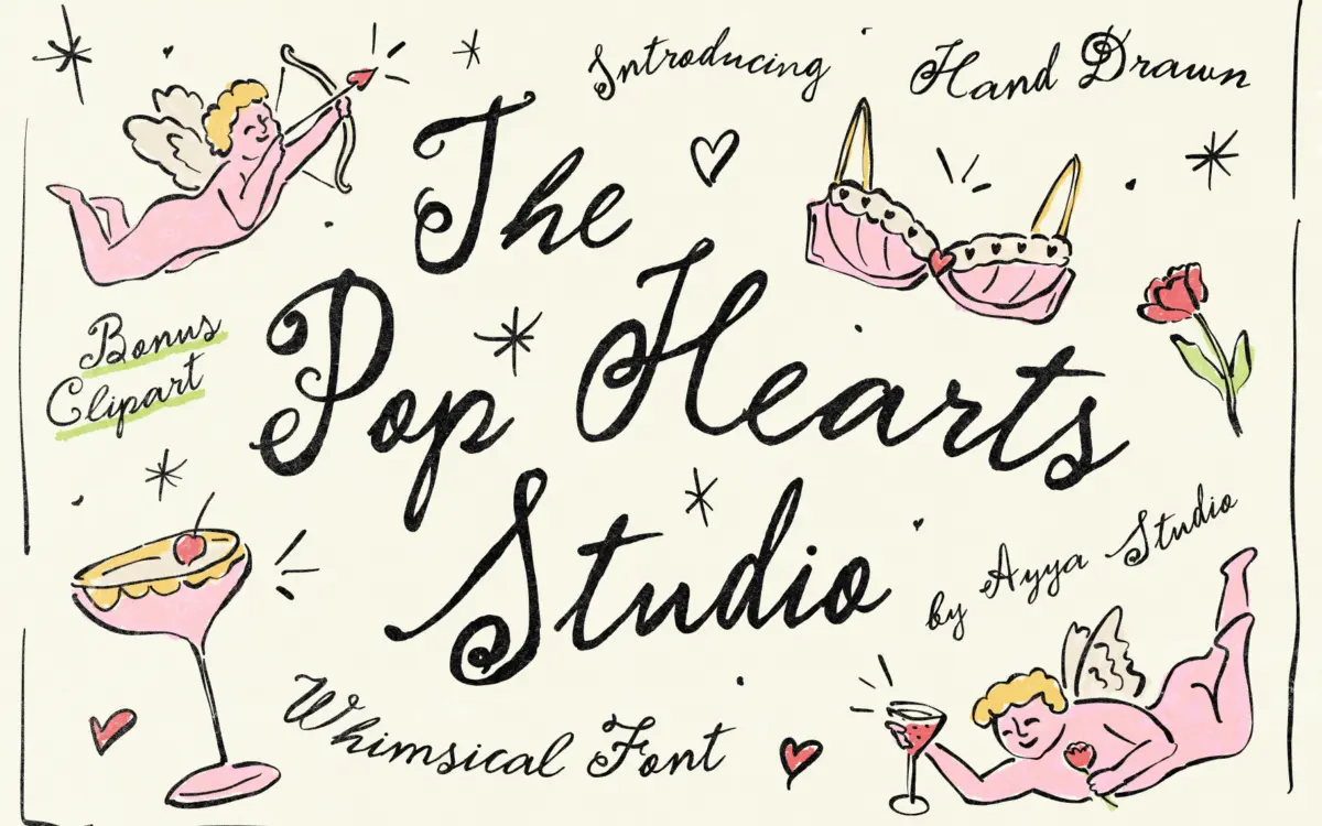
Is Pop Hearts Studio free to download?
Pop Hearts Studio is a commercial font sold on Creative Market, so the full version needs a paid license. Get it from the official listing: Pop Hearts Studio font download.
Need something free? These handwritten fonts from Google Fonts are free for personal and commercial use:
Design style
Pop Hearts Studio sits in the growing pile of fonts that trade polish for personality. It reads as brush or paint-marker lettering rather than pen script: strokes vary in weight within a single letter, baselines wobble, and some characters lean off-axis just enough to feel unplanned. There’s a clear nod to hand-painted shopfront signage and old pop-art poster lettering — the kind of type that looks like it was made in one take, not corrected.
The imperfection is the point, and it’s consistent rather than random. Terminals often flare or blot slightly, as if the tool ran dry mid-stroke. Letters don’t share a uniform rhythm — some are compressed, others sprawl — which gives it energy but also means it never settles into a calm reading pattern. This is a font with a mood, not a neutral workhorse.
Character set and features
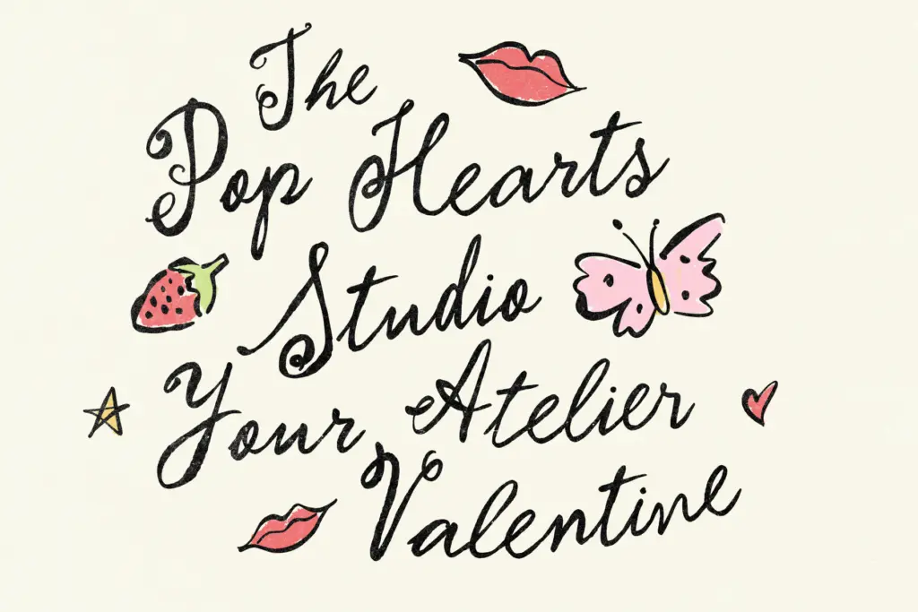
The set includes a full alphabet in upper and lowercase, and the seller notes it ships with a companion set of hand-drawn illustrations — hearts and small charm-like flourishes — meant to be used alongside the lettering rather than as part of the type itself. That’s a useful bundle for anyone building a small suite of assets around a single project, though it’s worth treating the illustrations as separate decorative elements rather than expecting them to behave like OpenType glyphs.
Because the letterforms are intentionally irregular, kerning needs attention. Loose, uneven letterspacing is part of the look, but at small sizes or in long lines that irregularity can tip into difficulty reading rather than charm. This isn’t a font to trust blindly in a paragraph of body text — it wants short bursts: a name, a date, a line of copy, a logotype.
Use cases
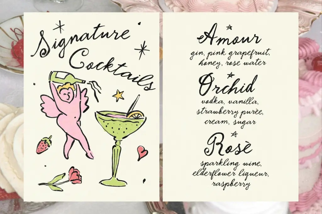
Where this typeface earns its keep is anywhere a brand or project wants to signal handmade warmth rather than precision — packaging labels, boutique branding, editorial pull quotes, gig posters, zine covers. The vintage-meets-pop-art quality suits fashion or lifestyle branding that’s leaning into nostalgia without going full antique. It also fits the wedding and Valentine’s stationery niche the seller is clearly targeting: save-the-dates, invitations, and note cards for couples who don’t want a traditional formal script.
It is less suited to anything requiring restraint or heavy body copy — annual reports, UI text, dense editorial layouts. The looseness that gives it charm at a headline size becomes noise once you ask it to carry paragraphs or work at nine points. Designers should also budget time for manual kerning adjustments on longer words, since the deliberate unevenness doesn’t always self-correct in standard layout software.
Used with restraint — a title, a monogram, a short phrase paired with a cleaner sans for supporting text — Pop Hearts Studio does what it sets out to do: it looks like someone actually made it by hand, in a hurry, and meant every bit of it.
What we liked, and what we didn’t
Strengths
- Consistent, deliberate imperfection gives it a genuine hand-painted feel rather than a generic script look
- Comes bundled with matching hand-drawn heart and charm illustrations for building out a full stationery or branding set
- Strong fit for nostalgic, pop-art-inflected branding and wedding or Valentine's projects that want warmth over formality
Trade-offs
- Uneven letterforms and loose spacing make it unreliable for anything beyond short lines of text
- Requires manual kerning attention, especially on longer words or headlines
Pop Hearts Studio delivers a convincing hand-painted, pop-art-adjacent lettering style that's genuinely full of character. It works best in short, large-scale applications like logos, headlines and stationery, and needs careful kerning and restraint to avoid tipping from charming into cluttered.

Tmfonts writes independent reviews of typefaces: what each font does well, where it falls short, what it suits, and where it is sold.