
Heartbreak Eighties Retro Serif Font Free Download
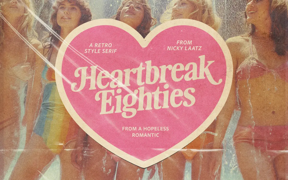
Is Heartbreak Eighties Retro Serif free to download?
Heartbreak Eighties Retro Serif is a commercial font sold on Creative Market, so the full version needs a paid license. Get it from the official listing: Heartbreak Eighties Retro Serif font download.
Need something free? These serif fonts from Google Fonts are free for personal and commercial use:
Design style
Heartbreak Eighties Retro Serif leans into the thick-stroke, soft-shouldered lettering that showed up on record sleeves and shopfront signage in the early eighties. The letterforms carry heavy vertical stress with rounded, almost pillowy terminals rather than sharp serifs, which gives the face its warmth. It’s not trying to be a period-accurate revival of any single historical model — it borrows the mood of that era’s display lettering and pushes the weight up so it reads as confident and slightly theatrical rather than austere.
The curves are generous. Bowls on letters like the lowercase ‘a’ and ‘e’ swell out before pulling back in, and the serifs on capitals are stubby rather than bracketed in the classic sense, which keeps the whole face feeling designed for impact rather than for long-form reading. There’s a deliberate softness to the edges too, a slight easing rather than a hard geometric cut, which is probably what the seller means by ‘silky soft edges’. It gives the letters a rounded, almost hand-finished quality without tipping into script territory.
Character set and features
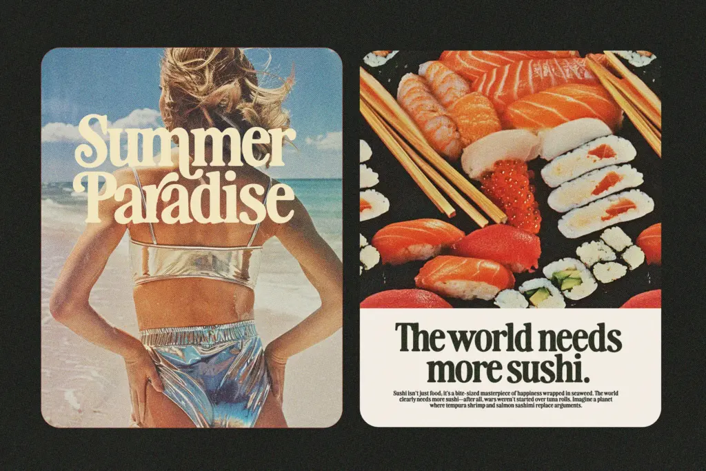
The face includes swash variants, which is where a lot of its personality lives — flourished capitals and alternate terminals that can be swapped in through OpenType features for headlines that need a bit more flair. Used sparingly, these swashes push a wordmark toward the feminine, ornamental end of the spectrum the seller describes; used in the plain glyphs, the same letters sit more square and masculine. That range is a genuine strength rather than a marketing line — the same skeleton does shift character depending on which alternates you call up.
As a display serif, it’s built for short strings: logotypes, headlines, single words on a package or poster. It is not designed, and shouldn’t be pressed into service, for paragraphs or body copy — the weight and the swash detailing will fight each other and turn illegible fast at small sizes. Spacing needs a light hand too; the wider glyphs and swash exits mean tight tracking will cause characters to collide, particularly in the alternate set.
Use cases
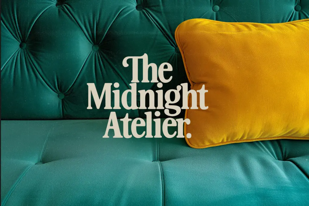
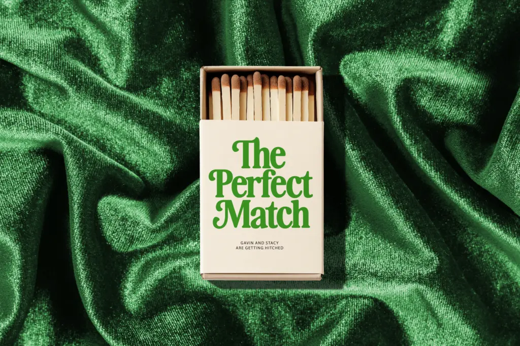
This is a font for a title, a logo, a badge, or a single line on packaging that wants to nod at eighties or early-nineties retail nostalgia without going full pastiche. It suits beauty and lifestyle branding, throwback event posters, greeting cards, and any wordmark that wants some warmth and swagger rather than clean minimalism. The swash alternates make it a reasonable choice for wedding stationery too, provided the rest of the suite stays plain — a heavy retro serif on every line of an invitation will overwhelm the page.
It won’t do double duty as a workhorse text face, and it’s not a neutral sans that recedes into the background — it wants attention, which is exactly the job it’s cut out for. Anyone needing a full editorial system will need to look elsewhere for body copy and pair this in only where the retro voice earns its place.
What we liked, and what we didn’t
Strengths
- Swash alternates give the same letterforms a genuinely different mood, from ornamental to squared-off
- Heavy, soft-edged strokes read clearly at poster and logo scale
- Works well for retro-themed branding without tipping into costume-y pastiche
Trade-offs
- Not legible at small sizes or in extended text, strictly a display face
- Wide glyphs and swash exits mean loose tracking is required, tight spacing causes collisions
Heartbreak Eighties Retro Serif is a confident, warm display face that does its best work in short bursts — logos, headlines, badges. The swash alternates give it real range between feminine and masculine moods, but it's strictly a display tool, not a text face.

Tmfonts writes independent reviews of typefaces: what each font does well, where it falls short, what it suits, and where it is sold.