
Modern Tropical Font Duo Logo Script Free Download
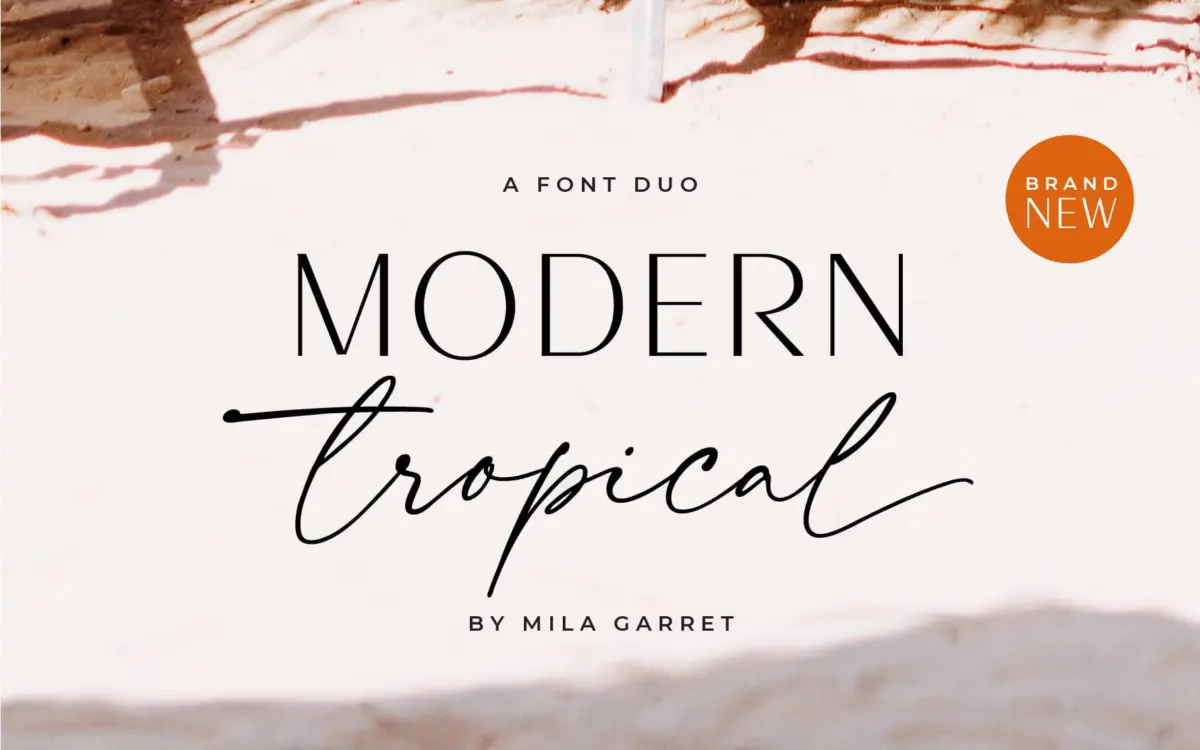
Is Modern Tropical Font Duo Logo Script free to download?
Modern Tropical Font Duo Logo Script is a commercial font sold on Creative Market, so the full version needs a paid license. Get it from the official listing: Modern Tropical Font Duo Logo Script download.
Need something free? These sans serif fonts from Google Fonts are free for personal and commercial use:
Design style
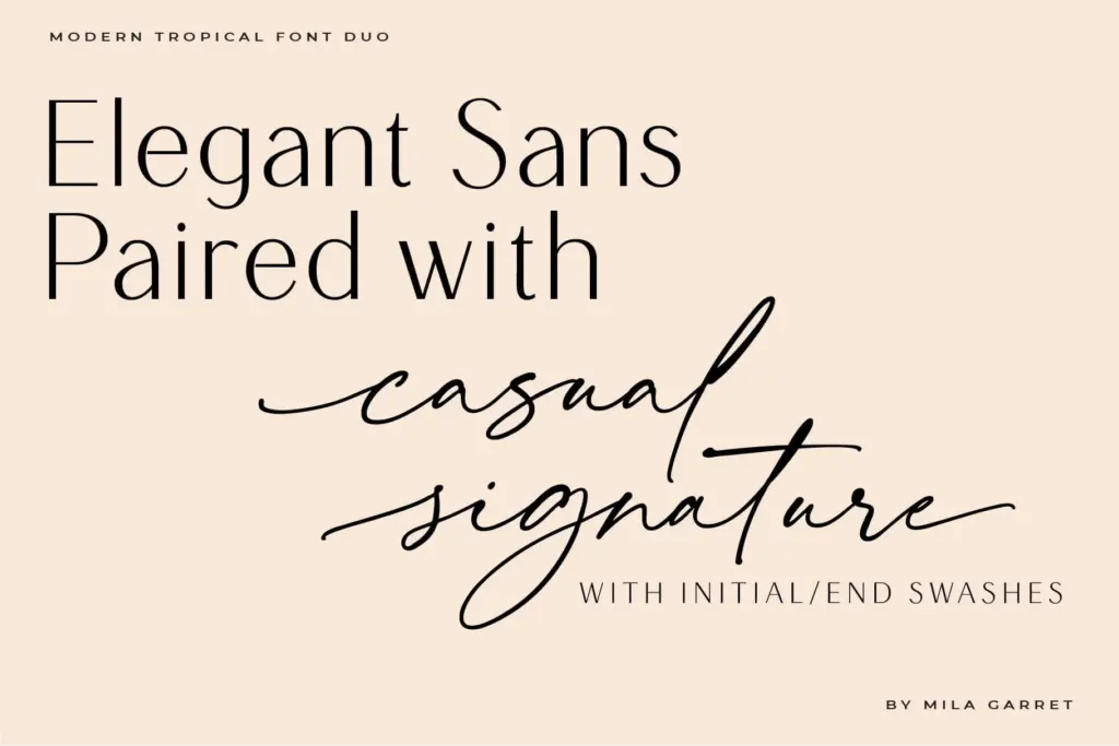
This is a two-part release: a plain-spoken geometric sans and an inky, casual script, sold as a matched set. The sans does the heavy lifting of restraint — even strokes, minimal contrast, no flourishes to speak of. It reads as a utility face, the kind meant to sit quietly under a logotype or run as body copy without drawing attention to itself. The script is where the personality lives, with a wet-brush feel to the strokes and a loose, hand-drawn baseline that doesn’t try too hard to look tidy.
The pairing logic is straightforward and it works on its own terms: one face is neutral, the other is expressive, and they’re clearly designed to sit next to each other rather than fight. That said, neither half is particularly distinctive on its own. The sans in isolation could be swapped for dozens of similar grotesques without much loss. The script has more character, but it’s a familiar register — the same loose, inky, ‘casual elegance’ script that has become a stock move in this corner of the market. If you’ve shopped for wedding fonts in the last five years, you’ve seen its cousins.
Character set and features
The brief points to ligatures as a feature of the script, which is standard practice for this style and helps smooth over awkward letter collisions — the double-l, the th, the ing endings that plague connected scripts. Beyond that, the listing doesn’t specify language coverage, alternates, or OpenType stylistic sets in any detail, so treat the feature set as basic rather than extensive: a script built for short lines of display text, not a script built for setting paragraphs.
Because the duo is positioned as a matched pair rather than a full family, don’t expect a range of weights on the sans side, or numerals and small caps treated with much ceremony. This is a logo-and-headline tool first, and the character set should be judged against that job, not against a full-service text family.
Use cases
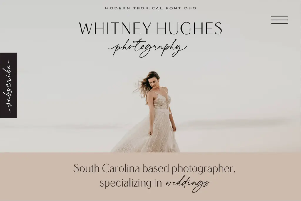
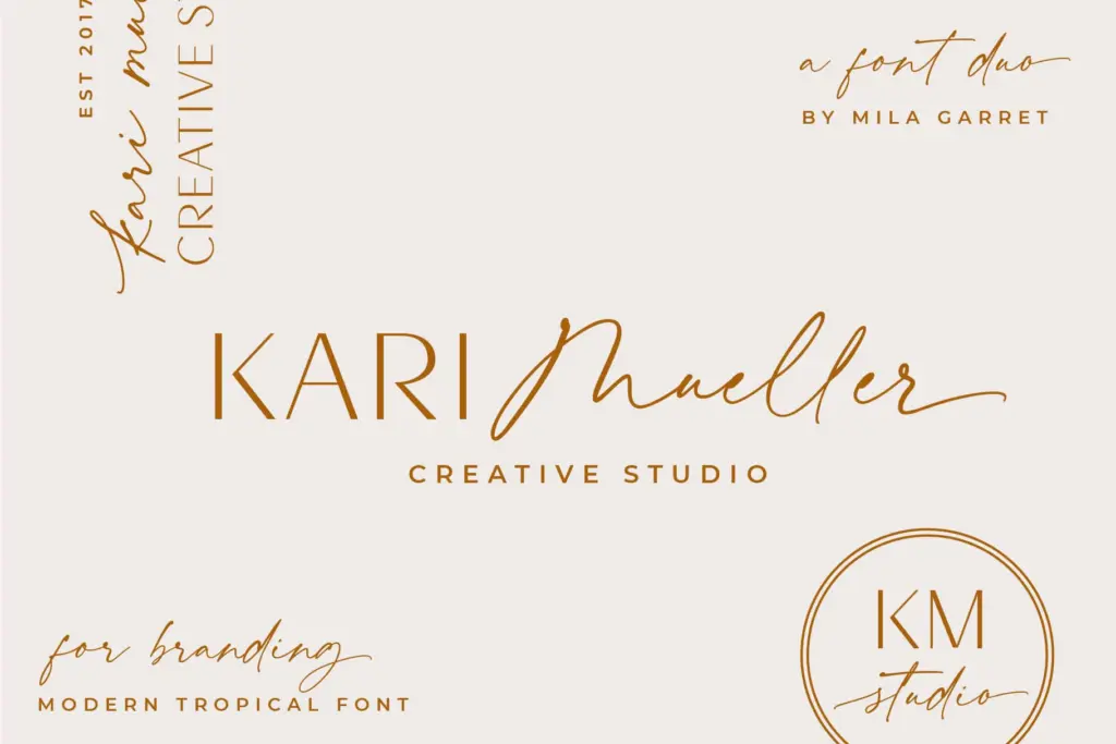
The obvious lane is branding for small, personality-driven businesses — the kind of client who wants a logotype in the sans and a signature flourish in the script for taglines or social captions. It’ll do fine on an Instagram graphic, a product label, an invitation suite where the script handles names and the sans handles the fine print of time and place.
It’s less suited to anything that needs to hold up at length. The script will fatigue a reader past a line or two, and the sans, while legible, doesn’t have enough personality to anchor an editorial layout on its own — it needs the script to do the talking. Treat this as a fast, low-risk pairing for logo marks, headers, and short-form marketing copy, not as the backbone of a full brand system.
What we liked, and what we didn’t
Strengths
- The sans and script are genuinely designed to sit together, saving the usual pairing guesswork.
- Ligatures on the script smooth over common letter collisions in short display settings.
- Clean, unfussy drawing makes it easy to drop into a logo mark without distraction.
Trade-offs
- The script's inky, casual style is common in the current market and doesn't stand out from similar releases.
- Limited feature set and no indication of extended language support restricts it to short-form, display-only use.
A serviceable, low-risk pairing for small branding jobs and invitation suites, not a font that will make a project distinctive on its own. The sans is neutral to the point of interchangeability, and the script is competent but sits in a very crowded stylistic lane. Fine for quick logo work, not built for anything text-heavy.

Tmfonts writes independent reviews of typefaces: what each font does well, where it falls short, what it suits, and where it is sold.