
Calgary Font Free Download

Is Calgary free to download?
Calgary is a commercial font sold on Creative Market, so the full version needs a paid license. Get it from the official listing: Calgary font download.
Need something free? These serif fonts from Google Fonts are free for personal and commercial use:
Design style
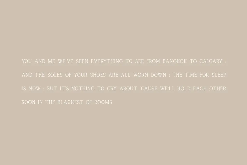
Calgary is a condensed serif built for restraint. The letterforms are narrow, the serifs are thin and unbracketed, and the overall impression is closer to a titling face than a text face, even now that it has a lowercase. There’s a slight formality to it — think of the kind of serif you’d see engraved on a brass plate or set across the top of a masthead. It doesn’t reach for personality through swashes or ornament. The character comes from proportion: tall, narrow capitals with tight internal spacing that give it a slightly compressed, upright posture.
The stroke contrast is moderate rather than dramatic. There’s no showy thick-thin swing here, which keeps the face feeling calm and a little austere. That restraint is the point, but it also means Calgary reads as one register — polished, quiet, a bit reserved — and doesn’t flex much beyond that mood.

Character set and features
The recent addition of lowercase letters is the meaningful change here, and it matters. A caps-only serif is a limited tool; adding lowercase turns Calgary into something that can actually set a sentence, not just a word or a name. The lowercase follows the same narrow, upright logic as the capitals, though it inevitably softens the titling feel a touch — the x-height and serif weight in lowercase read a bit more conventional than the capitals, which remain the stronger, more distinctive part of the family.
The set covers numerals, punctuation, and non-English characters, so it can handle basic multilingual setting without falling back to a substitute font. There’s no mention of ligatures, alternates, or a range of weights, and nothing here suggests a variable font or an extended stylistic set. This is a single-weight, single-purpose tool, and it’s worth knowing that going in — there’s no bold sibling to lean on for hierarchy, so any weight contrast in a layout has to come from a pairing typeface or from scale and colour instead.
Use cases
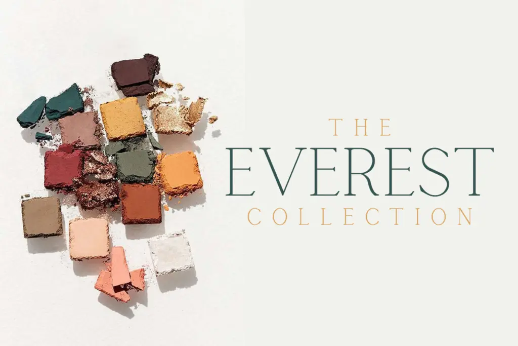
Calgary’s narrow proportions make it efficient for short lines: logotypes, monograms, business card titling, packaging labels, the kind of small blocks of text where a wide serif would crowd the space. It suits branding work that wants to feel established and slightly formal without tipping into anything ornate — boutique retail, hospitality, editorial mastheads, that general territory of
What we liked, and what we didn’t
Strengths
- Narrow proportions make it efficient for tight spaces like logos and business cards.
- Clean, unbracketed serifs give it a formal, restrained character suited to branding.
- New lowercase extends it from caps-only titling to basic sentence setting.
Trade-offs
- Single weight offers no built-in hierarchy for layouts that need contrast.
- Lowercase reads more generic than the distinctive capitals, and isn't built for long-form reading.
Calgary is a tidy, narrow serif that does one job — quiet, formal titling — reasonably well. The new lowercase extends its usefulness but doesn't erase the fact that this is a single-weight display tool, not a text family.

Tmfonts writes independent reviews of typefaces: what each font does well, where it falls short, what it suits, and where it is sold.