
You’re Darling Font Free Download
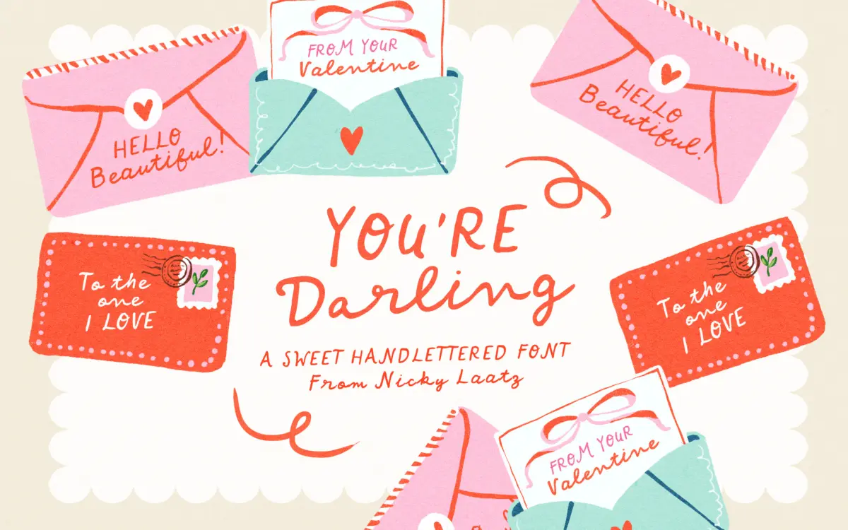
Is You're Darling free to download?
You're Darling is a commercial font sold on Creative Market, so the full version needs a paid license. Get it from the official listing: You're Darling font download.
Need something free? These handwritten fonts from Google Fonts are free for personal and commercial use:
Design style
You’re Darling is a casual penned script that leans hard into imperfection. The strokes wobble slightly, the baseline drifts, and the joins between letters look like they were made with a felt-tip rather than a brush pointe. That’s the point. This isn’t a font chasing calligraphic elegance — it’s aiming for the warmth of a handwritten note scrawled by someone who loves you, and it gets there.
The lowercase carries most of the personality: loopy ascenders, round bowls that don’t quite close evenly, and a rhythm that changes phrase to phrase rather than settling into a repeatable pattern. The uppercase is drawn separately and stands more upright, closer to a rounded print hand than a script capital. That’s a deliberate structural choice rather than a flaw — the seller notes it was designed to work on its own, and it does read cleanly at larger sizes, which is unusual for a script companion set.
What it lacks is restraint. The wobble is consistent throughout, so there’s no quiet passage to let the eye rest — every letter is doing the same amount of charm work. In short bursts that’s charming. Stretched across a paragraph, it gets busy.
Character set and features
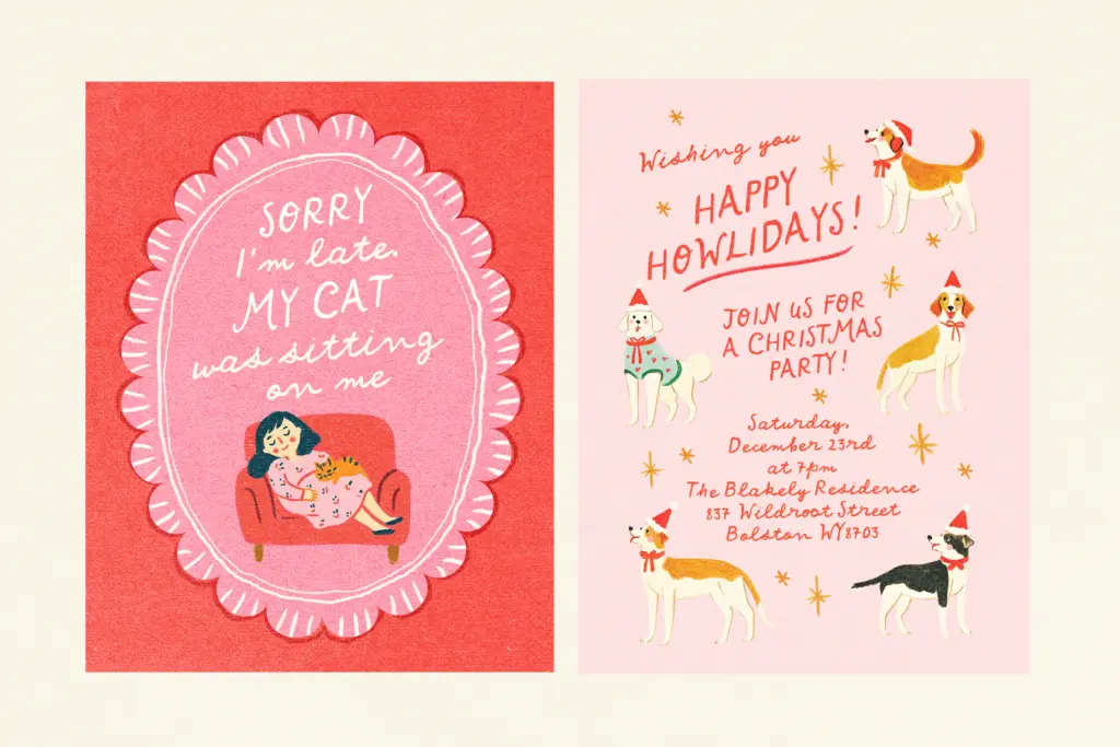
The lowercase and uppercase behave almost like two related but distinct alphabets, which gives you flexibility: set a whole word in the standing capitals for a poster-style header, or drop into the joined lowercase for the intimate, cursive feel. Mixing them within a single word — cap plus lowercase — is where the font does its best work, since that’s the exact pairing it was built to support.
Numerals and basic punctuation appear to follow the same loose, hand-drawn logic as the letters, so a date or a short numeral string won’t feel like it was bolted on from a different design. Don’t expect a font built for dense OpenType substitution systems or elaborate swash alternates — this reads as a straightforward, friendly script rather than a feature-loaded calligraphic system. If you need automatic contextual alternates to avoid repetition across a long line, check before committing, because the personality here comes from a fixed set of letterforms rather than swapping mechanics.
Use cases
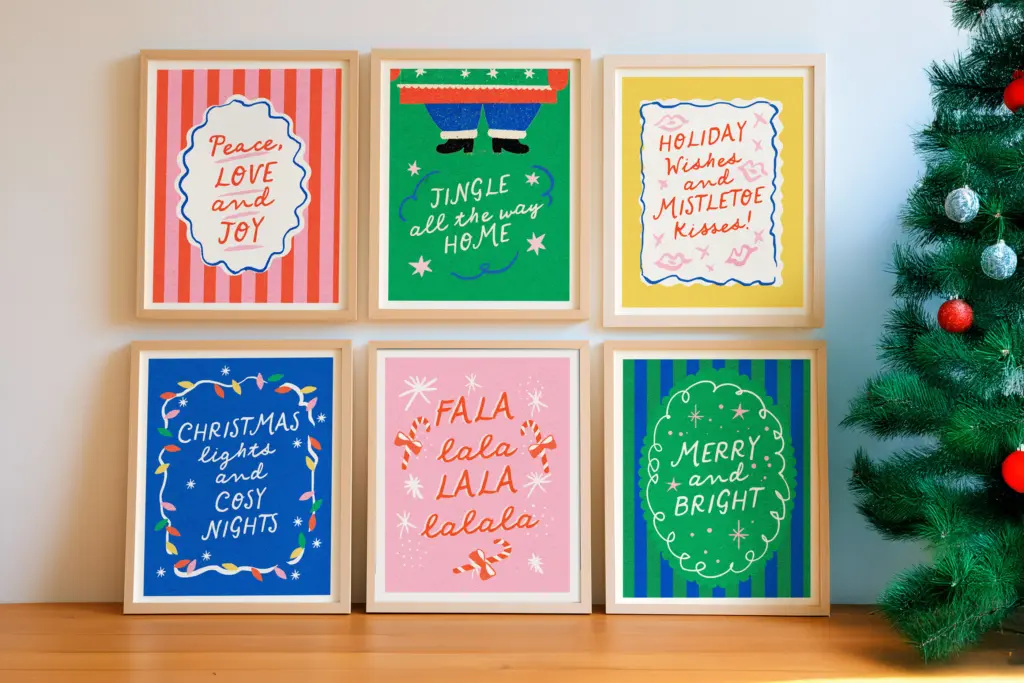
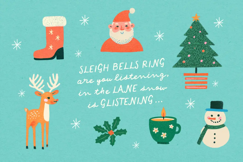
This is a font for short, affectionate messages: gift tags, greeting card covers, a line on a baby announcement, a sticker sheet, a single word on a nursery print. It’s also well suited to the more playful end of wedding stationery — a cheerful save-the-date rather than a formal invitation suite — since the seller’s own framing of it as a quote-and-poster script matches where it performs best.
Where it struggles is anywhere the tone needs to be dialled down. It’s not going to do quiet elegance, and it’s not built for body copy or anything requiring sustained reading — the irregular baseline that reads as charming in a two-word tag becomes fatiguing across several lines. Keep it short, keep it big, and pair it with a plain, steady sans or serif for any supporting text, letting You’re Darling carry the one line that needs the hug.
What we liked, and what we didn’t
Strengths
- The standalone uppercase set reads cleanly on its own, unusual for a script companion face
- Consistent handwritten charm makes it strong for short, emotional messages like tags and cards
- Mixing caps and lowercase within a word is where the design is clearly strongest
Trade-offs
- The uniform wobble gives no quiet moments, so longer text gets visually tiring
- Limited apparent feature set means less flexibility than calligraphic scripts with contextual alternates
You're Darling is a cheerful, unpretentious script that does exactly what its name suggests — short, affectionate messages with real warmth. It's not built for long-form use or subtlety, but for gift tags, cards and playful headlines it earns its keep.

Tmfonts writes independent reviews of typefaces: what each font does well, where it falls short, what it suits, and where it is sold.