Serif
3.9
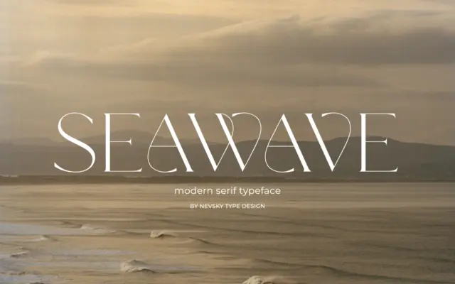
NT Seawave: a high-contrast serif for fashion and luxury branding
Design style NT Seawave belongs to the family of high-contrast serifs that trace back to Didone models but push the…
 Tmfonts

Design style NT Seawave belongs to the family of high-contrast serifs that trace back to Didone models but push the…
Tmfonts
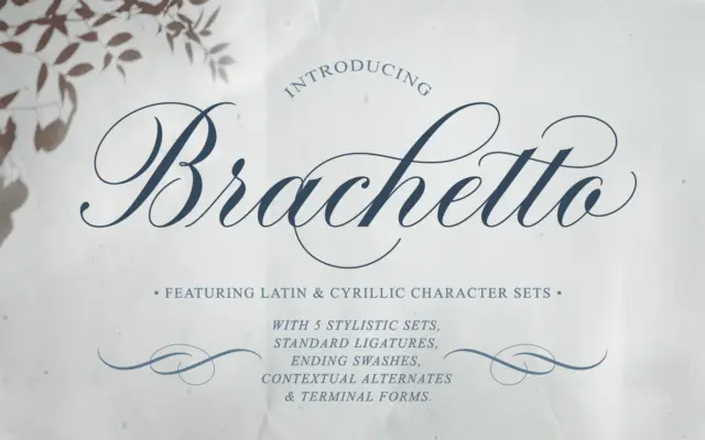
Design style Brachetto sits in the copperplate-influenced camp of calligraphic scripts, but it doesn’t try to replicate a pointed-pen hand…
Tmfonts
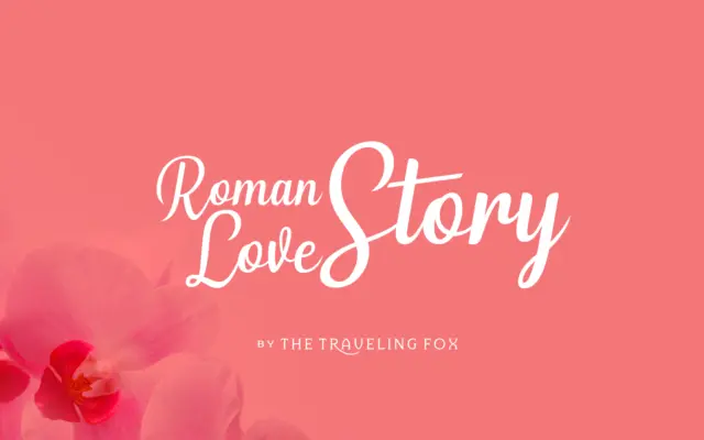
Design style Roman Love Story sits in the well-populated field of casual connecting scripts, the kind built around a monoline…
Tmfonts
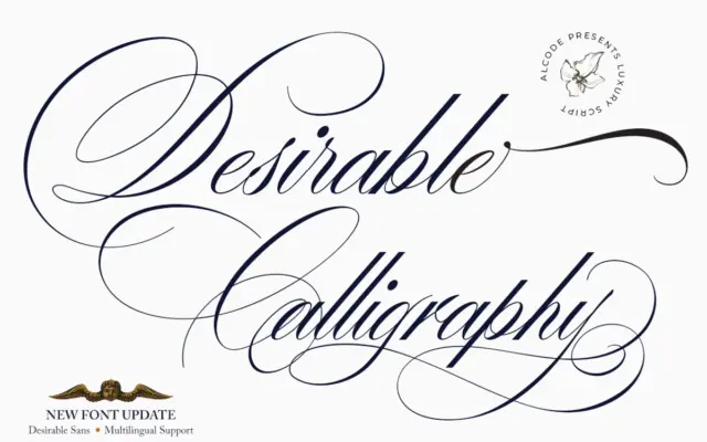
Design style Desirable Calligraphy sits in the crowded field of pointed-nib scripts that reference old manuscript hands, but it leans…
Tmfonts
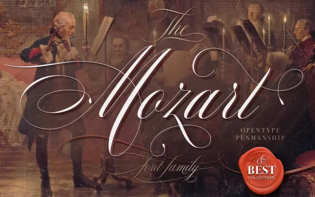
Design style The Mozart Script sits in the copperplate-adjacent family of connecting scripts, drawing on the rhythm of Spencerian and…
Tmfonts
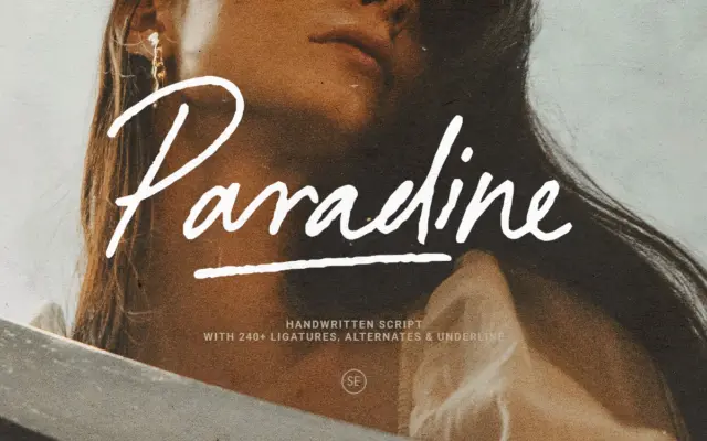
Design style Paradine sits in the crowded field of handwritten signature scripts, but it earns its keep through a looser,…
Tmfonts
Design style Magic Hours sits at the thicker end of the modern-vintage serif trend that has been popular in branding…
Tmfonts
Design style Editor’s Note Display is the sharpened, blown-up sibling of the Editor’s Note family. Where a text serif has…
Tmfonts
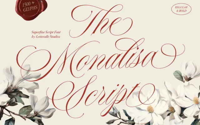
Design style Monalisa Script sits in the crowded field of fine-tipped calligraphy scripts, the kind built to look like it…
Tmfonts