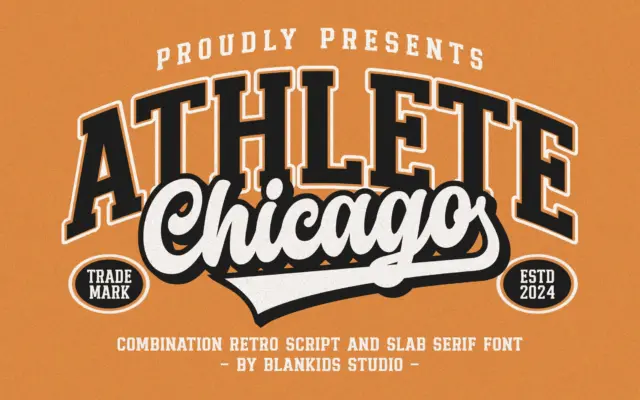
Chicago Athlete: a varsity slab-and-script duo for team branding
Design style Chicago Athlete pulls from collegiate athletic lettering: the block-letter jerseys, the stitched patches, the varsity jacket chest logo.…
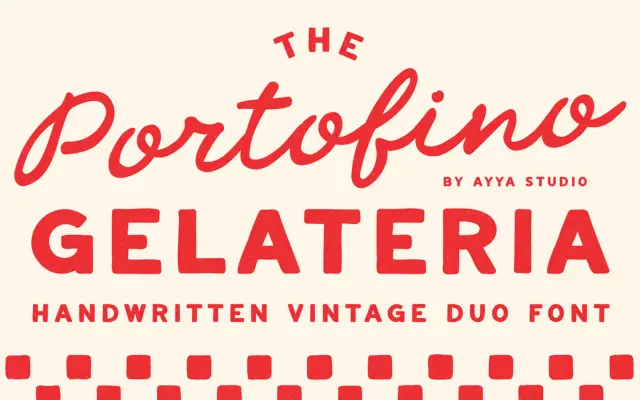
Design style Portofino Gelateria is built around a familiar but well-executed idea: a loose, handwritten script paired with a plainer…
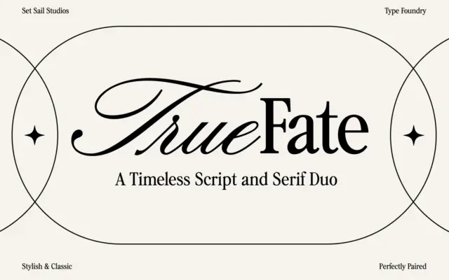
Design style True Fate arrives as two related but distinct faces rather than one typeface with a variant. The script…
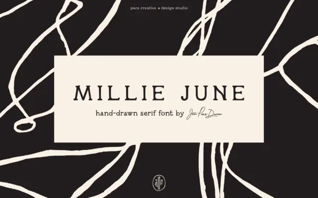
Design style Millie June is a hand-drawn serif that leans into its own wobble rather than smoothing it out. Strokes…
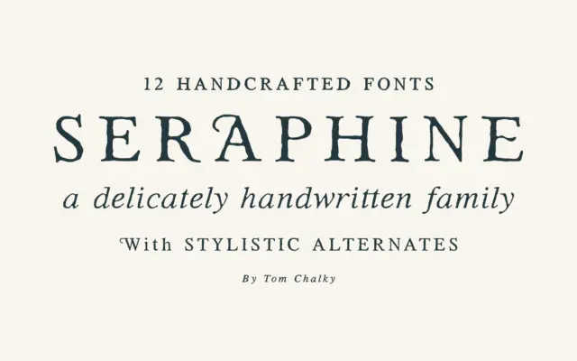
Design style Seraphine sits in that increasingly crowded space of serifs built to feel warm rather than authoritative. Tom Chalky’s…
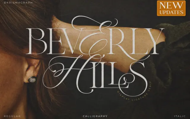
Design style Beverly Hills sits at the crossroads of calligraphy and serif construction, and it wears that hybrid identity openly.…
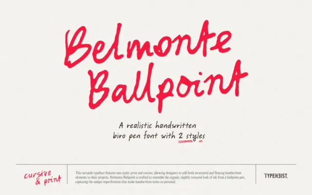
Design style Belmonte Ballpoint sets out to do one specific thing: look like it came out of a cheap pen…
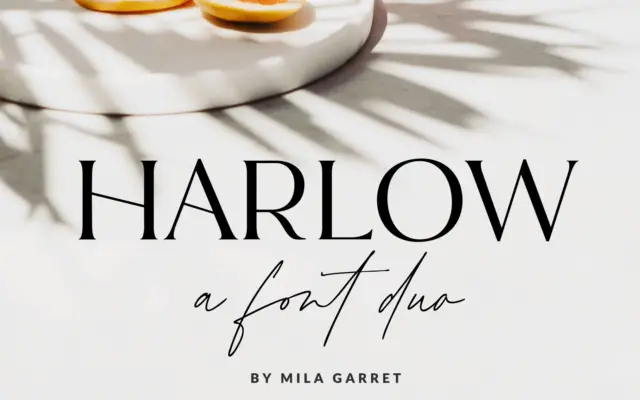
Design style Harlow is sold as a duo, and that pairing is the whole idea: a restrained serif set against…
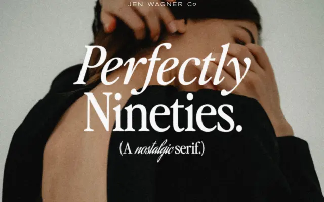
Design style Perfectly Nineties draws on the compact, no-nonsense serifs that filled magazine mastheads and fashion spreads in the late…