
Millie June Font Free Download
Is Millie June free to download?
Millie June is a commercial font sold on Creative Market, so the full version needs a paid license. Get it from the official listing: Millie June font download.
Need something free? These handwritten fonts from Google Fonts are free for personal and commercial use:
Design style
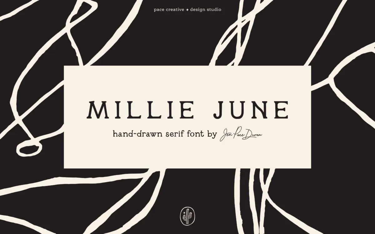
Millie June is a hand-drawn serif that leans into its own wobble rather than smoothing it out. Strokes taper unevenly, serifs are drawn rather than constructed, and the baseline drifts slightly letter to letter, the way it would if you’d written it with a brush pen and a bit of patience rather than a ruling pen. The overall mood sits somewhere between farmhouse signage and a hand-lettered wedding menu — soft, a little worn, never crisp.
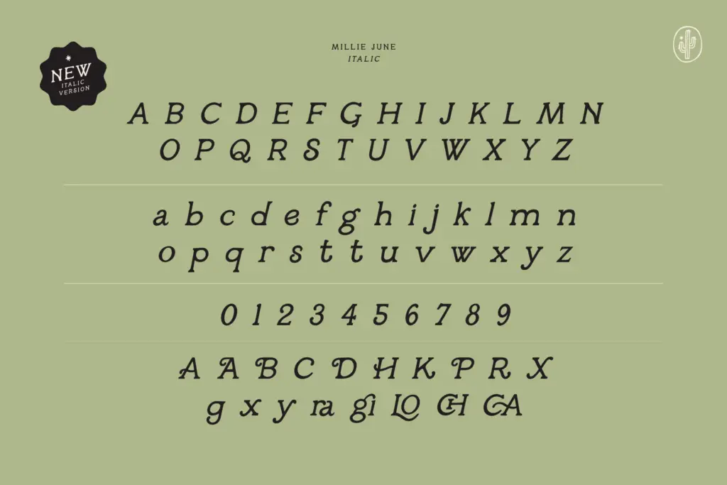
What keeps it from tipping into novelty is restraint in the letter construction itself: the serifs are modest, the x-height is generous enough to read as a text-adjacent serif rather than pure lettering, and the italic companion leans at a gentle, consistent angle instead of trying to look spontaneous. It’s a font that knows exactly which kind of imperfection it wants — the kind that reads as handmade care, not sloppiness. That said, the deliberate irregularity is a style choice you either want or don’t; if you need a serif that looks the same every time a letter repeats, this isn’t it.
Character set and features
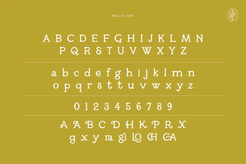
The set covers upper and lowercase, numerals, and a run of special characters, plus alternate letterforms for swapping out repeated shapes — useful given how visible the hand-drawn variation is when the same letter appears twice in a word. The italic is a full companion style rather than a slant applied to the roman, which matters here since so much of the font’s warmth lives in stroke direction.
Multilingual support extends the font past basic English-language use, which is worth checking against your own character needs before committing a whole brand system to it. Delivery in TTF, OTF, WOFF and WOFF2 covers desktop layout work and web use without extra conversion. There’s no mention of a bold weight, so anyone needing a hierarchy within the family will need to lean on size, colour, or the italic rather than weight contrast.
Use cases
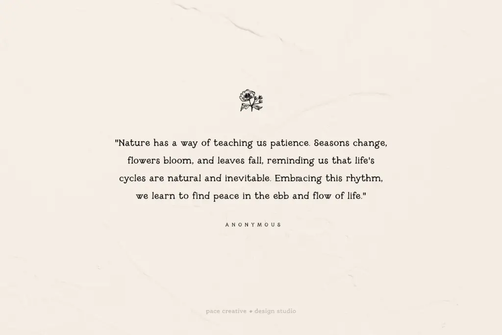
This is a display font first — it’s built for the moments where character matters more than density of information. Logotypes for small-batch or handmade goods, packaging for food and beverage brands leaning into a rustic or heritage story, wedding stationery, greeting cards, and any editorial spot that wants a handwritten pull-quote all suit it well. The alternate characters earn their keep in short-word settings like logos and headers, where the eye actually catches the variation.
It is not a font for body copy or anything read at length — the irregular baseline and drawn serifs that make it charming at large sizes will just look muddy in a paragraph. Keep it to headlines, short lines, and standalone words, and pair it with a plain, quiet sans or serif for supporting text so the handwritten quality has room to be the accent rather than the whole voice of the design.
What we liked, and what we didn’t
Strengths
- Drawn irregularity feels deliberate rather than sloppy, with a genuine point of view.
- Full italic companion (not just a slant) adds real range for accents and pairings.
- Alternate characters help disguise repeated letters in short-word logo and header settings.
Trade-offs
- No bold weight is mentioned, limiting hierarchy options within the family alone.
- The uneven baseline and drawn serifs make it unsuitable for body copy or dense text.
Millie June does one thing well: a warm, hand-drawn serif with vintage charm for short, display-scale settings. It's not built for body text and lacks a bold weight for internal hierarchy, but for logos, packaging, and stationery work it delivers a consistent, considered kind of imperfection.

Tmfonts writes independent reviews of typefaces: what each font does well, where it falls short, what it suits, and where it is sold.