
TAN Pearl Font Free Download
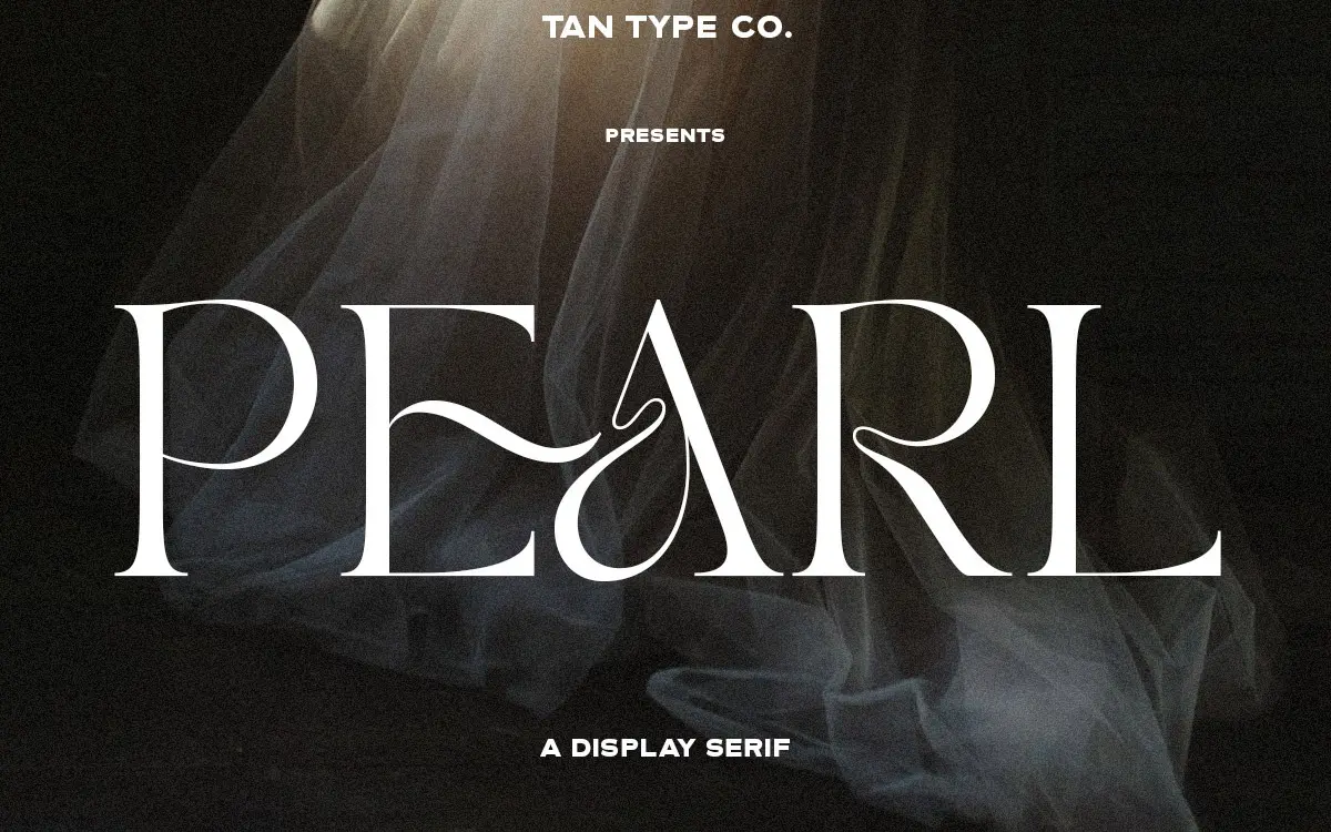
TAN fonts are designed and sold by TanType Co. tmfonts is an independent review site — we’re not affiliated with TanType Co. and don’t host or sell their fonts.
Designers hunting for a TAN Pearl free download usually want it for one thing: a wordmark with curls in the right places. The straight answer is that TanType Co. sells TAN Pearl as a commercial font and has not released a free, demo or personal-use version, so using it means buying a licence, starting at $17.
TAN Pearl free download: no demo, only paid licences
The one official source we found is TanType’s Creative Market listing, and it has no free file. A “trial fonts” line on that page belongs to Creative Market’s enterprise service, not to this font. Searches turned up no MyFonts page or foundry website for TAN Pearl either. Sites promising the full font for nothing are unofficial, and their copies come with no licence.
Licence prices on the listing in October 2026:
- Desktop: $17 per seat, for print, logos, merchandise and images for social media
- Webfont: $17, shown reduced to $14.45
- E-pub: $40, shown at $37.45
- App: $136, shown at $133.45
The listing also promises alternate letters, multilingual support and free future updates. When you download TAN Pearl after buying, you get it straight from the foundry’s shop.
Get TAN Pearl — official listing
TAN Pearl specimen and verified specs
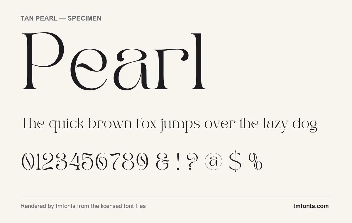
- Styles: 1 (Regular)
- File formats: OTF, TTF, WOFF, WOFF2
- Glyphs: 366
- Language support: Basic Latin (English), Western European, Central & Eastern European
- OpenType features: standard ligatures, discretionary ligatures, stylistic alternates, kerning, fractions
Checked by tmfonts from the licensed font files.
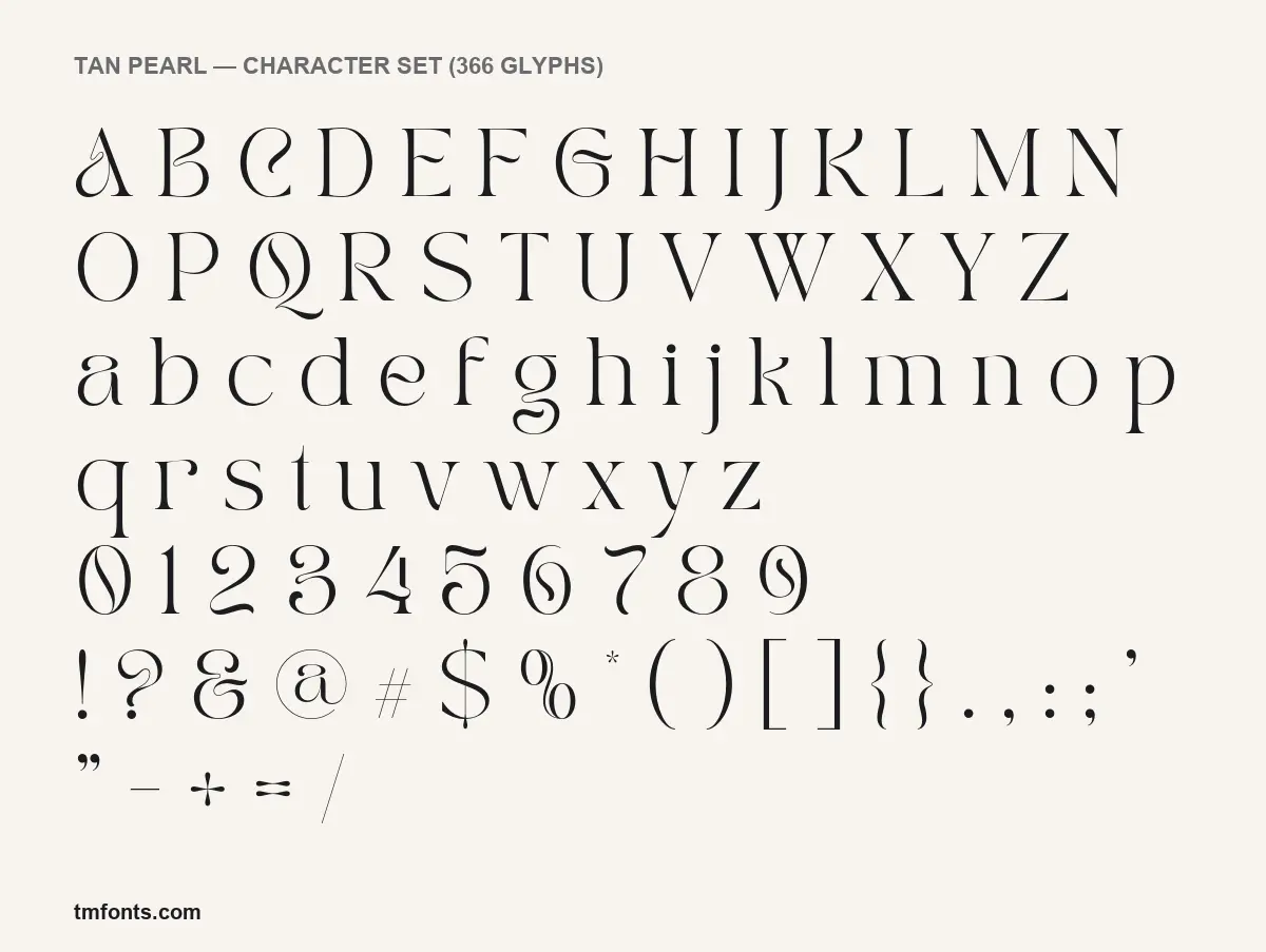
The curls, hooks and teardrops
TanType describes TAN Pearl as a serif that “teases your eyes with its curves yet still able to maintain its classy composure”. In the specimens on this page, rendered from the licensed font files, the structure is plain and the personality sits at the ends of strokes. Stems are straight and upright, serifs are small and sharp, and the contrast between heavy strokes and hairlines is strong.
Then the terminals take over. The r ends in a heavy teardrop hanging from its arm. The C closes with a hairline that curls back into the letter. The j, q and y drop into long, thin descenders, and the g’s lower half is an open, swinging hook rather than a closed loop. The e’s bar swoops through the counter instead of running straight across, so every word with an e gets a small wave in the middle. The lowercase a is single-storey, which keeps words like “Pearl” round and even.
In our specimen line the “th” pair appears to join into one shape, which looks like the standard ligatures at work. The small marks are drawn with a lighter hand: the # and * are thin and small beside the letters, and a single long hairline runs through the $. At a large size the heavy strokes carry the design; at text sizes the hairlines start to fade, so keep it to headlines and short lines.
One style, four file formats
- Styles: a single Regular. There are no other weights and no italic.
- Glyphs: 366 in the licensed file.
- Formats: OTF, TTF, WOFF and WOFF2 in the files we examined. The listing names .otf, .ttf and .woff.
- Version: 1.000. Creative Market shows the listing as created on 9 November 2020.
- Credit: TanType Co. The designer field in the Pearl files is blank.
Accents, ligatures and alternates
The TAN Pearl font covers Basic Latin, Western European and Central and Eastern European characters, so names and headlines in French, German, Spanish, Polish, Czech or Hungarian will set without missing letters. There is no Cyrillic or Greek.
It carries five OpenType features, explained plainly:
- Kerning adjusts the gap between specific letter pairs. It works automatically almost everywhere.
- Standard ligatures join pairs that would otherwise clash. Most design apps apply them by default.
- Discretionary ligatures are decorative joins you switch on yourself, handy for a brand name.
- Stylistic alternates swap certain letters for a second design. The listing says you need software with OpenType support to reach them.
- Fractions turn 1/2 or 3/4 typed as text into proper fraction glyphs.
Illustrator, InDesign and Photoshop expose all of these through the OpenType and Glyphs panels; Affinity Designer and Figma support them too. The font has no Private Use Area codes, so in Canva or Cricut Design Space you get the default letters only. To use an alternate there, set the word in an OpenType-capable app and import it as an SVG or PNG.
Wordmarks, labels and what to pair with them
A single word in TAN Pearl does most of the work, which is why it suits logotypes for florists, bakeries, beauty and jewellery brands, plus wedding monograms, perfume and candle labels, and magazine cover lines. Because there is only one weight, build hierarchy with a second family:
- Mulish in a light or regular weight for body text; its plain shapes leave the curls to Pearl.
- Crimson Pro for longer passages if you want the whole layout to stay serif.
- Manrope in small, spaced capitals for prices, dates and taglines.
Using TAN Pearl in a logo: the licence question
Every use, personal or commercial, needs a paid licence; the font has no free tier. Under Creative Market’s font licence, Desktop covers unlimited personal and commercial projects, including products for sale, packaging and paid ads, with one seat per user. Embedding the font in a website needs Webfont, and apps and e-books each need their own licence. Logo work deserves a careful read: the terms allow it under conditions, including disclaiming the font when you register a trademark, so check the current wording before you file. A TAN Pearl free download from an unofficial site gives you none of these rights. This is general information, not legal advice.
Getting TAN Pearl onto your computer
Unzip the file from Creative Market. Windows: right-click the OTF and choose Install. Mac: double-click the OTF and click Install in Font Book. Install OTF or TTF, not both, and restart your apps. The WOFF and WOFF2 files are for websites only.
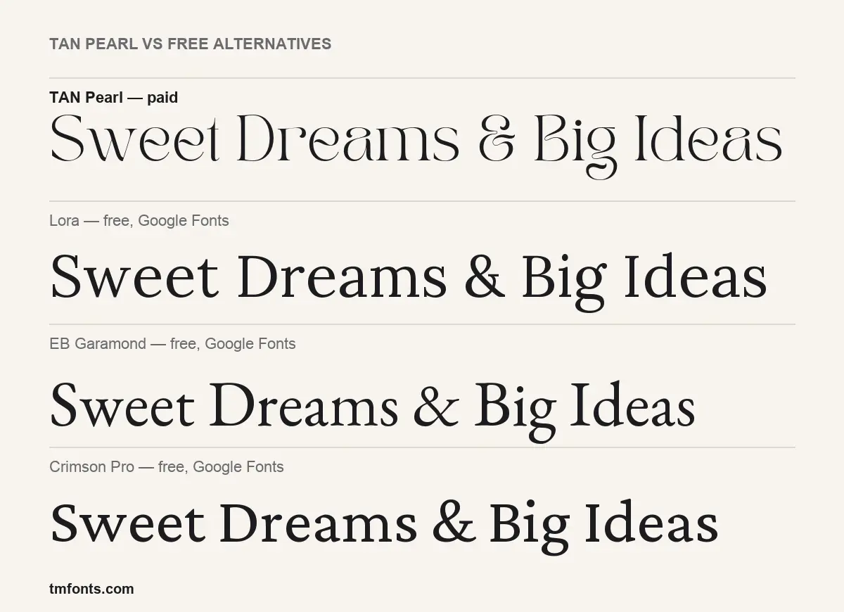
Lora, EB Garamond and Crimson Pro as free stand-ins
If a TAN Pearl free download was meant to save the budget, these Google Fonts are free for commercial use. None has Pearl’s swooping e or teardrop r, as the comparison image shows, but each covers part of the job:
- Lora has brush-like curves and moderate contrast in a full family of weights and italics. It is far calmer and much better for paragraphs.
- EB Garamond is a classic book face with old-style warmth. It gives a refined, traditional tone without any of Pearl’s showiness.
- Crimson Pro is crisper and slightly condensed, with sharper serifs. It is the most neutral of the three and pairs well as Pearl’s text companion.
TAN Pearl FAQ
Is TAN Pearl free to download?
No. There is no official TAN Pearl free download, demo or personal-use version. The cheapest licence is Desktop at $17 per seat on Creative Market.
Can I use TAN Pearl for a business logo?
Yes, with a paid licence, but read the logo and trademark conditions in Creative Market’s font licence first.
Will the alternates work in Canva or Cricut?
No. Without PUA codes, those apps show the default letters only. Use Illustrator, Affinity or Figma for the alternates.
Who makes TAN Pearl?
TanType Co., which sells it through its Creative Market shop. tmfonts is an independent review site and is not affiliated with the foundry.
What pairs well with TAN Pearl?
A plain sans such as Mulish for body text, or Crimson Pro if you want a serif for longer reading.

Tmfonts writes independent reviews of typefaces: what each font does well, where it falls short, what it suits, and where it is sold.