
Stylish Aesthetic Typeface Free Download
Is Stylish Aesthetic Typeface free to download?
Stylish Aesthetic Typeface is a commercial font sold on Creative Market, so the full version needs a paid license. Get it from the official listing: Stylish Aesthetic Typeface download.
Need something free? These sans serif fonts from Google Fonts are free for personal and commercial use:
Design style
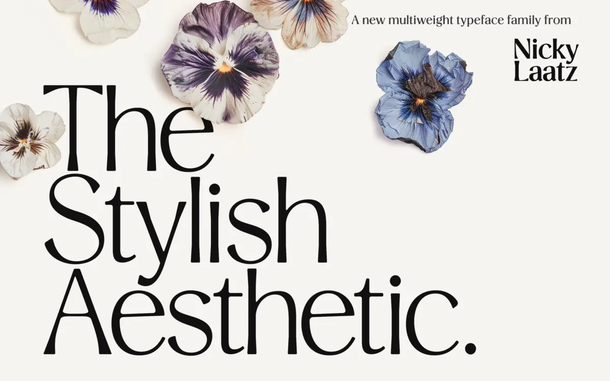
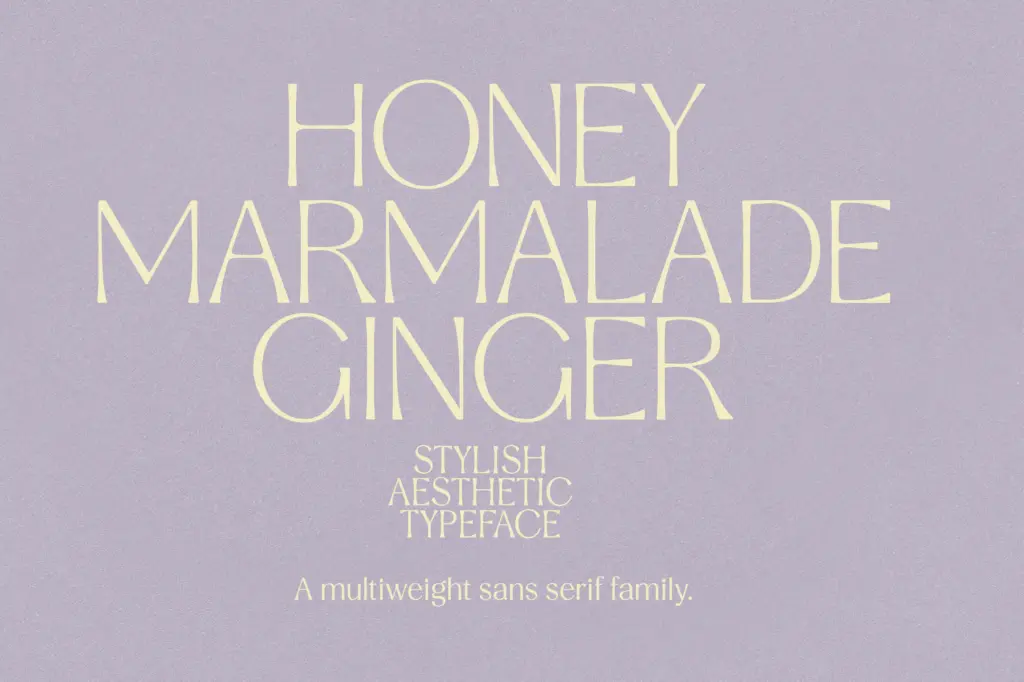
Stylish Aesthetic is a high-contrast sans that leans on the tension between rounded and angular forms rather than settling into one camp. Curves stay smooth through bowls and terminals, but where strokes meet at diagonals — in the A, V, W, and the arms of the K — the drawing sharpens into a clean, almost geometric point. That mix keeps the letterforms from reading as either purely humanist or purely constructed, which is presumably the ‘chic’ the name is going for. It’s a contemporary display-leaning sans, not a revival of anything in particular.
The contrast itself is the real story of the family. At Extra Light, the strokes thin down to a delicate hairline that reads as fashion-editorial rather than functional. At Black, the same skeleton carries enough weight to feel closer to a poster face. Nine weights spanning that range is a genuine spread, and the spacing between them feels even rather than lumped at one end.
Character set and features
Language support covers a solid run of Western European languages — Danish, French, German, Italian, Spanish, Portuguese, the Nordic set including both Norwegian standards, plus Filipino, Indonesian and a few regional German variants. That’s a practical range for a family aimed at branding and editorial work in Europe and beyond, though it’s worth checking your own diacritic needs before committing, since exotic accent combinations are where multi-weight families sometimes show their seams.
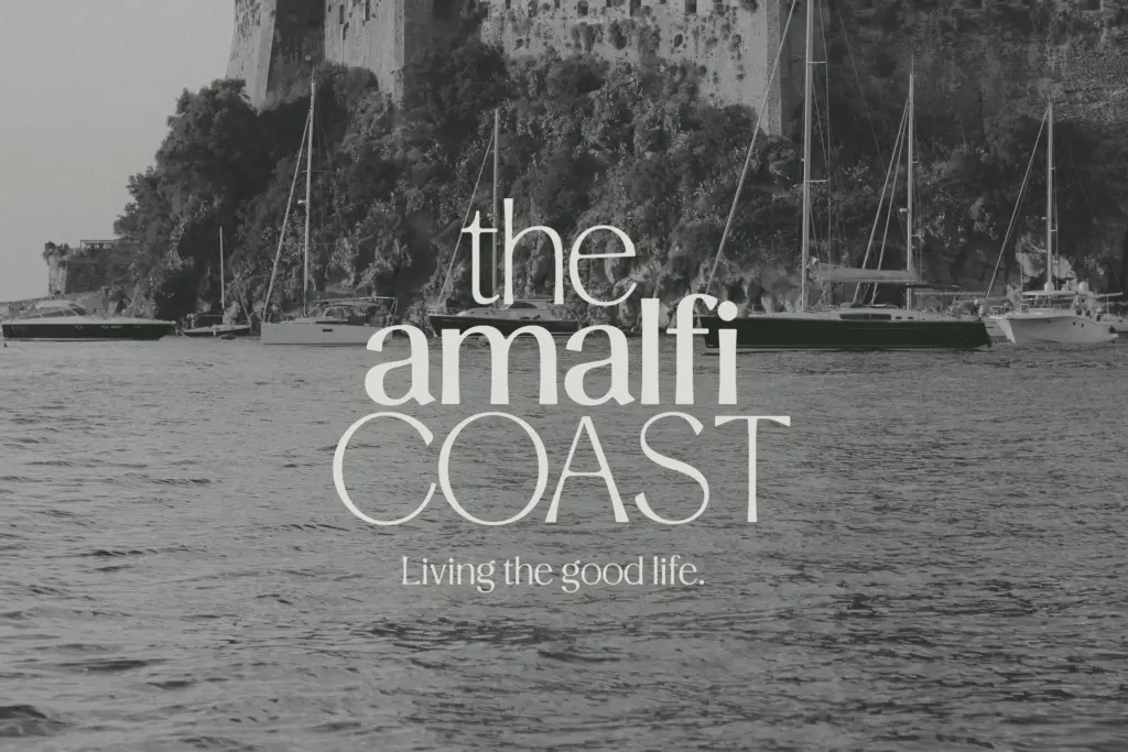
Nine weights is the headline feature, and it’s the kind of range that rewards a designer who wants one typeface to do the job of a whole system — headline, subhead, caption, pull quote — without switching families. The trade-off with any family this wide is consistency of texture: the extremes (Extra Light and Black) inevitably feel like different personalities wearing the same skeleton, and pairing them within one layout takes a careful hand to avoid looking like two unrelated fonts sharing a page.
Use cases
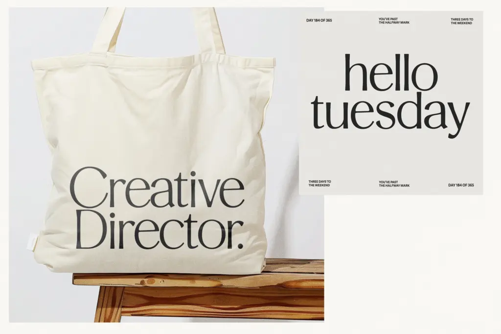
This is a typeface built for branding and editorial contexts where a single family needs to flex across a masthead, body copy, and pull quotes. The lighter weights suit wedding stationery, fashion lockups, and any place a delicate, sophisticated sans is wanted over a script. The heavier weights work as standalone display type — logotypes, cover lines, packaging — where the angular contrast can carry a headline on its own.
It’s less suited to dense body text at small sizes; the high-contrast strokes that make it distinctive at display sizes are the same feature that will thin out and lose crispness in a paragraph of 9pt text, especially in the lighter weights. Treat it as a headline-and-accent family first, with a plainer workhorse sans handling long-form reading, and it earns its keep.
What we liked, and what we didn’t
Strengths
- Nine weights give real flexibility from hairline-thin to poster-bold within one family.
- The angular-meets-smooth contrast gives it a distinct personality rather than a generic sans feel.
- Solid multi-language coverage across Western European and Nordic markets.
Trade-offs
- High contrast strokes lose crispness at small body-text sizes, especially in the lighter weights.
- The lightest and heaviest weights feel like different personalities, requiring care when combined.
Stylish Aesthetic is a well-drawn high-contrast sans with genuine range across its nine weights, best used for headlines, branding and light editorial accents rather than body text. The extremes of the family pull in slightly different directions stylistically, which takes care to manage in a single layout. Solid choice for anyone building a branding system that needs one family to flex from delicate to bold.

Tmfonts writes independent reviews of typefaces: what each font does well, where it falls short, what it suits, and where it is sold.