
Ten Pounds Font Free Download
Is Ten Pounds free to download?
Ten Pounds is a commercial font sold on Creative Market, so the full version needs a paid license. Get it from the official listing: Ten Pounds font download.
Need something free? These serif fonts from Google Fonts are free for personal and commercial use:
Design style
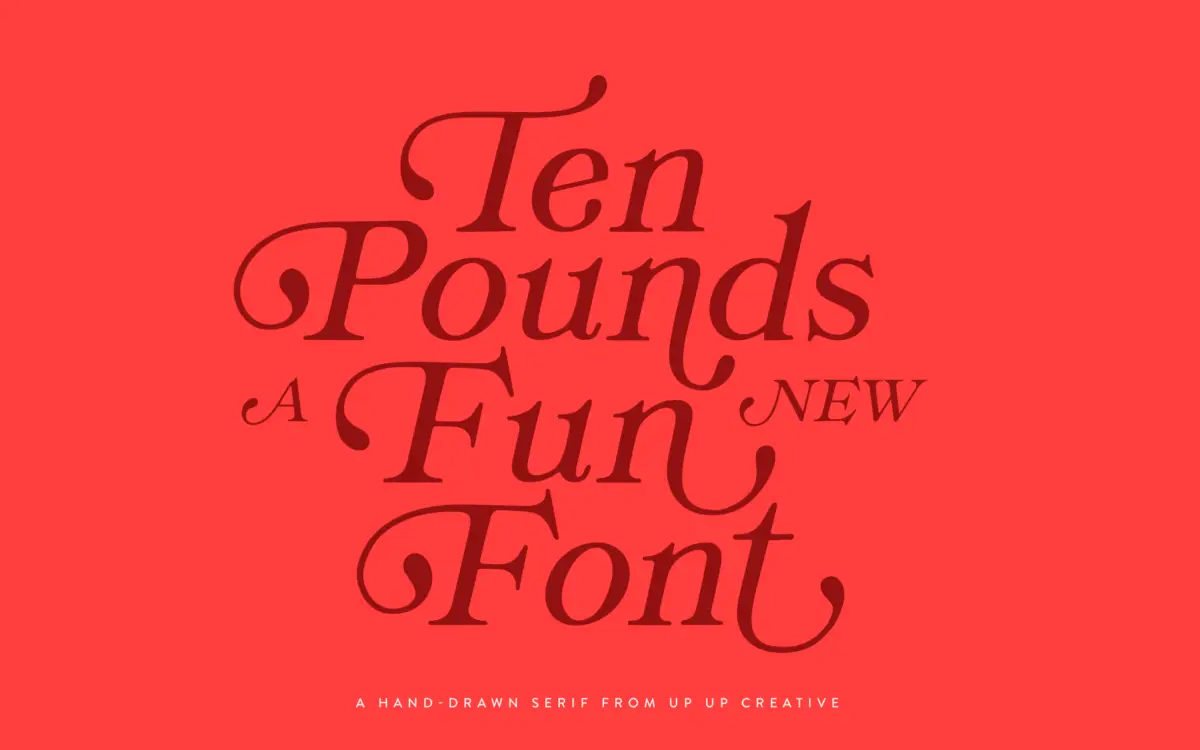
Ten Pounds is a hand-drawn serif with the wobble and inconsistency you’d expect from a font built off actual pen strokes rather than a ruler. Serifs are stubby and slightly uneven from letter to letter, stems bow a little, and the baseline has a gentle bounce rather than sitting dead straight. It reads as a friendly, informal serif rather than a refined one — closer to hand lettering for a market stall sign than to anything with typographic pedigree. There’s warmth in the drawing, but not much restraint; every letter wants attention, which is fine in short bursts and tiring at length.
The construction leans heavily on its irregularity as the whole point. That’s a legitimate choice, but it means the font has one mood. It doesn’t flex between casual and serious — it’s always a bit gleeful, always announcing itself as handmade. Designers looking for a hand-drawn serif that can also do quiet, credible work elsewhere will need to look past this one.
Character set and features
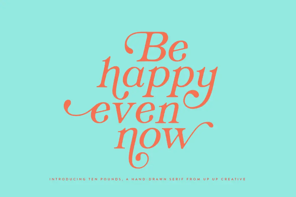
The glyph count is the real story here: over 1,300 glyphs including more than 100 ligatures, plus stylistic sets, character variants, and initial/final contextual forms. That’s a substantial OpenType build for a font in this style, and it suggests genuine effort went into giving individual words their own personality rather than just repeating a fixed alphabet. Multilingual support and currency symbols are included, which is a practical bonus for anyone doing packaging or menu work outside English-only markets.
The catch is accessibility of these features. They’re built for OpenType-savvy layout software — Illustrator, InDesign — and the seller’s own notes admit that getting them working in Word requires digging into the advanced font menu. That’s an honest disclosure worth repeating: if your workflow is Word or PowerPoint, most of what makes this font interesting will simply not surface. You’ll get the base regular weight and none of the ligature or swash richness that justifies the glyph count.
Use cases
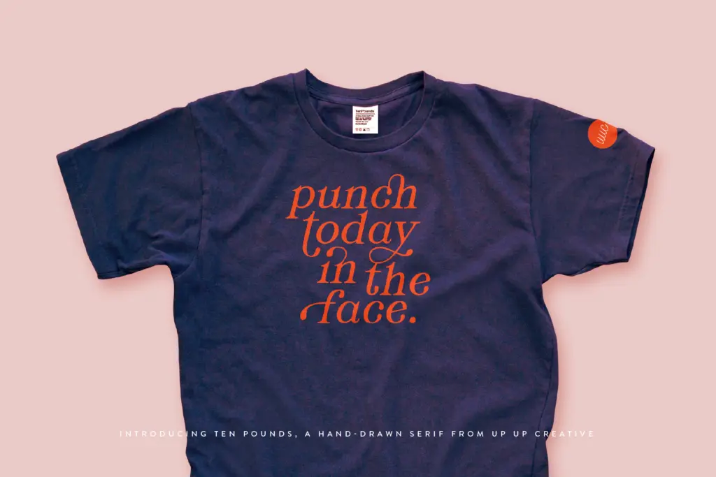
This is a font for short, expressive lines: a logotype, a poster headline, a birthday invitation, a t-shirt graphic, a chalkboard-style menu heading. It suits projects aimed at children, casual food and drink branding, and craft or maker businesses trying to signal handmade authenticity. The irregularity that makes it charming at large display sizes becomes a liability at body text sizes — don’t set paragraphs in it, and don’t expect it to hold up small on a shipping label.
It also comes in a single weight and style, so it isn’t a font family you can build a full identity system around by itself. Pair it with a plain, quiet sans or serif for supporting text, and let Ten Pounds do the one job it’s drawn for: the big, friendly word at the top of the page.
What we liked, and what we didn’t
Strengths
- Extensive glyph set with over 100 ligatures gives real word-by-word variation
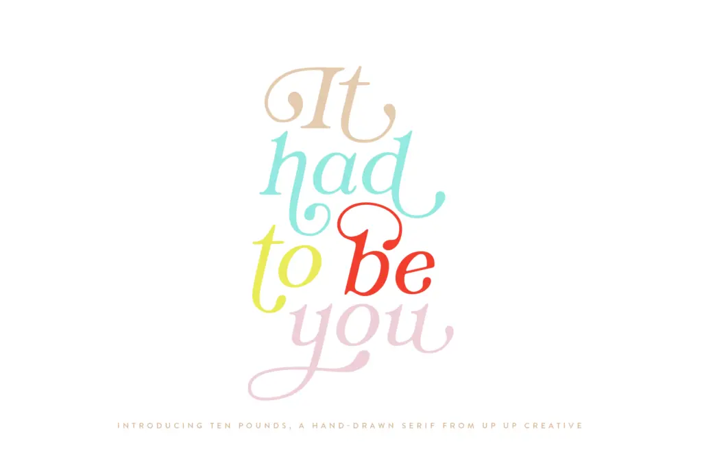
- Contextual alternates and stylistic sets add genuine handmade texture, not just decoration
- Multilingual and currency symbol support broadens its practical use beyond English branding
Trade-offs
- OpenType features require Illustrator, InDesign or similar — Word users lose most of the font's character
- Only available as a single regular weight, limiting it as a standalone family for full identity systems
Ten Pounds is a charming, handmade-feeling display serif with an unusually deep OpenType feature set for its category. It's built for one job — short, playful display text — and does that job well, but its irregularity and software requirements limit where it can go.

Tmfonts writes independent reviews of typefaces: what each font does well, where it falls short, what it suits, and where it is sold.