
Rancheros Font Free Download
Is Rancheros free to download?
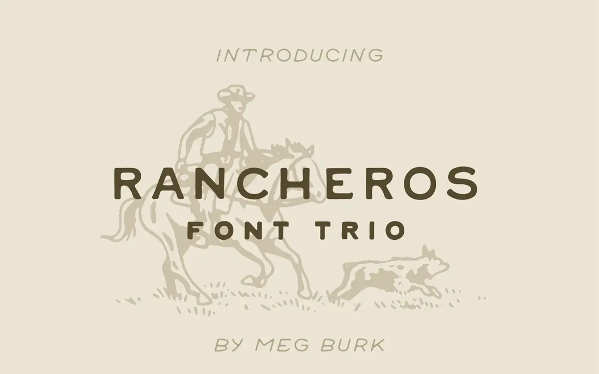
Rancheros is a commercial font sold on Creative Market, so the full version needs a paid license. Get it from the official listing: Rancheros font download.
Need something free? These display fonts from Google Fonts are free for personal and commercial use:
Design style
Rancheros is a set of three uppercase hand-lettered display faces built around a Southwestern, hand-stamped look. Despite the marketplace listing it under sans serif, this isn’t a neutral working sans — it’s a rough-edged display style with the irregular baselines, wobbly strokes, and inked-label texture you’d expect from old feed sacks, hot-sauce bottles, and roadside signage. The brief cites New Mexico and the wider Southwestern US as reference points, and that shows in the letterforms: strokes that thicken and taper unevenly, corners that don’t quite meet, and a general sense that these were drawn with a brush or a worn marker rather than a pen tool.
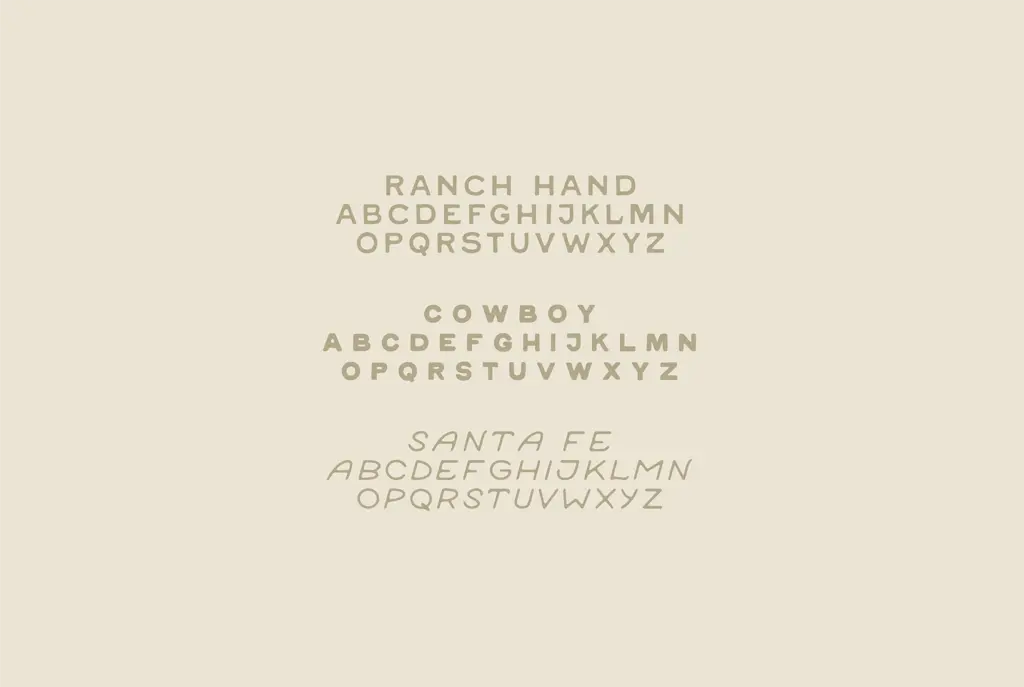
The three-font structure gives you variation rather than a weight range in the conventional sense. One face reads as a slightly cleaner stamped block letter, another leans rougher and more distressed, and a third brings in more visible hand-lettering irregularity. None of them behave like a grid-built grotesque; each has its own texture and none is trying to be quiet. That’s the point of a trio like this — you pick the version that fits the mood of the piece rather than dialling in a weight.
Character set and features
This is an uppercase-only set, which is typical for hand-lettered western fonts and worth knowing before you commit to it for anything with mixed-case requirements. Expect basic Latin letters, numerals, and standard punctuation rather than an extended character set, ligatures, or alternate glyphs — the brief doesn’t mention any of that, and the style of the font (deliberately irregular, single-drawn letterforms) doesn’t lend itself to swapping alternates the way a script font might. What you’re buying is the texture of the strokes themselves, not a system of flourishes.
Because the three fonts are designed to be mixed, the real feature here is compositional: you can set a word in the roughest face for a hero mark, then repeat it in the cleaner variant for supporting text, and the family resemblance holds. That’s a more useful kind of
What we liked, and what we didn’t
Strengths
- Three related faces let you mix rough and clean textures within one branding system.
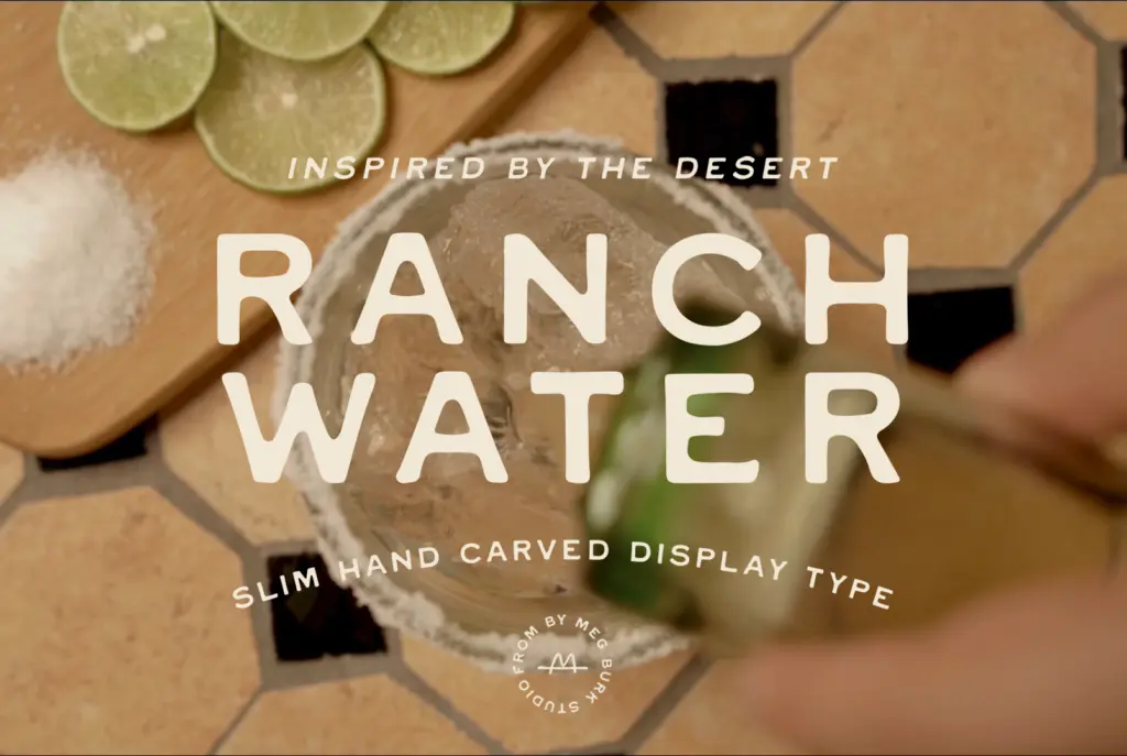
- The stamped, uneven stroke work reads convincingly as Southwestern signage rather than a generic distressed font.
- Family resemblance holds across the trio, so pairing them together doesn't feel disjointed.
Trade-offs
- Uppercase only, which limits it for any layout needing sentence case or mixed-case wordmarks.
- Legibility drops fast at small sizes or in long runs, so it's unsuitable for body copy.
Rancheros delivers a convincing hand-stamped Western texture across three related display faces, and the trio structure is genuinely useful for mixing tones within one project. It's strictly a short-word, uppercase display tool, though, with no lowercase and no extended feature set to lean on.

Tmfonts writes independent reviews of typefaces: what each font does well, where it falls short, what it suits, and where it is sold.