
Palmore Font Free Download

Is Palmore free to download?
Palmore is a commercial font sold on Creative Market, so the full version needs a paid license. Get it from the official listing: Palmore font download.
Need something free? These serif fonts from Google Fonts are free for personal and commercial use:
Design style
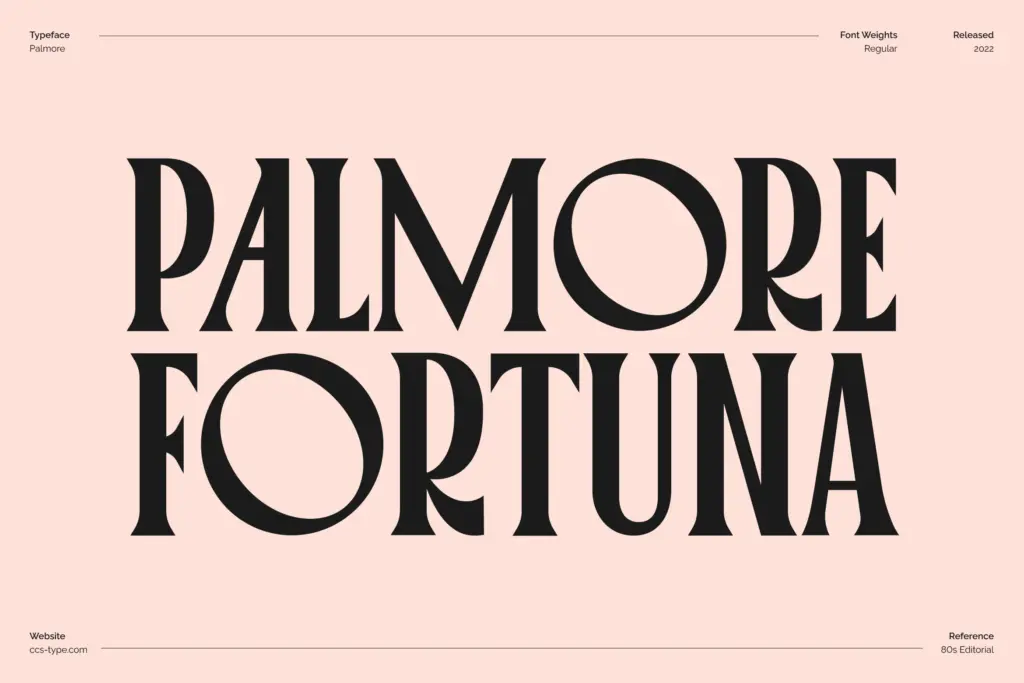
Palmore sits at the intersection of condensed display lettering and rounded, almost bubbly serif construction. The proportions are narrow and tall, but the bowls of letters like O and C are drawn wide and full, which gives the face a slightly lopsided charm — tight verticals paired with generous curves. That contrast is the whole personality of the typeface. It reads as a period piece, something you’d expect on a magazine masthead or a hand-lettered shop sign from a few decades back, but the rounded terminals keep it from feeling stiff or overly formal.
The serifs themselves are soft rather than sharp, blunt little nubs rather than fine hairlines, which reinforces the rounded feel rather than fighting it. Stroke contrast is moderate — enough to give the letters some structure without pulling focus from the condensed rhythm. Set a few words at large size and the letterforms lock together with a steady, almost mechanical cadence, which is clearly the intent: this is a face built to march across a headline, not to be admired letter by letter.
Character set and features
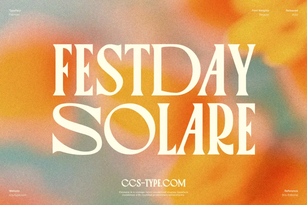
The set runs to over 300 glyphs, covering alternates, ligatures, and multilingual characters, and comes in four weights. The alternates matter more than they might in a plainer face — because the base letterforms are already distinctive, swapping in an alternate O or C changes the texture of a word noticeably, not just its ornamentation. Ligatures are useful here too, since the condensed spacing means certain pairs can crowd if left to set on their own.
Four weights gives some room to work with hierarchy within a single family, though given how condensed and characterful the design already is, don’t expect the heavier weights to function as a workhorse text style. This is a display face through and through, and the weight range exists to give you options for emphasis, not for building out a full editorial system.
Use cases
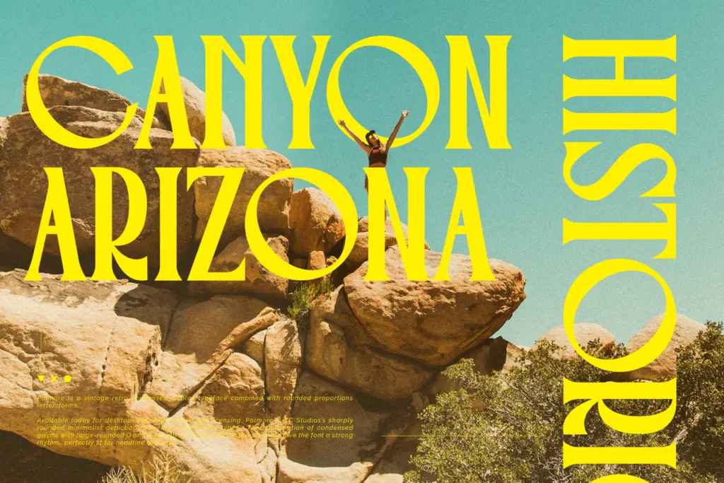
Palmore’s natural home is short-form display type: headlines, mastheads, posters, packaging labels, badges and logotypes that want a vintage or retro flavour without tipping into pure novelty. The condensed proportions make it efficient for tight spaces — a narrow book spine, a product label, a single punchy word on a social graphic — where a wider serif would struggle to fit.
It is not a body text font, and the seller doesn’t pretend otherwise; at small sizes the rounded serifs and tight spacing will blur together and the character starts working against readability. Keep it to a handful of words, set large, and let the alternates do some of the styling work. For anything needing sustained reading — paragraphs, captions, long-form editorial copy — pair it with a plainer serif or sans and reserve Palmore for the moments that need a bit of period charm.
What we liked, and what we didn’t
Strengths
- The rounded O and C give an otherwise condensed face real personality and warmth.
- Alternates and ligatures let you meaningfully change the texture of a headline, not just decorate it.
- Four weights provide enough range for basic hierarchy within display work.
Trade-offs
- Too condensed and characterful to work as a body text font at small sizes.
- The vintage rounded look is distinctive enough that it won't suit every brand or project.
Palmore is a confident condensed display serif with a distinctive rounded twist that reads clearly as vintage without being a costume. It's not built for body text and shouldn't be asked to do that job, but for headlines, labels and short display copy it has real character.

Tmfonts writes independent reviews of typefaces: what each font does well, where it falls short, what it suits, and where it is sold.