Script
3.7
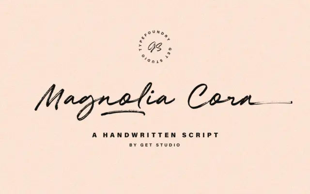
Magnolia Cora Script: a brush-textured script for casual, handmade branding
Design style Magnolia Cora Script is built around the idea of a dry brush dragged across paper rather than a…
 Tmfonts

Design style Magnolia Cora Script is built around the idea of a dry brush dragged across paper rather than a…
Tmfonts
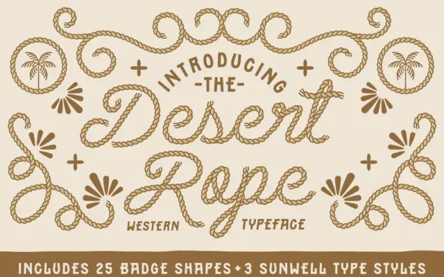
Design style Desert Rope is a connecting script built around a rope motif — loose, looping strokes that read as…
Tmfonts
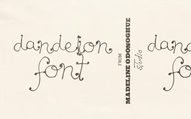
Design style Dandelion is a hand-drawn display font built around a loose, botanical line. The strokes wobble slightly, the stems…
Tmfonts
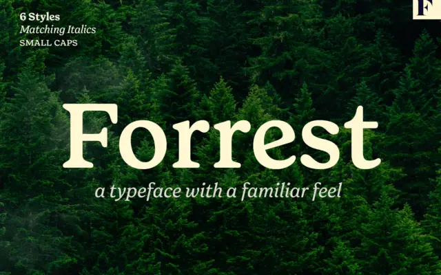
Design style Forrest is a serif built on nostalgia rather than novelty. The letterforms read as a reworking of old…
Tmfonts
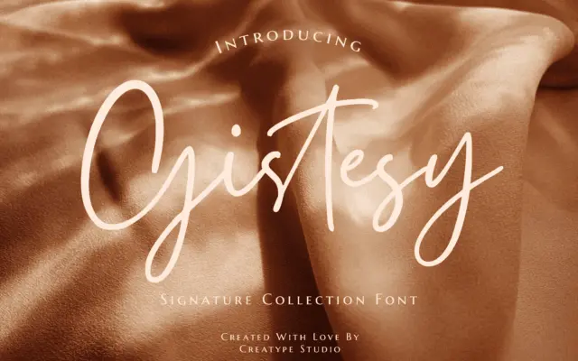
Design style Gistesy belongs to the crowded family of signature-style scripts built to look like a fast, confident hand with…
Tmfonts
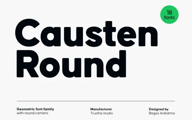
Design style Causten Round takes a geometric skeleton — circular counters, even stroke widths, a constructed look — and files…
Tmfonts
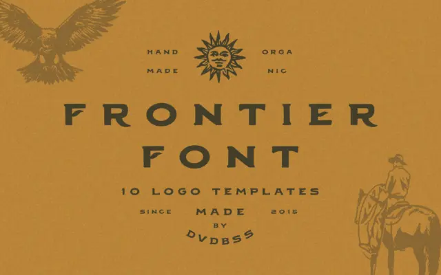
Design style Frontier is a slab-adjacent serif built on Western sign-painting conventions: wide proportions, blunt serifs, and the slightly irregular…
Tmfonts
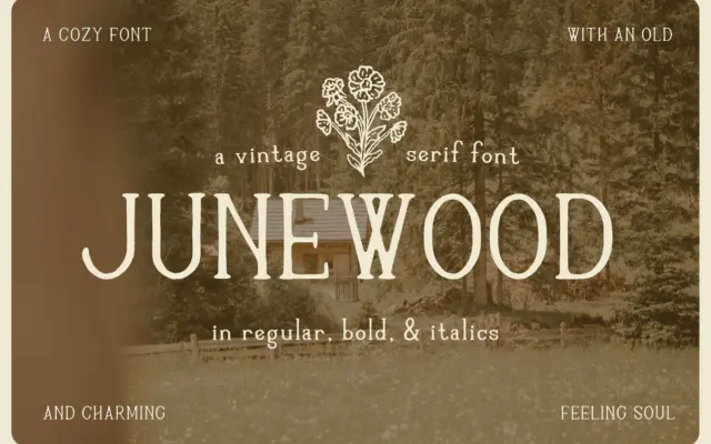
Design style Junewood is a handdrawn serif built on irregularity rather than precision. The strokes wobble slightly at the edges,…
Tmfonts
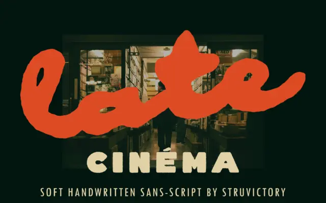
Design style Late Cinema runs on a contrast that gives it most of its personality: solid, almost sans-serif capitals set…
Tmfonts