Serif
3.9
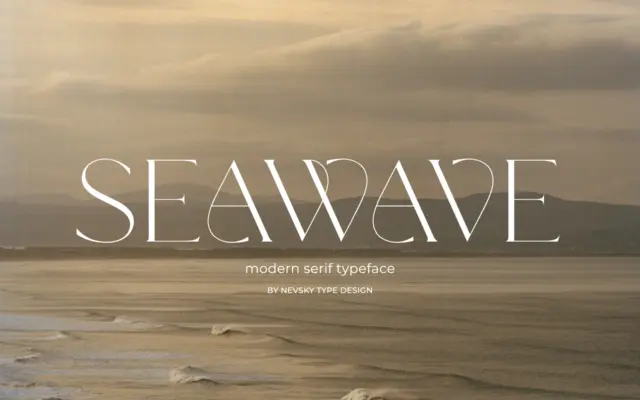
NT Seawave: a high-contrast serif for fashion and luxury branding
Design style NT Seawave belongs to the family of high-contrast serifs that trace back to Didone models but push the…
 Tmfonts

Design style NT Seawave belongs to the family of high-contrast serifs that trace back to Didone models but push the…
Tmfonts
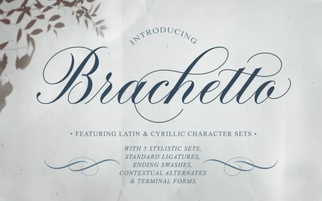
Design style Brachetto sits in the copperplate-influenced camp of calligraphic scripts, but it doesn’t try to replicate a pointed-pen hand…
Tmfonts
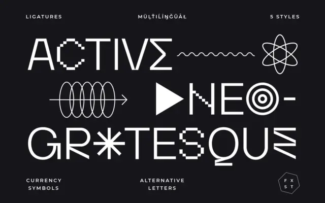
Design style Activica sits in neo-grotesque territory, but it doesn’t stay quiet about it. The skeleton is the familiar calm…
Tmfonts
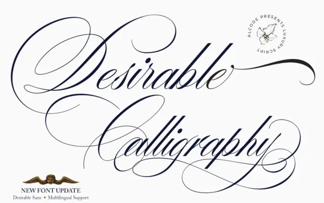
Design style Desirable Calligraphy sits in the crowded field of pointed-nib scripts that reference old manuscript hands, but it leans…
Tmfonts
Design style Authoritative sits in the crowded field of brush-adjacent, marker-style scripts built to look like a quick note rather…
Tmfonts
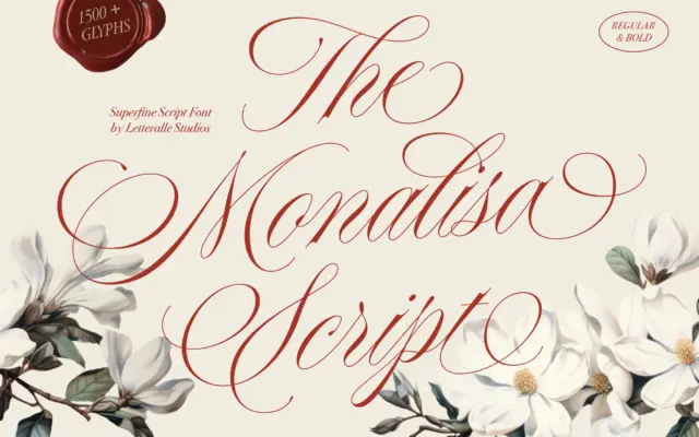
Design style Monalisa Script sits in the crowded field of fine-tipped calligraphy scripts, the kind built to look like it…
Tmfonts
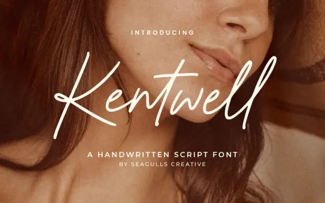
Design style Kentwell sits in the crowded field of casual handwritten scripts built to look like a quick pen note…
Tmfonts
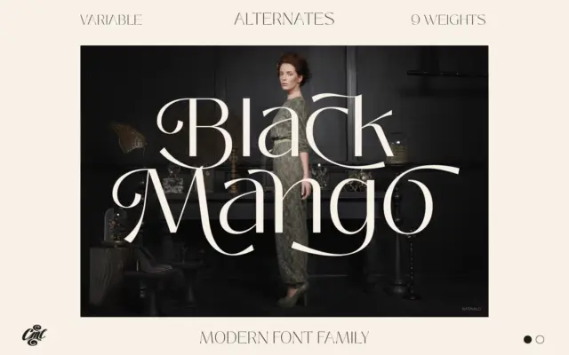
Design style Black Mango sits in the current wave of pared-back grotesque-adjacent sans faces: low contrast, closed apertures kept just…
Tmfonts
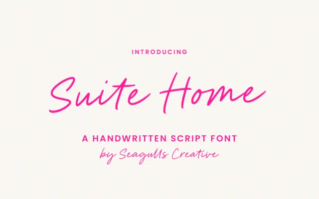
Design style Suite Home sits in the casual end of the handwritten script category, the kind of lettering that reads…
Tmfonts