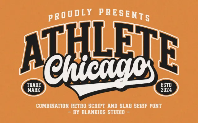
Chicago Athlete: a varsity slab-and-script duo for team branding
Design style Chicago Athlete pulls from collegiate athletic lettering: the block-letter jerseys, the stitched patches, the varsity jacket chest logo.…
Tmfonts reviews typefaces in depth — every font is tested in real branding, editorial and screen layouts before a word gets written. 555+ fonts reviewed and counting.
Design style Chicago Athlete pulls from collegiate athletic lettering: the block-letter jerseys, the stitched patches, the varsity jacket chest logo.…
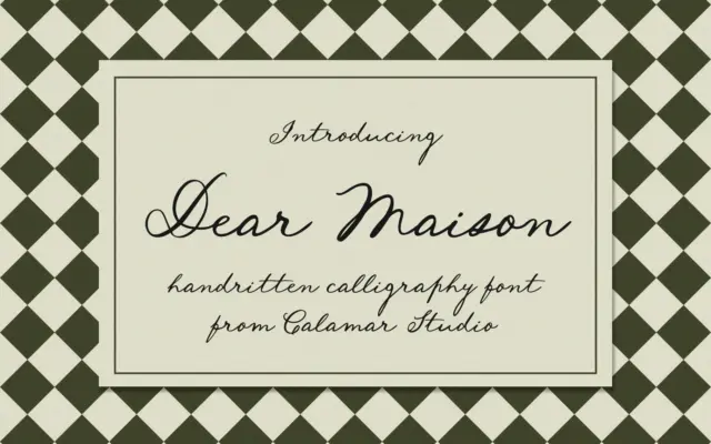
Design style Dear Maison is a monoline-leaning cursive script that leans into a loose, handwritten quality rather than formal calligraphy.…
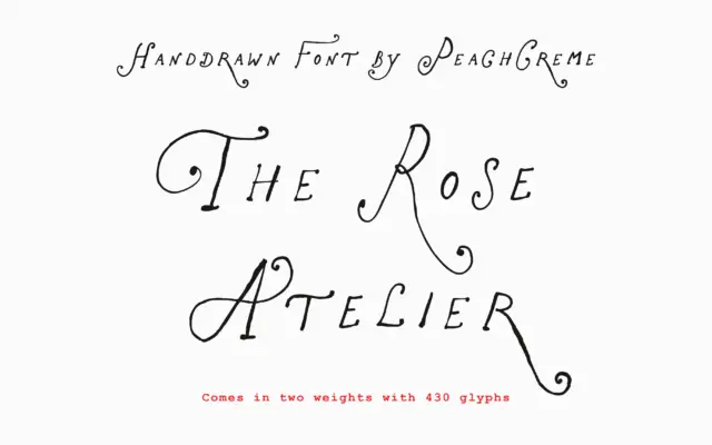
Design style The Rose Atelier sits in the crowded field of hand-drawn display scripts built for feminine branding, but it…
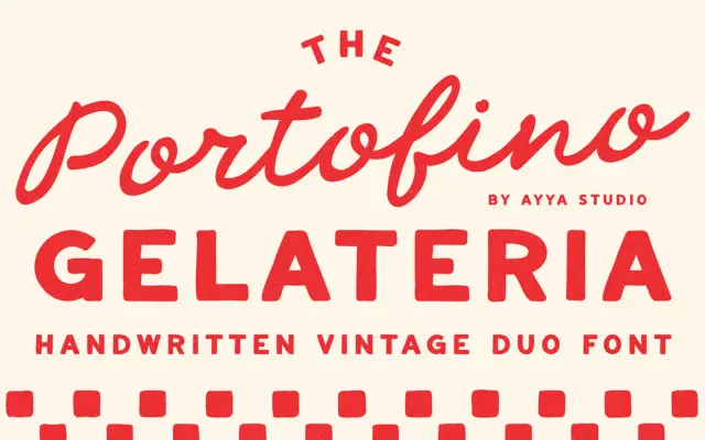
Design style Portofino Gelateria is built around a familiar but well-executed idea: a loose, handwritten script paired with a plainer…
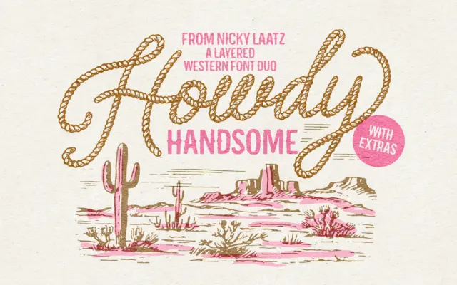
Design style Howdy Handsome leans hard into a specific vernacular: the hand-lettered rope script you’d expect on a rodeo poster…
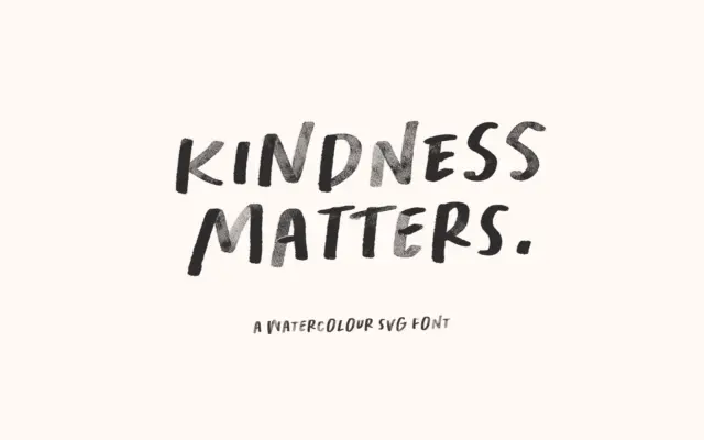
Design style Kindness Matters is a handwritten, all-caps display face built around a watercolour texture baked directly into the letterforms.…
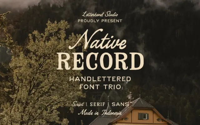
Design style The Native Record is built as a three-part system rather than a single face: a hand-lettered script, a…
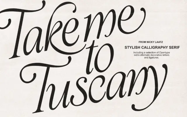
Design style Take Me To Tuscany is a calligraphic italic built on exaggerated contrast: thick, ink-loaded downstrokes against fine hairline…
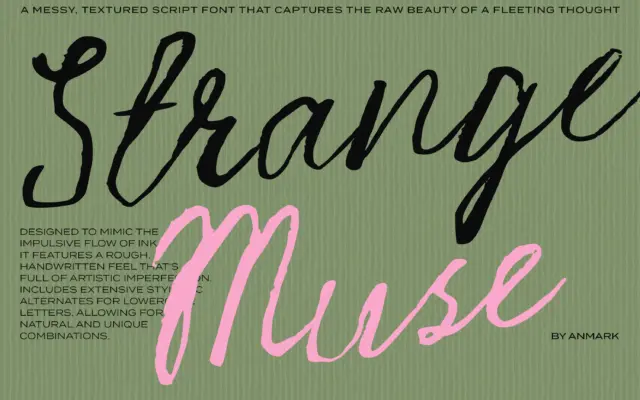
Design style Strange Muse leans hard into the raw side of script lettering. Strokes vary in pressure the way a…