
Chleo Phenelope Handwriting Font Free Download
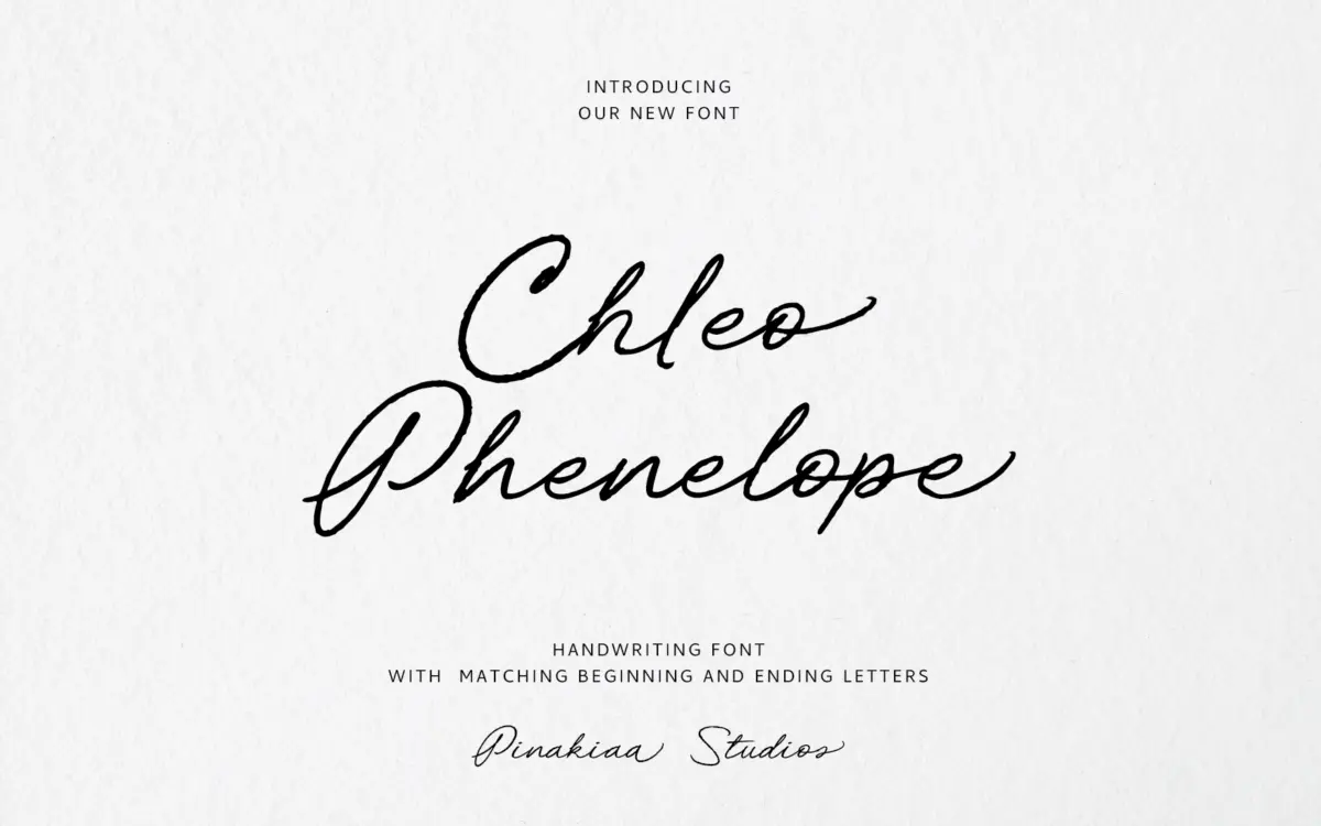
Is Chleo Phenelope Handwriting free to download?
Chleo Phenelope Handwriting is a commercial font sold on Creative Market, so the full version needs a paid license. Get it from the official listing: Chleo Phenelope Handwriting font download.
Need something free? These handwritten fonts from Google Fonts are free for personal and commercial use:
Design style
Chleo Phenelope Handwriting sits in the informal end of the script spectrum — a font built to look like someone wrote it quickly with a fine marker or a felt-tip pen, rather than one modelled on formal copperplate or calligraphic tradition. The strokes are loose and slightly uneven, with joins that lean rather than connect with mechanical precision. There’s a deliberate rawness to it: baselines drift, letter angles vary, and the overall rhythm reads as a real hand rather than a vector trace of one.
That rawness is the whole point of the design, and it works as long as you accept the trade-off that comes with it. This isn’t a script built for polish or restraint. It leans into imperfection as a style choice, which means it reads as warm and personal rather than premium or formal. If you’re after the sort of script that looks etched onto a wedding invitation with quiet elegance, this isn’t quite that register — it’s closer to a note scribbled on a card, or the kind of lettering you’d see on a small-batch product label.
Character set and features
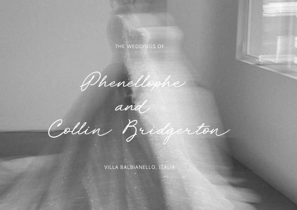
The font ships with three alternate styles per letter, which is the feature worth paying attention to here. Swapping between alternates as you set a word breaks up the repetition that plagues handwriting fonts — without them, any script tends to look suspiciously uniform the moment the same letter repeats twice in a headline. With three variants in rotation, Chleo Phenelope avoids that trap reasonably well, especially in short phrases where the eye has time to notice repeated shapes.
Ligatures are also included, which help smooth over some of the more awkward letter-to-letter transitions that scripts run into — particularly around ascenders and descenders that would otherwise collide or leave odd gaps. Used well, ligatures are what separate a script that reads as connected handwriting from one that reads as disconnected letters glued together. Whether you get the full benefit depends on your software supporting OpenType features properly; if you’re working in an environment that doesn’t apply ligatures and alternates automatically, you’ll need to be comfortable hunting through a glyph panel to access them manually, which not every designer wants to do on a deadline.
Use cases
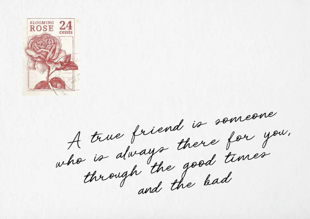
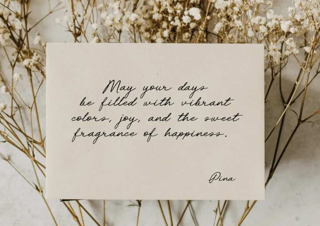
This font suits short-form, personal-feeling work: greeting cards, social media quote graphics, packaging accents, gift tags, and the occasional logo mark for a brand that wants to feel handmade rather than corporate. It’s well suited to setting a single line or a short phrase where its looseness reads as charm rather than noise.
It is not a font for long paragraphs or body copy — like most handwriting scripts, the irregularity that makes it appealing at display size becomes fatiguing to read once you’re several lines deep. Keep it to headlines, callouts, and short quotes, and pair it with a plain, quiet sans or serif for anything that needs actual reading. Used that way, in small doses, it does its job well.
What we liked, and what we didn’t
Strengths
- Three alternate styles per letter break up repeated letterforms in short phrases
- Ligatures smooth over awkward joins between ascenders and descenders
- Well suited to informal, handmade-feeling branding and packaging accents
Trade-offs
- The deliberate unevenness makes it tire the eye quickly at paragraph length
- Getting full use of the alternates and ligatures depends on software with proper OpenType support
Chleo Phenelope Handwriting is a casual, felt-tip style script that leans into imperfection rather than polish. The alternates and ligatures help it avoid looking repetitive, but it's strictly a short-phrase, display-size tool — not one for body text or formal invitation work.

Tmfonts writes independent reviews of typefaces: what each font does well, where it falls short, what it suits, and where it is sold.