
Daydream Font Free Download
Is Daydream free to download?
Daydream is a commercial font sold on Creative Market, so the full version needs a paid license. Get it from the official listing: Daydream font download.
Need something free? These handwritten fonts from Google Fonts are free for personal and commercial use:
Design style
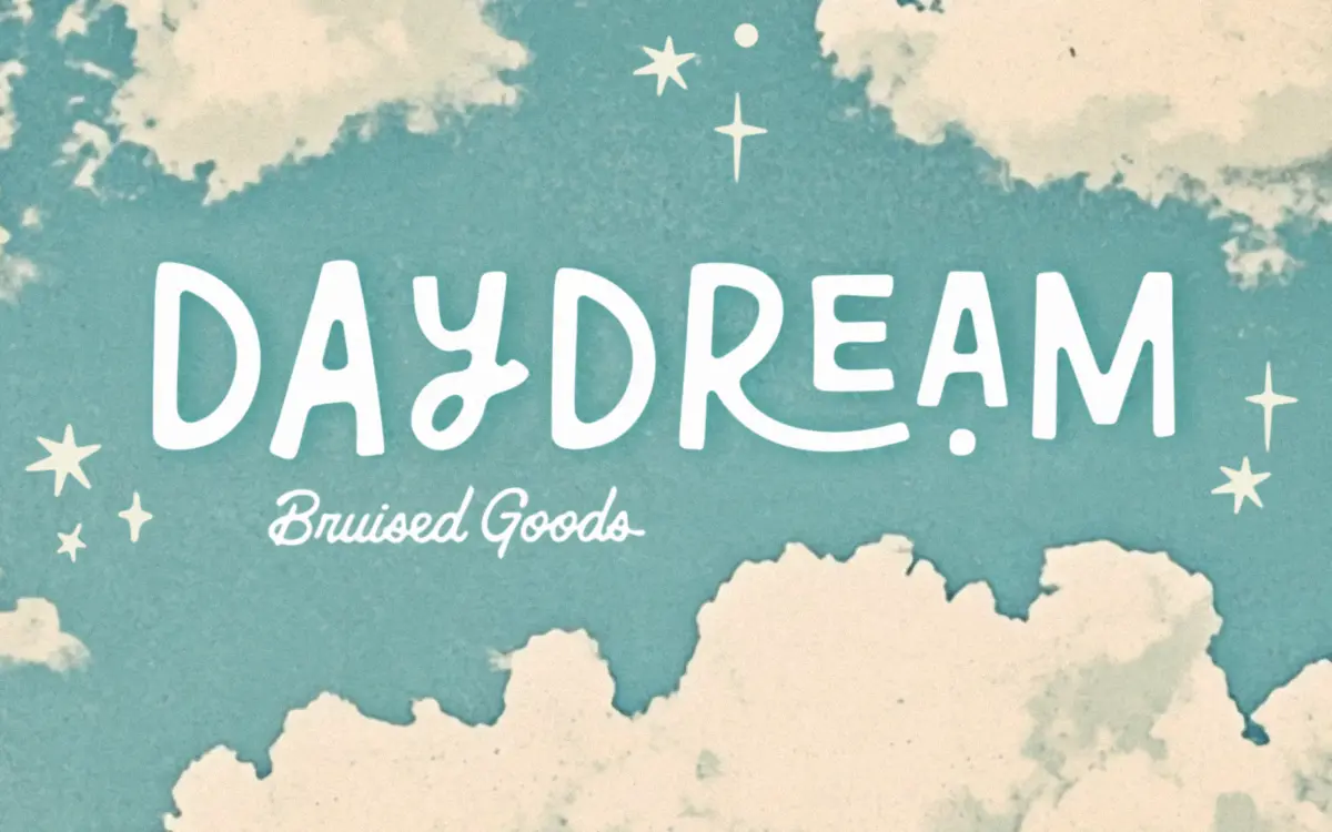
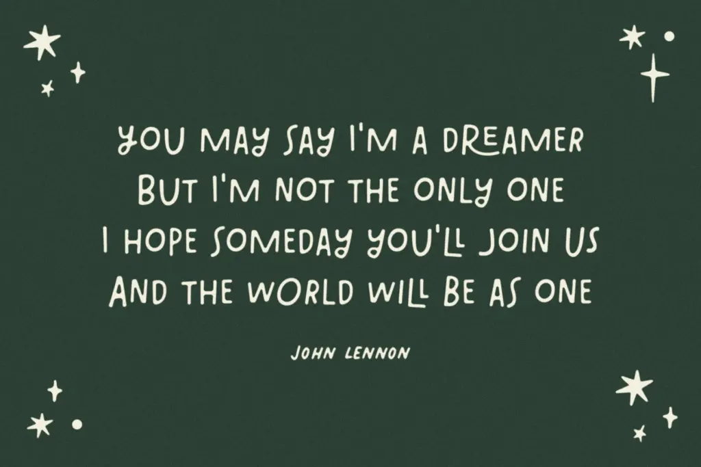
Daydream is a hand-lettered display face built for headlines rather than sentences, and it’s honest about that limitation from the start. The letterforms have the slightly wobbly, marker-drawn quality typical of the genre: strokes swell and thin in places a ruling pen never would, and joins between letters lean on ligatures rather than uniform spacing. It reads as friendly and a bit goofy, closer to a hand-drawn sticker than a formal script. The uppercase-only structure gives it a blocky, poster-like presence when set large, which suits the loose, unfussy character of the drawing.
The family comes in four styles — Light, Regular, Bold, and an Outline — which gives more range than most single-weight novelty scripts. The Outline in particular opens up layering options: stack it over a solid weight for a two-tone effect, or use it alone for a lighter touch on packaging or merch where a solid mark would feel heavy.
Character set and features
Each style carries 340 glyphs, covering uppercase, numerals, symbols, and punctuation, with language support extending to Danish, English, French, German, Irish, Italian, Portuguese, Spanish, Swedish, and Swiss German. That’s a reasonably wide net for a display font of this kind, and it means the accented characters needed for those languages are actually drawn rather than left to fallback.
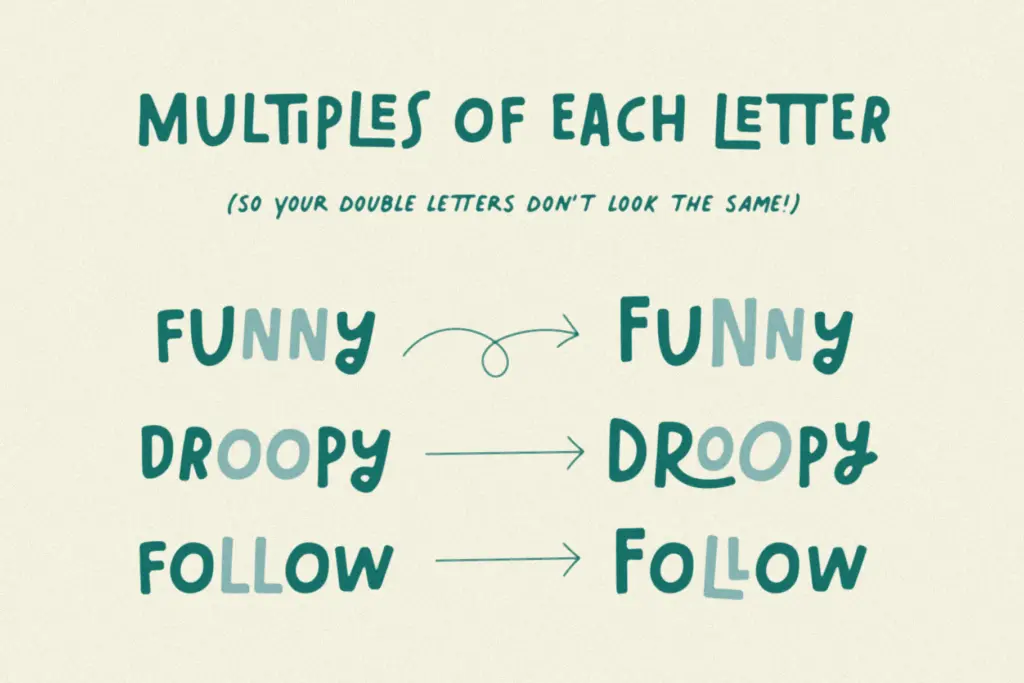
The ligatures are the feature to pay attention to, and also the reason the font is restricted to display use. Letter pairs and common combinations are given custom joins so words look continuously lettered rather than typed, which is the whole appeal of a font like this. But that same mechanism is fragile at length — set a full sentence and the contextual alternates start working against each other, producing collisions and awkward spacing rather than the smooth flow they’re designed for. This isn’t a flaw so much as a boundary condition: the font wants short bursts of text, not paragraphs.
Use cases
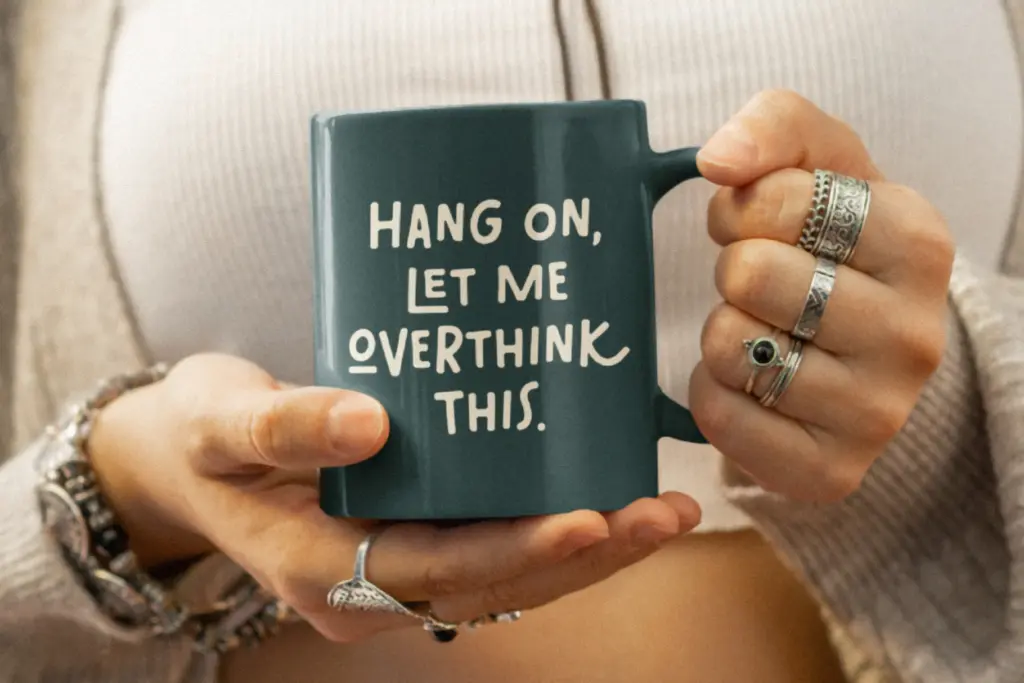
Daydream is built for headlines, logotypes, short taglines, and packaging call-outs — anywhere a handful of words need to feel warm and handmade rather than templated. It suits kids’ brands, baby products, casual apparel, and stickers particularly well, where the slightly imperfect linework reads as charm rather than sloppiness. It also works for social posts and merchandise where a single word or short phrase carries the whole design.
It’s less useful anywhere text needs to stay legible at small sizes or run long — subheads in a brochure, body copy, or anything requiring dense information. Pair it with a plain, restrained sans for supporting text, since Daydream’s job is to do the loud part and get out of the way for the rest.
What we liked, and what we didn’t
Strengths
- Four styles including a usable Outline for layering effects
- Wide language support for a novelty display font
- Ligatures create a genuinely continuous, hand-lettered flow at short lengths
Trade-offs
- Not legible or stable enough for anything beyond short headlines or single words
- Uppercase-only character set limits typographic flexibility
Daydream is a solidly drawn, cheerful display face that does exactly what it says: short bursts of hand-lettered charm for logos, packaging, and headlines. The ligature system that makes it feel handmade also caps its usefulness at longer lengths, so know its limits going in. For kids' brands, merch, and casual branding work, it earns its keep.

Tmfonts writes independent reviews of typefaces: what each font does well, where it falls short, what it suits, and where it is sold.