
Oakes Grotesk Font Free Download
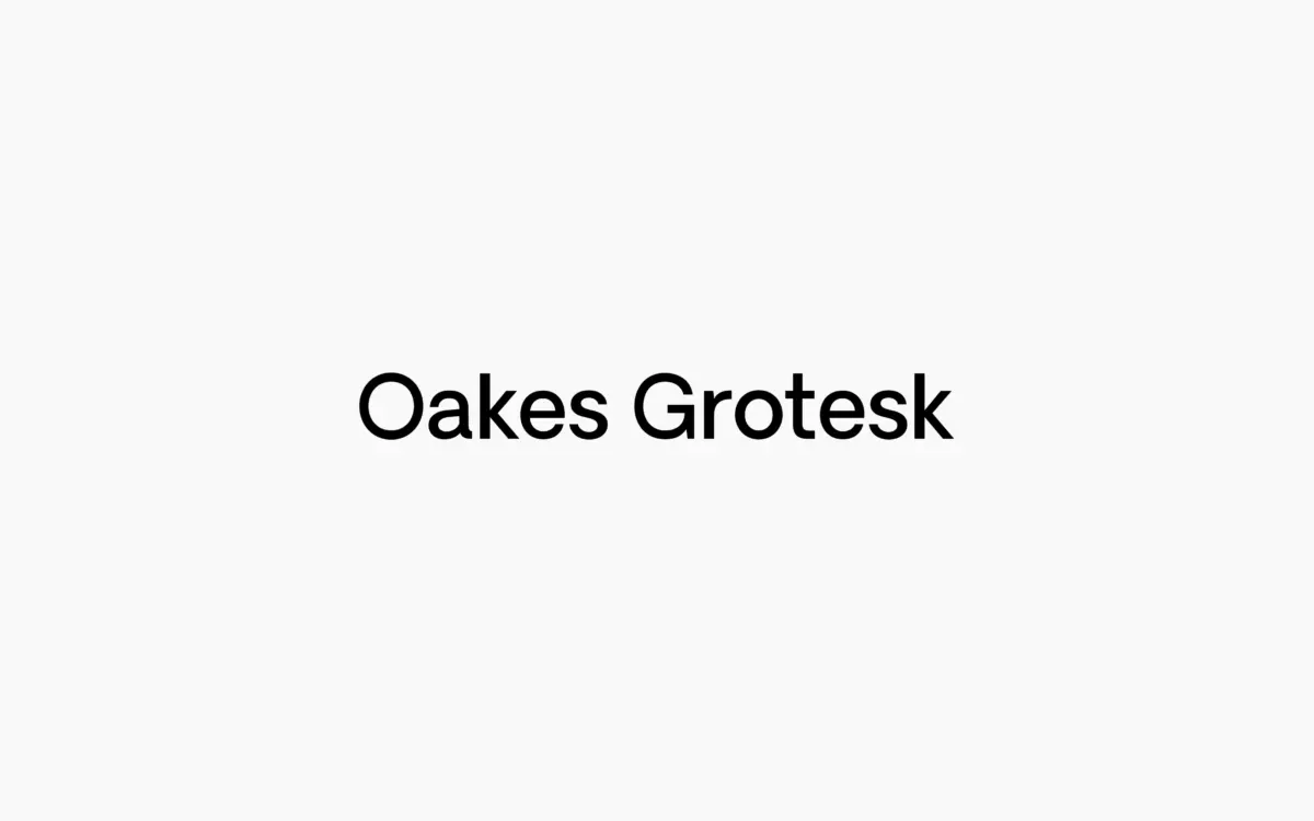
Is Oakes Grotesk free to download?
Oakes Grotesk is a commercial font sold on Creative Market, so the full version needs a paid license. Get it from the official listing: Oakes Grotesk font download.
Need something free? These sans serif fonts from Google Fonts are free for personal and commercial use:
Design style
Oakes Grotesk is the more buttoned-down sibling of Studio Few’s original Oakes typeface, and the family reads as a deliberate reworking rather than a simple weight expansion. The brief was legibility at text sizes, and it shows in the metrics: wider apertures, steadier stroke contrast, and a general willingness to sacrifice a bit of personality for evenness. The curves that gave the original Oakes its warmth are still there, but they’ve been reined in. You see it in the shoulders of the n and m, which round off softly instead of snapping into a corner, and in the terminals, which stay blunt rather than tapering into anything showy.
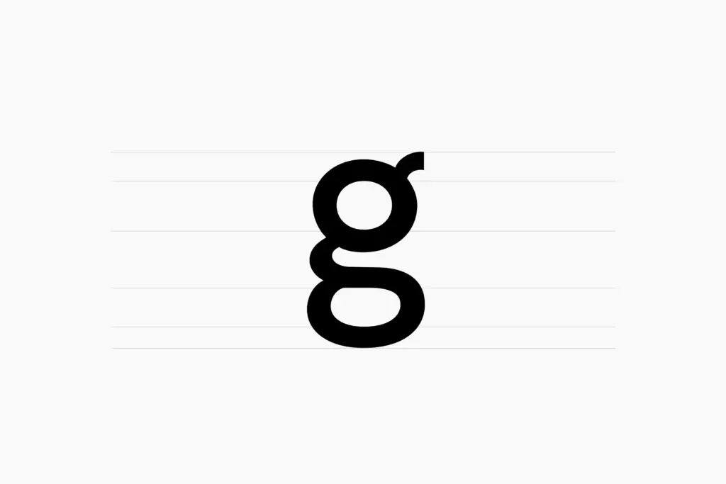
The most telling change is the g. Oakes Grotesk swaps in a double-story form, which is a different animal from a single-story bowl in both rhythm and texture on the page. It’s a more conservative, more legible choice, and it signals what this typeface is for: it wants to sit in paragraphs, not just shout from a poster. That said, the grotesk label undersells how much curvature survives — this isn’t a neutral, geometric workhorse. There’s still a trace of humanist warmth in the counters, which keeps it from feeling clinical.
Character set and features
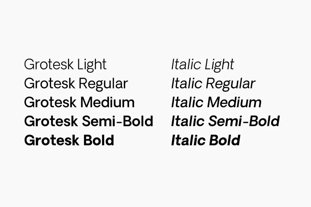
Five weights plus italics gives you a workable range, from a light suitable for long-form text to a bold that can hold its own in a headline without needing a separate display cut. The italics aren’t a slanted afterthought — they carry their own curvature that matches the roman’s temperament, which is worth checking before you assume italics are interchangeable across weights.
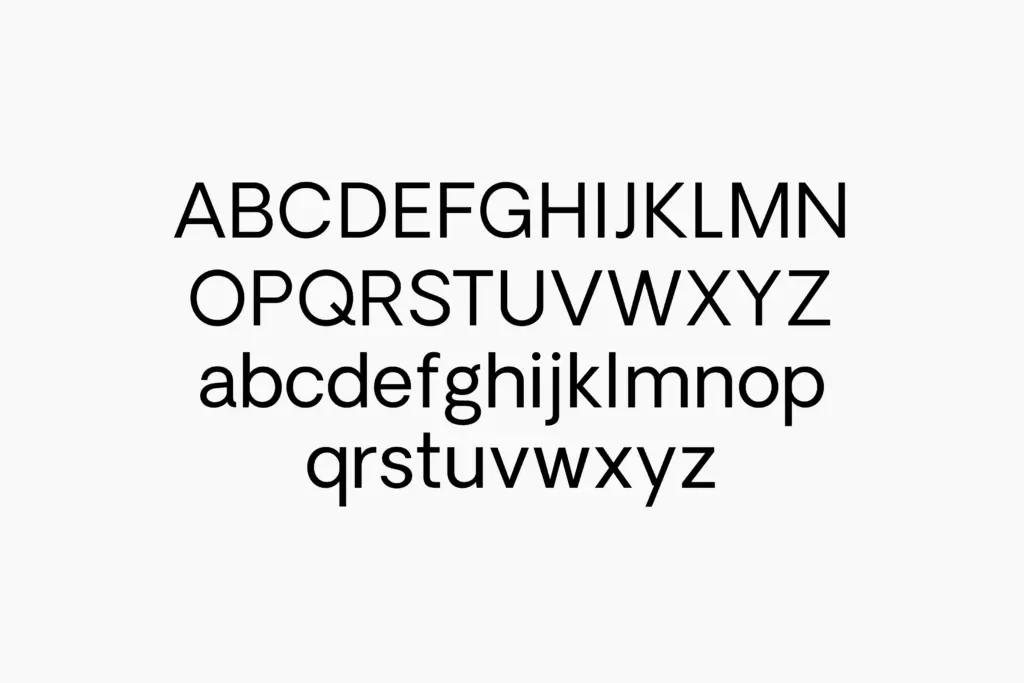
Language coverage extends across Baltic, Central European, Western European, Dutch, Romanian and Turkish sets, plus Euro currency support, so it’s built for European-market work beyond basic Latin. That’s a meaningful detail if your projects involve multilingual branding, though it’s worth confirming diacritic spacing yourself in dense paragraphs, as accented glyphs can crowd unpredictably in typefaces that weren’t originally drawn with them in mind.
What’s less clear from the specimen is how deep the OpenType feature set goes — there’s no mention of alternates, ligatures beyond the standard set, or fractions, so treat this as a solid, functional grotesk rather than a feature-loaded one. If your work depends on stylistic sets or small caps, you’ll want to verify those exist before committing a layout to them.
Use cases
This is a typeface for identity systems that need to run long: annual reports, editorial layouts, corporate websites, packaging copy blocks — anywhere the same face has to work as both a headline and three paragraphs of body text underneath it. The five-weight range makes it plausible as a standalone system font rather than something you pair with a serif for contrast, which is useful if a client wants one typeface doing everything.
It’s less exciting as a pure display face. The restraint that makes it legible at 10pt also makes it a bit anonymous at 96pt — there are other groteskss with more attitude if the job is a single word on a poster. Oakes Grotesk earns its keep in the unglamorous middle distance: the reports, the UI, the packaging panel nobody photographs for a portfolio but somebody has to read.
What we liked, and what we didn’t
Strengths
- The double-story g and widened apertures genuinely improve readability at text sizes.
- Five weights plus matching italics cover headline-to-body duty without a second typeface.
- Extended European language support makes it usable for multilingual branding work out of the box.
Trade-offs
- The restraint that helps body text makes large display use feel a bit flat and anonymous.
- No mention of stylistic alternates or extended OpenType features, so it's functional rather than expressive.
Oakes Grotesk does exactly what it sets out to do: make a warmer grotesk legible enough for body copy without losing all its character. It's a dependable corporate workhorse rather than a showpiece, and it's most useful to designers who need one typeface to run from paragraph to headline without switching families.

Tmfonts writes independent reviews of typefaces: what each font does well, where it falls short, what it suits, and where it is sold.