Script
3.9
Aspire Pasque: a serif-and-script pairing for wedding and luxury work
Design style Aspire Pasque is a two-part duo built on a familiar formula: a formal serif paired with a fluid…
 Tmfonts

Design style Aspire Pasque is a two-part duo built on a familiar formula: a formal serif paired with a fluid…
Tmfonts
Design style Maple is a heavy, blocky display face built for impact rather than nuance. The letterforms sit close to…
Tmfonts
Design style Wild Oaklands sits in the loose, marker-pen end of the script spectrum. The strokes carry visible ink pooling…
Tmfonts
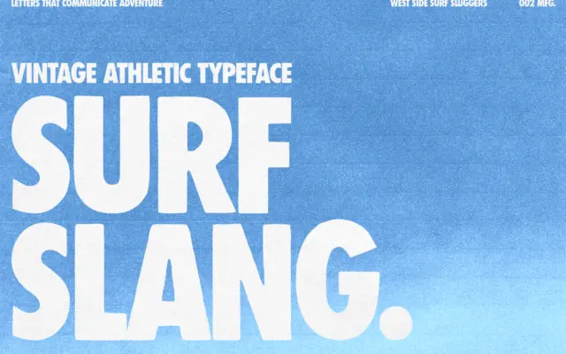
Design style Surf Slang is a heavyweight condensed sans built for shouting rather than reading. The letters are squeezed tight,…
Tmfonts
Design style PressBox is built around the look of old metal type shops: wood-block posters, hand-set job printing, the kind…
Tmfonts
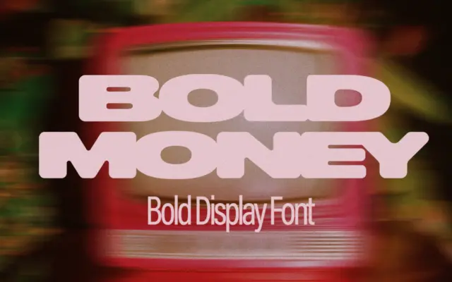
Design style Bold Money is a heavyweight all-caps display face built around a single conceit: the letters look like they’re…
Tmfonts
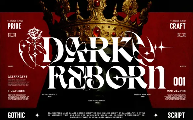
Design style Dark Reborn sits at the collision point of Blackletter and modern serif construction. Rather than the tight, angular…
Tmfonts
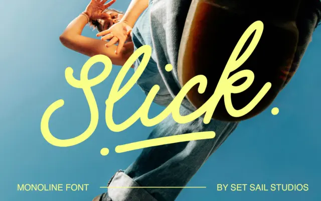
Design style Slick is a monoline cursive script — one stroke weight throughout, no shading or contrast to lean on.…
Tmfonts
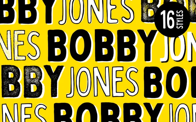
Design style Bobby Jones is a bold, handcrafted display sans built on the idea that imperfection is the point. The…
Tmfonts