Script
3.9
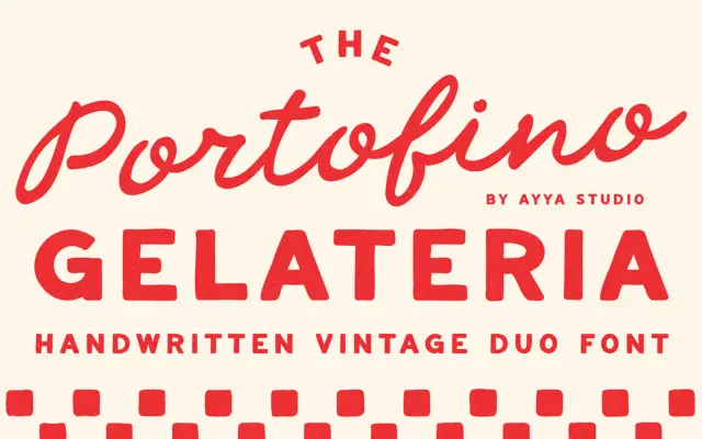
Portofino Gelateria: a hand-drawn script duo for retro Italian branding
Design style Portofino Gelateria is built around a familiar but well-executed idea: a loose, handwritten script paired with a plainer…
 Tmfonts

Design style Portofino Gelateria is built around a familiar but well-executed idea: a loose, handwritten script paired with a plainer…
Tmfonts
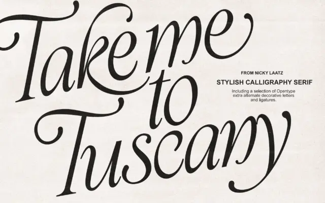
Design style Take Me To Tuscany is a calligraphic italic built on exaggerated contrast: thick, ink-loaded downstrokes against fine hairline…
Tmfonts
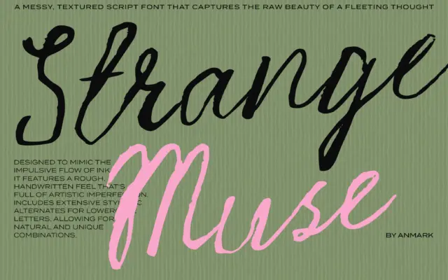
Design style Strange Muse leans hard into the raw side of script lettering. Strokes vary in pressure the way a…
Tmfonts
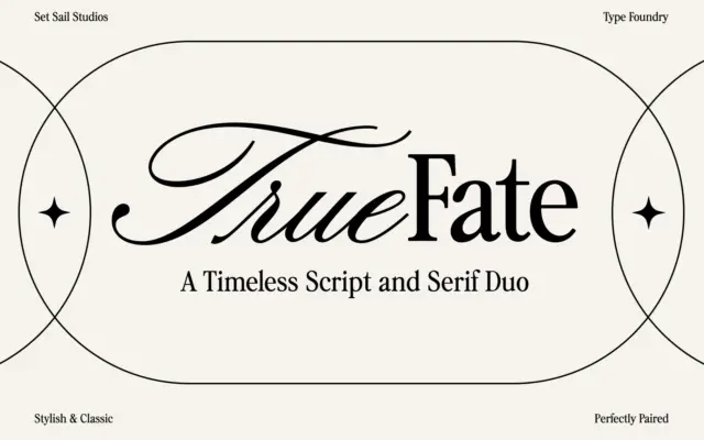
Design style True Fate arrives as two related but distinct faces rather than one typeface with a variant. The script…
Tmfonts
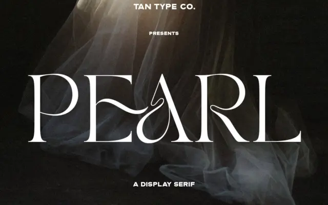
Design style TAN – PEARL sits in that crowded but reliable category of the ‘fashion serif’ — high contrast strokes,…
Tmfonts
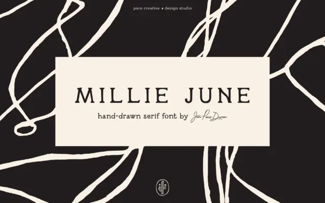
Design style Millie June is a hand-drawn serif that leans into its own wobble rather than smoothing it out. Strokes…
Tmfonts
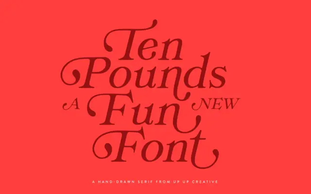
Design style Ten Pounds is a hand-drawn serif with the wobble and inconsistency you’d expect from a font built off…
Tmfonts
Design style Pumped Up Kicks is a bold sans-serif display face built entirely around movement. Letters wobble off an implied…
Tmfonts
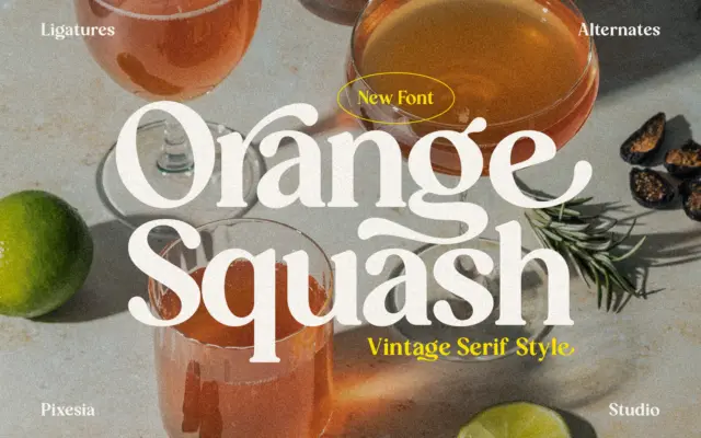
Design style Orange Squash sits in the current wave of thick-serif display faces that lean on 1970s packaging and record-sleeve…
Tmfonts