Serif
3.9
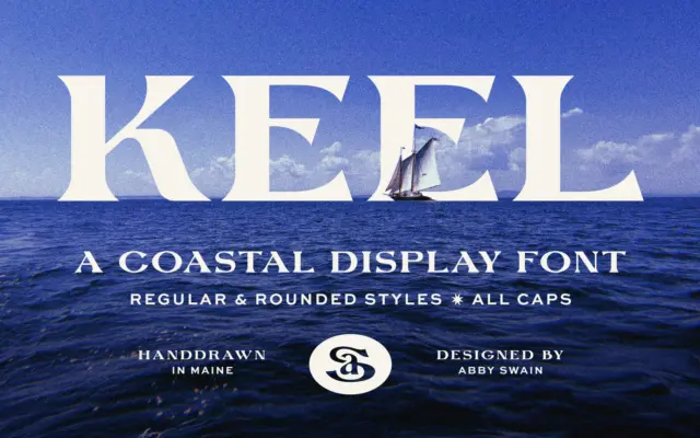
Keel: a hand-drawn coastal serif for signage and small-brand identity
Design style Keel is a display serif built on the kind of irregularity that only comes from drawing letters by…
 Tmfonts

Design style Keel is a display serif built on the kind of irregularity that only comes from drawing letters by…
Tmfonts
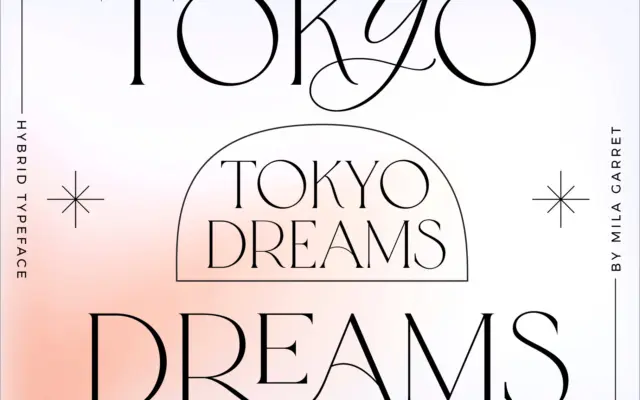
Design style Tokyo Dreams is built around one central idea: a plain serif skeleton that can be dressed up or…
Tmfonts
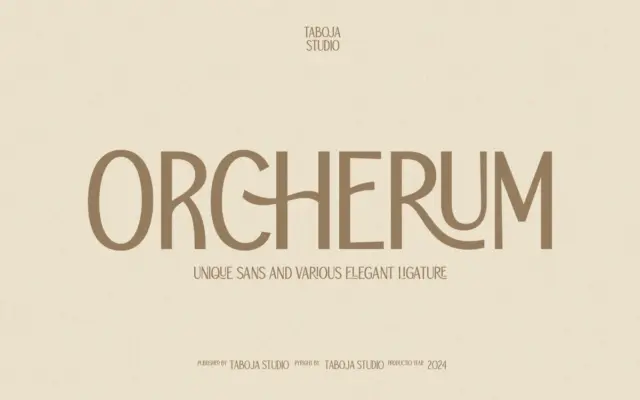
Design style TBJ Orcherum is a single-weight sans serif designed as a display face first and a text face never.…
Tmfonts
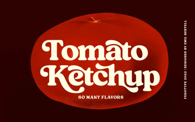
Design style Tomato Ketchup is a heavyweight vintage serif with the kind of stocky, confident stroke you’d expect from a…
Tmfonts
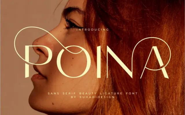
Design style Poina is an uppercase-only sans serif built around ligatures rather than a full running text system. The letters…
Tmfonts
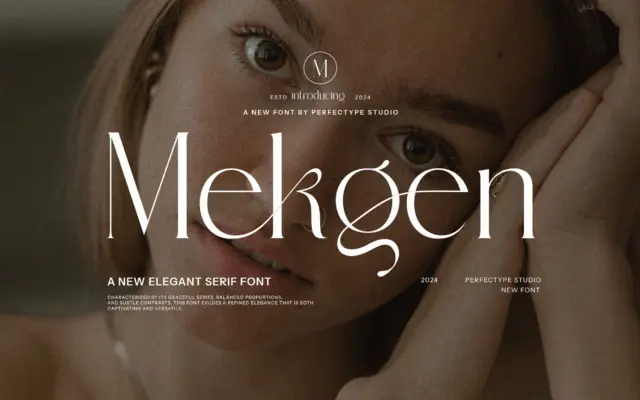
Design style Mekgen sits in the decorative serif camp rather than the text-serif one. The letterforms carry the usual markers…
Tmfonts
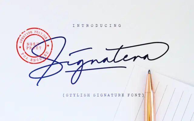
Design style Signatera belongs to the crowded family of monoline signature scripts — the kind built to look like a…
Tmfonts
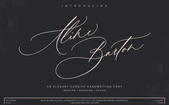
Design style Aline Barton belongs to the crowded family of brush-flavoured connecting scripts, but it leans harder into ornament than…
Tmfonts
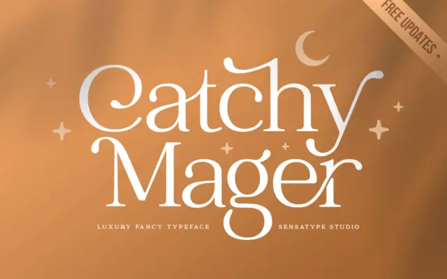
Design style Catchy Mager reads as a serif built primarily as a logotype tool rather than a text face. The…
Tmfonts