Display
3.8
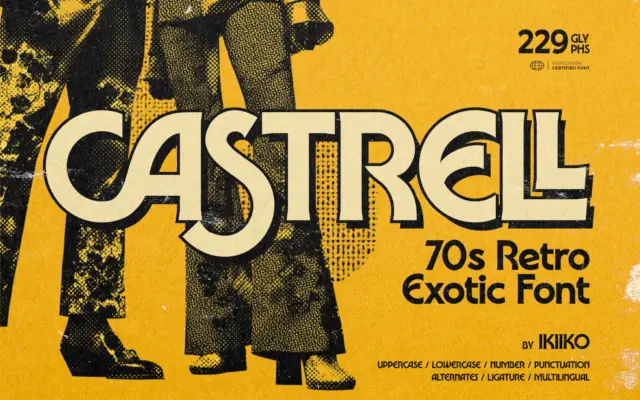
Castrell: a bold 70s funk display face for posters and retro branding
Design style Castrell sits in that overworked-but-still-fun lane of 70s revival lettering, the kind of face built to look like…
 Tmfonts

Design style Castrell sits in that overworked-but-still-fun lane of 70s revival lettering, the kind of face built to look like…
Tmfonts
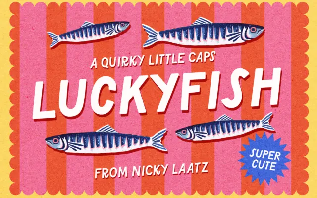
Design style Lucky Fish is an all-caps display sans built for noise, not nuance. The letterforms are chunky and slightly…
Tmfonts
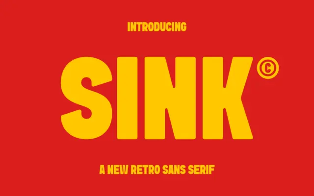
Design style Sink sits in that familiar territory of heavyweight retro sans faces: thick strokes, low contrast, and a general…
Tmfonts
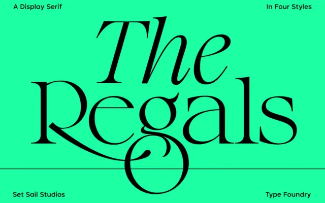
Design style The Regals sits in transitional serif territory: moderate stroke contrast, a vertical stress, and bracketed serifs that lean…
Tmfonts
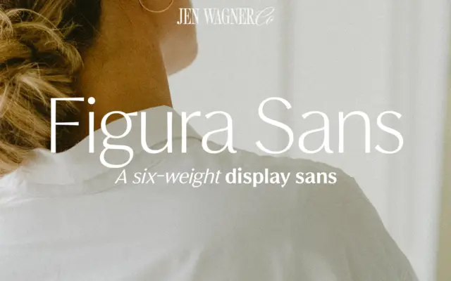
Design style Figura Sans belongs to the current run of “quiet luxury” sans serifs that trade on restraint rather than…
Tmfonts
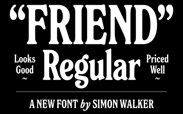
Design style Friend is a rounded serif built on unusually tall proportions. The x-height sits high, the ascenders and descenders…
Tmfonts
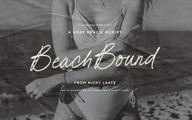
Design style Beach Bound is a pencil script built on a light, slightly textured stroke rather than a smooth brush…
Tmfonts
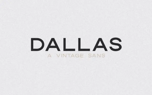
Design style Dallas is an uppercase-only sans with the slightly squared, workmanlike look of mid-century signage lettering. The forms are…
Tmfonts
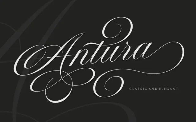
Design style Antura Script sits in the copperplate-revival family that has become crowded over the last decade, but it leans…
Tmfonts