Serif
3.9
Cravelo: a condensed vintage serif with rounded charm for headlines
Design style Cravelo sits at the intersection of two things that don’t often meet in one letterform: condensed vintage lettering…
 Tmfonts

Design style Cravelo sits at the intersection of two things that don’t often meet in one letterform: condensed vintage lettering…
Tmfonts
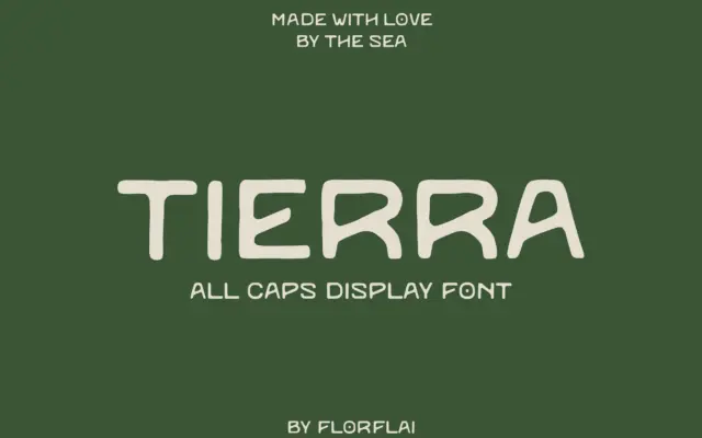
Design style Tierra reads as a sans, but it doesn’t behave like one. The name is the clue: it’s Spanish…
Tmfonts
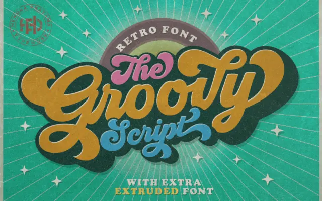
Design style Groovy grew out of a hand lettering project, and that origin shows in the way the strokes behave.…
Tmfonts
Design style Biker Diamond Typeface belongs to the badge-and-patch school of lettering that grew out of motorcycle club insignia, varsity…
Tmfonts
Design style Vintage Heirloom belongs to the crowded family of fine-point calligraphy scripts built to mimic pointed-pen lettering: thin hairline…
Tmfonts
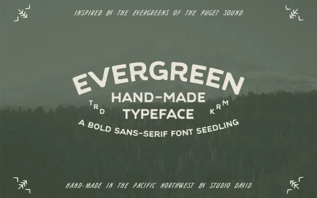
Design style Evergreen is an uppercase-only sans with a hand-built feel rather than a mechanically drawn one. The strokes carry…
Tmfonts
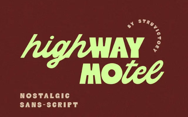
Design style Highway Motel is built on a split personality rather than a single letterform logic. The uppercase is a…
Tmfonts
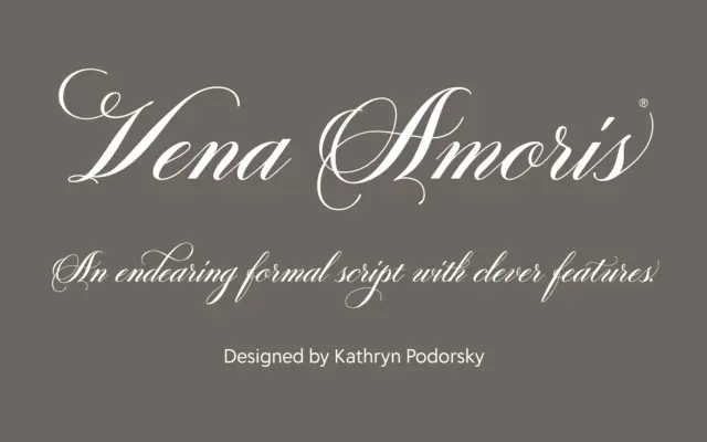
Design style Vena Amoris sits in the copperplate tradition: high contrast strokes, a pronounced slant, and the kind of pointed-pen…
Tmfonts
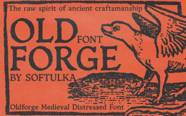
Design style Oldforge belongs to the well-worn category of distressed medieval display faces, the kind meant to evoke hand-forged signage,…
Tmfonts