Handwritten
3.9
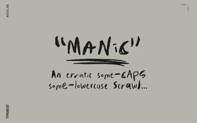
MANIC: a deliberately messy handwriting font for chaotic branding
Design style MANIC reads as a scrawl first and a typeface second, which is exactly the point. The letterforms mix…
 Tmfonts

Design style MANIC reads as a scrawl first and a typeface second, which is exactly the point. The letterforms mix…
Tmfonts
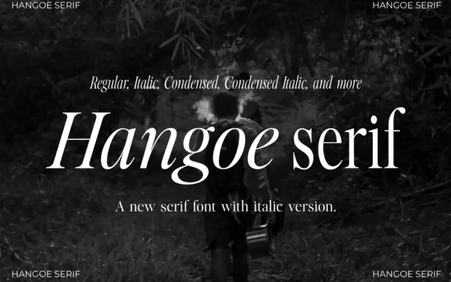
Design style Hangoe sits in old-style serif territory, but drawn with a taller, more condensed proportion than most revival faces…
Tmfonts
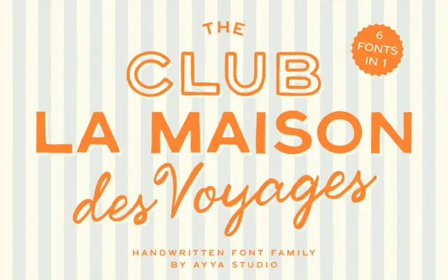
Design style This is a family built around a mood rather than a single letterform idea. The brief points to…
Tmfonts
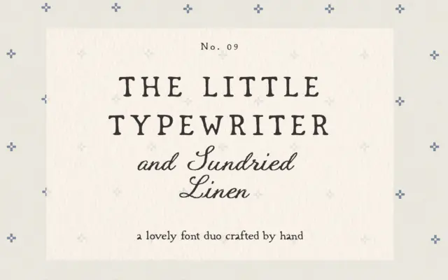
Design style This is a two-face set built around a single mood: worn paper, farmhouse shelves, hand-tied twine. Little Typewriter…
Tmfonts
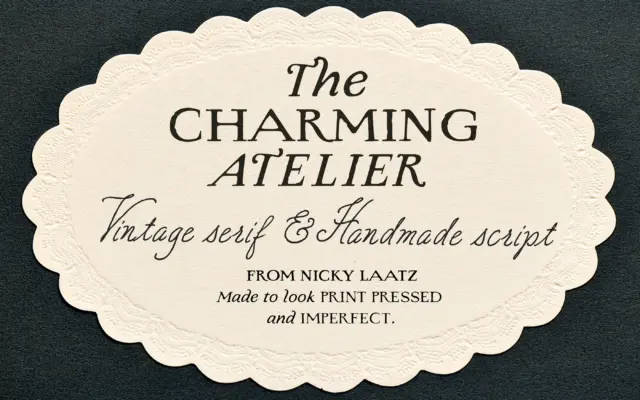
Design style The Charming Atelier is a two-part family built around a single premise: old letterpress printing wasn’t clean, and…
Tmfonts
Design style Black Paint Font is built from actual brushed strokes rather than a smoothed-over vector interpretation of one. Each…
Tmfonts
Design style Hello Branch sits in the soft-contrast serif territory that’s become a staple of branding kits over the past…
Tmfonts
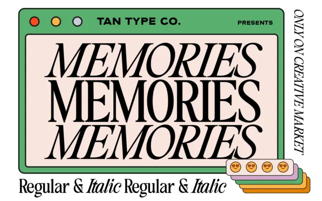
Design style TAN – Memories sits in the classic serif tradition: moderate contrast, bracketed serifs, a construction that owes more…
Tmfonts
Design style Wild Oaklands sits in the loose, marker-pen end of the script spectrum. The strokes carry visible ink pooling…
Tmfonts