
The Charming Atelier Font Duo Free Download
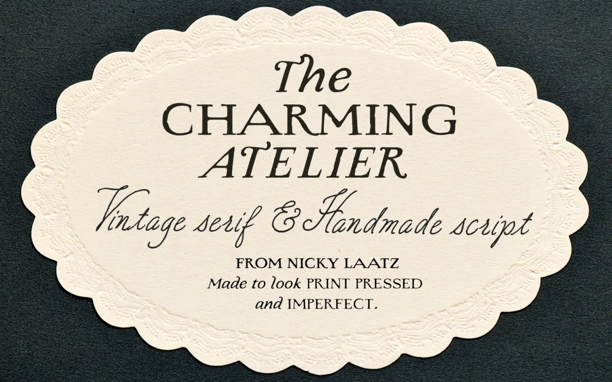
Is The Charming Atelier Font Duo free to download?
The Charming Atelier Font Duo is a commercial font sold on Creative Market, so the full version needs a paid license. Get it from the official listing: The Charming Atelier Font Duo download.
Need something free? These handwritten fonts from Google Fonts are free for personal and commercial use:
Design style
The Charming Atelier is a two-part family built around a single premise: old letterpress printing wasn’t clean, and that’s exactly why it’s charming. The serif half carries deliberately rough edges, uneven strokes and simulated ink bleed, the kind of texture that comes from metal type biting into damp cotton paper rather than a laser printer. It reads as antique without tipping into novelty — the letterforms themselves are fairly restrained classic serifs, and the wobble is what does the vintage work.
The script half is the more expressive of the pair. It’s handlettered rather than a mechanical connecting script, with visible variation from letter to letter and looping ascenders that give it movement. Where the serif is doing structure, the script is doing warmth — Nicky Laatz has pitched it closer to a fountain-pen love letter than a formal calligraphy hand, which suits the pairing’s stated intent of softness meeting polish.
Together they work the way a good duo should: neither one is trying to be the whole story. The serif can carry body copy or headline weight on its own; the script exists mainly to add a personal flourish over the top.
Character set and features
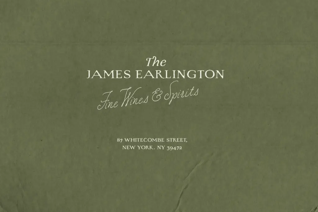
Both faces come in multiple weight variants, which is the practical strength here — a rough, heavy serif for a headline and a lighter, calmer version of the same letterforms for supporting text, without switching families. That range matters more with a texture-based face than with a clean one, since a single weight of a distressed serif can feel monotonous across a whole layout.
The script’s imperfect strokes are a double-edged feature. They’re what gives it its handmade authenticity, but they also mean some letter combinations sit more comfortably than others, and getting a full sentence to read evenly takes some manual kerning attention rather than trusting the defaults blindly. This is normal territory for handlettered scripts, not a flaw specific to this one, but it’s worth knowing before you set a paragraph of it and expect book-typesetting evenness.
The letterpress bleed effect on the serif is baked into the shapes rather than applied as a texture layer, so it scales predictably — it won’t suddenly look like a bitmap filter at large sizes, which is a common failure point for this style of face.
Use cases
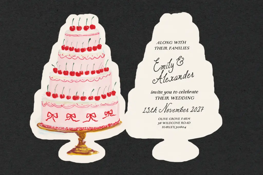
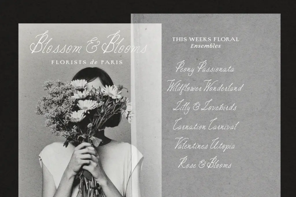
This duo is built for a narrow but well-defined lane: wedding stationery, vintage-leaning packaging and labels, boutique branding that wants a hand-finished, old-world feel, and editorial pieces going for a heritage tone. The serif’s rough edge and the script’s looseness both read best at display and mid-size — headers, monograms, short vows, product names — rather than as long-form running text.
It’s not a general-purpose UI or body-copy pairing, and it won’t suit anything wanting a crisp, contemporary look. But for the specific job of making a printed piece feel like it came off a hand-fed press a century ago, softened by a personal note in the margin, it’s a considered, well-matched pair rather than two unrelated fonts bundled together.
What we liked, and what we didn’t
Strengths
- Multiple weights in both faces let you build hierarchy without leaving the family
- The letterpress texture is drawn into the letterforms so it scales cleanly at large sizes
- The script and serif genuinely complement rather than compete with each other
Trade-offs
- The handlettered script needs manual spacing attention to read evenly across a full phrase
- Neither face is suited to long-form body text or clean modern branding
The Charming Atelier does one job well: giving printed pieces an old-press, hand-finished feel without looking like a filter effect. It's not built for long text or contemporary branding, but within its vintage-romance lane the pairing is genuinely considered.

Tmfonts writes independent reviews of typefaces: what each font does well, where it falls short, what it suits, and where it is sold.