
Taldose Font Free Download
Is Taldose free to download?
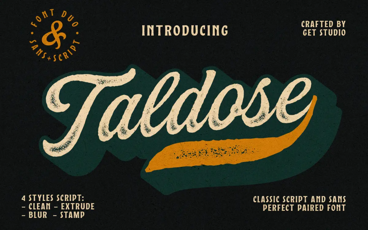
Taldose is a commercial font sold on Creative Market, so the full version needs a paid license. Get it from the official listing: Taldose font download.
Need something free? These script fonts from Google Fonts are free for personal and commercial use:
Design style
Taldose is a brush-style script built around four variations of the same skeleton rather than four unrelated fonts. The Clean version is the baseline: connected, slightly forward-leaning strokes with the kind of loose, hand-brushed rhythm that avoids looking too even. The Blur, Stamp and Extrude cuts take that same lettering and rough it up — worn edges, stamped texture, or an offset extrude shadow that pushes the letters into three dimensions. It’s a reasonable way to get four distinct moods without redrawing anything, but it also means you’re limited to one letterform personality across the set. If the base script doesn’t suit your project, none of the treatments will fix that.
Brookvale, the bundled sans, is plain and geometric with even stroke widths and no eccentricities. It reads as a deliberate foil to the script’s texture rather than a font with much character of its own, which is exactly its job.
Character set and features
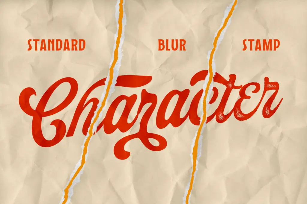
The script’s connecting strokes are its strongest asset — letters flow into each other without the joins looking mechanical, and there’s enough variation in the curves that repeated letters (double l’s, double s’s) don’t look stamped from the same die, at least in the Clean version. Once you move to Blur or Stamp, that subtlety gets buried under texture; the roughening effect is applied fairly uniformly, so at small sizes it can read as noise rather than deliberate wear. Extrude is the trickiest of the four to use well: the dimensional shadow needs generous spacing and a fair amount of size to be legible, and it will fight busy backgrounds.
No word on language coverage or OpenType ligature sets beyond what’s visible in the sample images, so treat any claims about swash alternates or extended character support with caution until you’ve opened the files. Brookvale, by contrast, is straightforward enough that there’s little to question about its coverage — it does the job a utility sans is supposed to do.
Use cases
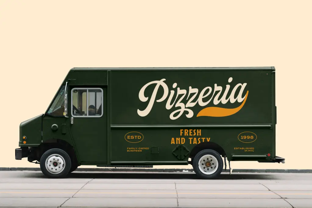
The pairing is built for branding work where a script needs a stable partner: logotypes, packaging labels, invitation suites, social headers. Clean is the one to reach for when the brief calls for elegance without excess texture — think stationery, product labels, or any place the script needs to sit next to body copy and still read clearly. Blur and Stamp suit anything leaning vintage or artisanal — coffee packaging, craft branding, apparel graphics — where a bit of imperfection sells the story.
Extrude is the outlier. It’s a headline-only tool, best reserved for large-format work — posters, hero type on a landing page, a single word on a t-shirt — where its dimensional shadow has room to breathe. Push it into a paragraph or a small logo lockup and it collapses into mush.
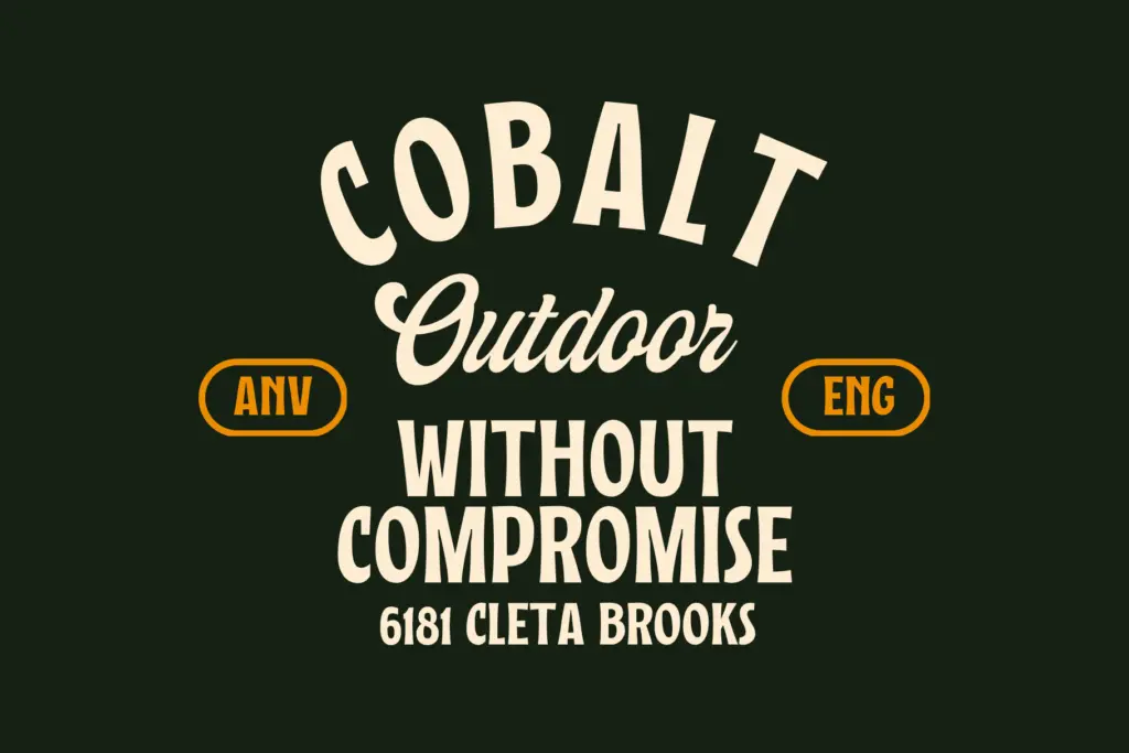
Brookvale carries the weight everywhere else: body text, taglines, address blocks, anything the script shouldn’t be asked to do. Used together, the two fonts cover a fairly complete branding kit, provided the project can tolerate a script with only one core letterform design underneath its four disguises.
What we liked, and what we didn’t
Strengths
- The connecting strokes in the Clean version avoid the repetitive, stamped look many script fonts fall into
- Four style variations from one skeleton give a lot of mileage without buying multiple typefaces
- Brookvale is a genuinely neutral sans that won't compete with the script for attention
Trade-offs
- The texture in Blur and Stamp is applied fairly evenly, which can read as noise rather than deliberate wear at small sizes
- Extrude needs large sizes and generous spacing to stay legible, limiting it to headline use only
Taldose is a workable script-and-sans branding kit built on one solid letterform with four cosmetic finishes layered over it. Clean is genuinely useful, Extrude is a headline specialist that needs care, and Brookvale quietly does the heavy lifting everywhere else.

Tmfonts writes independent reviews of typefaces: what each font does well, where it falls short, what it suits, and where it is sold.