
Juana: a high-contrast serif family built for editorial headlines
Design style
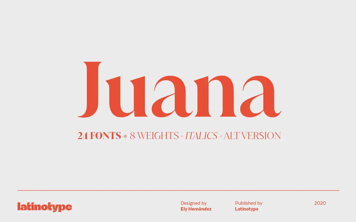
Juana is a serif built on extremes. The contrast between thick and thin strokes is pushed hard, giving it a fashion-editorial character close to the didone tradition but with softer, more contemporary proportions than a strict Bodoni or Didot revival. The thins are genuinely thin — hairline thin at the higher weights — which is what gives the family its stylish, slightly theatrical feel rather than a bookish one.
It’s descended from an earlier typeface, Jazmín, and that lineage shows in the details: the bracketed transitions between stroke weights, the closed, teardrop-like terminals, the way the bowls stay round rather than tightened into ovals. Across eight weights the contrast ratio doesn’t stay static — the lighter weights read more evenly, while the heavier ones lean into the drama, with thins that nearly disappear against the bold verticals. That’s a deliberate choice, and it means the family behaves less like one typeface scaled up and down and more like a range from quiet to loud.
Character set and features
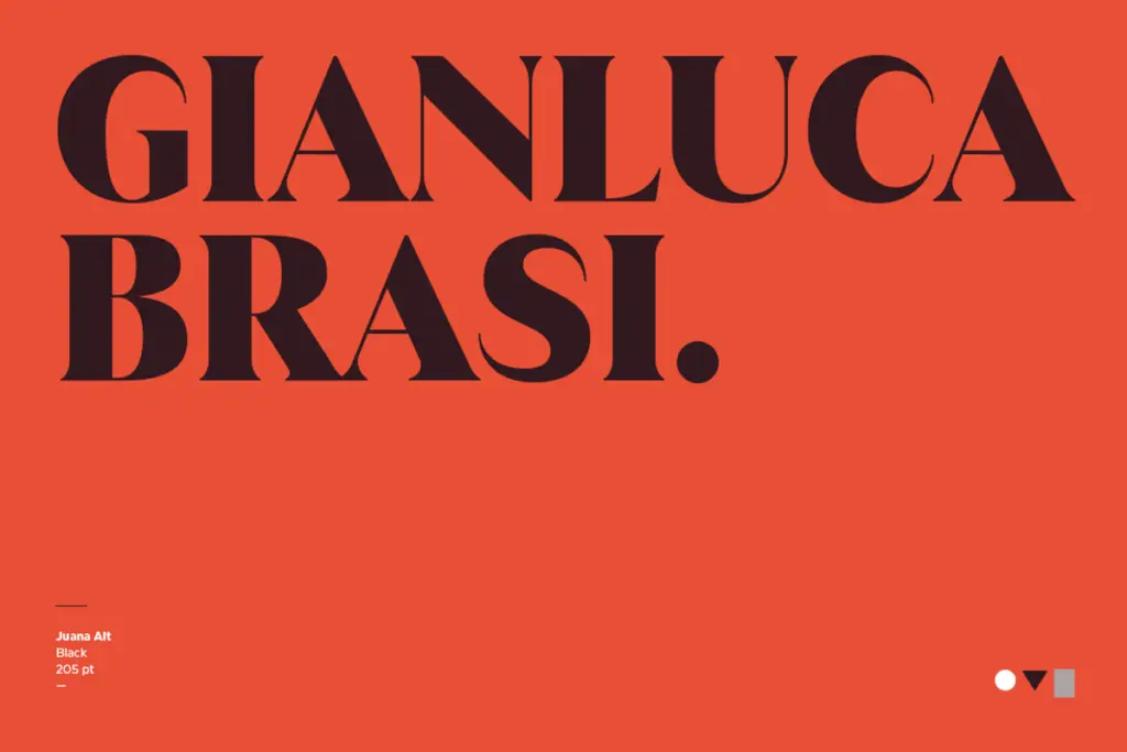
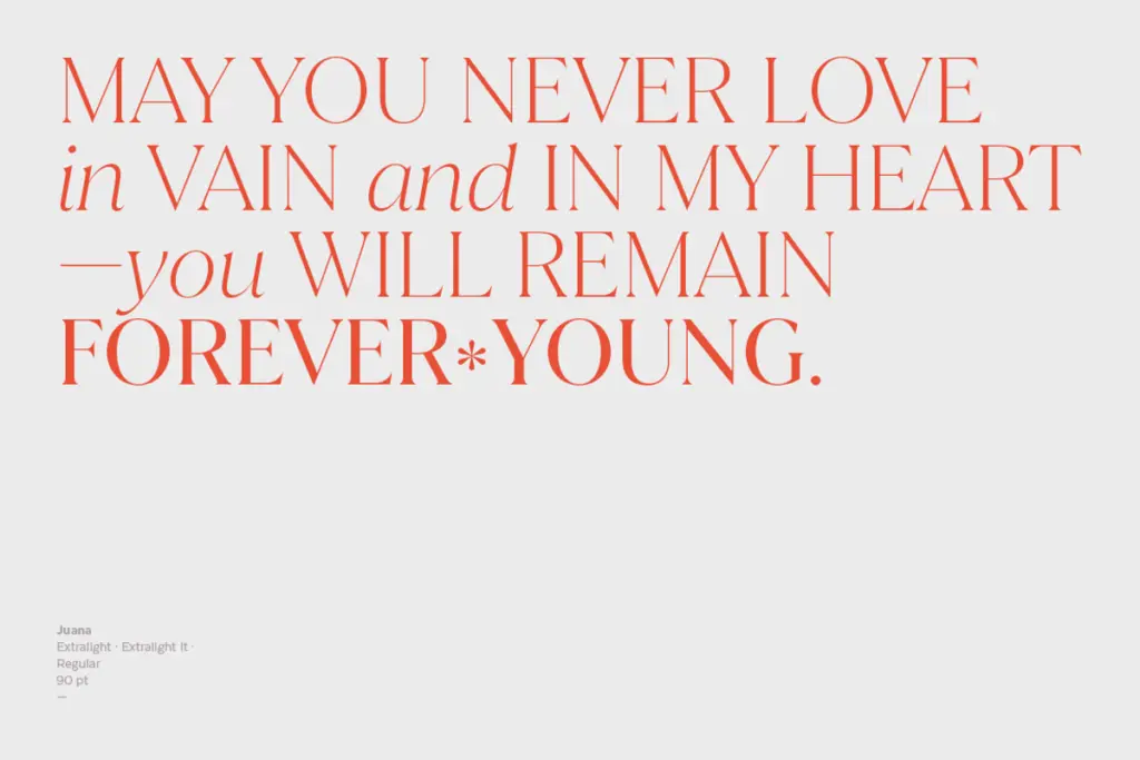
Every weight ships with a matching italic, and there’s an alternate set alongside the default. The italics aren’t just slanted romans — they pick up more calligraphic entry strokes and a slightly narrower rhythm, which helps them read as genuine companions rather than a mechanical oblique. The alternates give some of the more expressive characters (things like the a, g, and certain capitals) a less formal option, useful when the default forms feel too stiff for a piece of display work.
Language coverage is broad, built to support well over 200 Latin-based languages, so diacritics and extended characters aren’t an afterthought bolted onto a Western European set. That matters if you’re working across markets, though as with any high-contrast serif, accents on the thinnest weights need checking at small sizes — hairlines and diacritic marks can compete for the same visual space.
Use cases
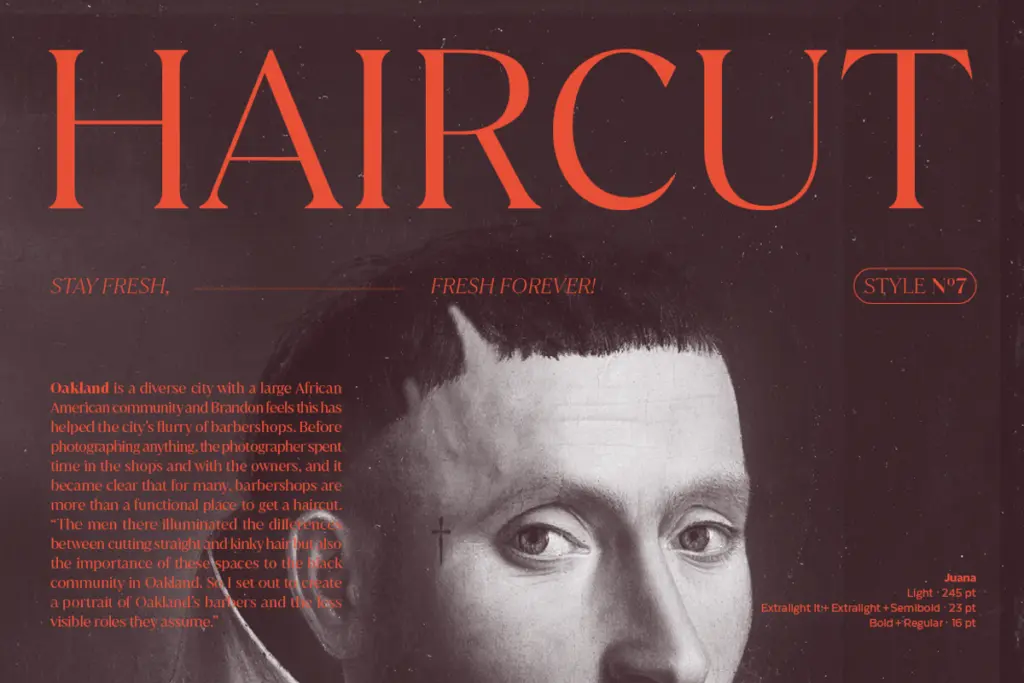
Juana’s natural home is editorial: magazine headlines, feature titles, section openers, anything that gets set large and is meant to carry some attitude. The extreme contrast is the whole point at display sizes — it’s what gives the letterforms their tension. At body copy sizes, though, that same contrast works against it; the hairlines thin out and the text can feel fragile or uneven on lower-resolution screens and cheaper print stock. This is a headline family first, and trying to force it into long-form text sets is where it comes apart.
For branding and logotype work, the lighter and medium weights offer a controlled elegance, while the bolds and blacks push toward something closer to a fashion wordmark. Pair a heavier weight with a plain sans for supporting text, and the eight-weight range gives enough room to build a full identity system without reaching for a second serif. It’s a font for projects that want to look considered and a little sharp-edged, not for ones that need to disappear into the background.
What we liked, and what we didn’t
Strengths
- Extreme thick-thin contrast gives it real presence at headline sizes
- Eight weights plus matching italics and an alternate set offer genuine range
- Broad Latin-based language support makes it usable across many markets
Trade-offs
- Hairline strokes thin out and lose crispness at small or body-copy sizes
- The strong contrast can make diacritics and fine details fragile on lower-quality print or screens
Juana is a confident, high-contrast display serif that earns its drama at large sizes but shouldn't be asked to carry body text. It's best suited to editorial titles and branding work that wants some tension in the letterforms, with enough weights to build a full system.
Verdict

Tmfonts reviews typefaces in depth — every font is tested in real branding, editorial and screen layouts before a word gets written. 555+ fonts reviewed and counting.