
Pumped Up Kicks: a bouncy all-caps display font for playful branding
Design style
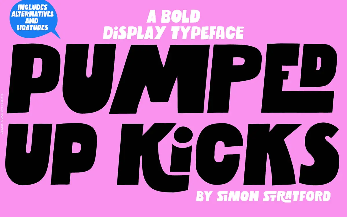
Pumped Up Kicks is a bold sans-serif display face built entirely around movement. Letters wobble off an implied baseline — some dip below it, others float above — so a single word reads like it’s mid-jump. The strokes are thick and confident, with rounded corners that keep the overall feel friendly rather than aggressive. There’s no attempt at geometric precision here; the charm is in the inconsistency, and the drawing commits to that idea rather than hedging it.
It sits closer to hand-lettered display work than to conventional grotesque sans design, even though the marketplace files it as sans serif. The letterforms are simple enough to read quickly but irregular enough that you notice the construction before the word. That’s the trade-off: it’s a font with a personality, not a neutral tool, and it won’t disappear into a layout the way a workhorse sans would.
Character set and features
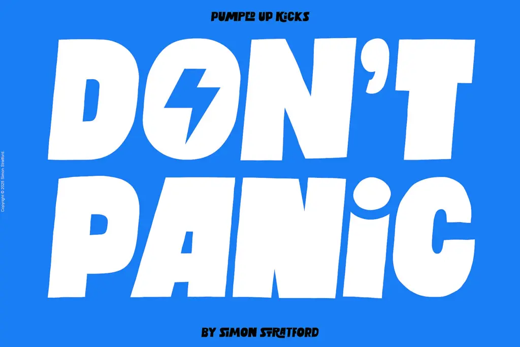
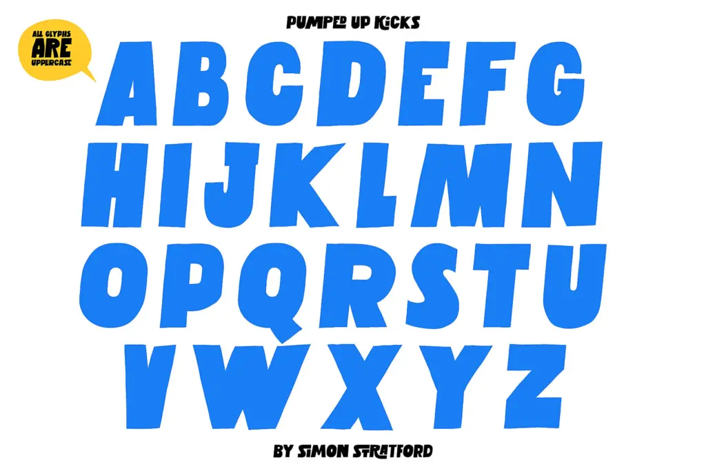
This is an uppercase-only font, and the seller is upfront about that rather than pretending otherwise. In place of a lowercase set, Pumped Up Kicks offers alternate uppercase glyphs for the full A–Z range, accessible through stylistic alternates. Practically, this means you can swap a repeated letter — two A’s in a headline, say — for a different-shaped version of the same letter, which breaks up visual monotony in short words and logotypes.
This is a genuinely useful feature for a display font of this kind, since all-caps setting can get visually repetitive fast, especially with a face this animated. The alternates give a working designer some control over rhythm without having to hand-edit outlines. What isn’t clear from the brief is how deep the alternate set goes beyond letter shapes — no mention of numerals, punctuation variants, or ligatures, so treat those as standard rather than expanded. There’s also no lowercase to fall back on, which limits how much body text you can realistically set with it; this is a headline tool, not a paragraph typeface.
Use cases
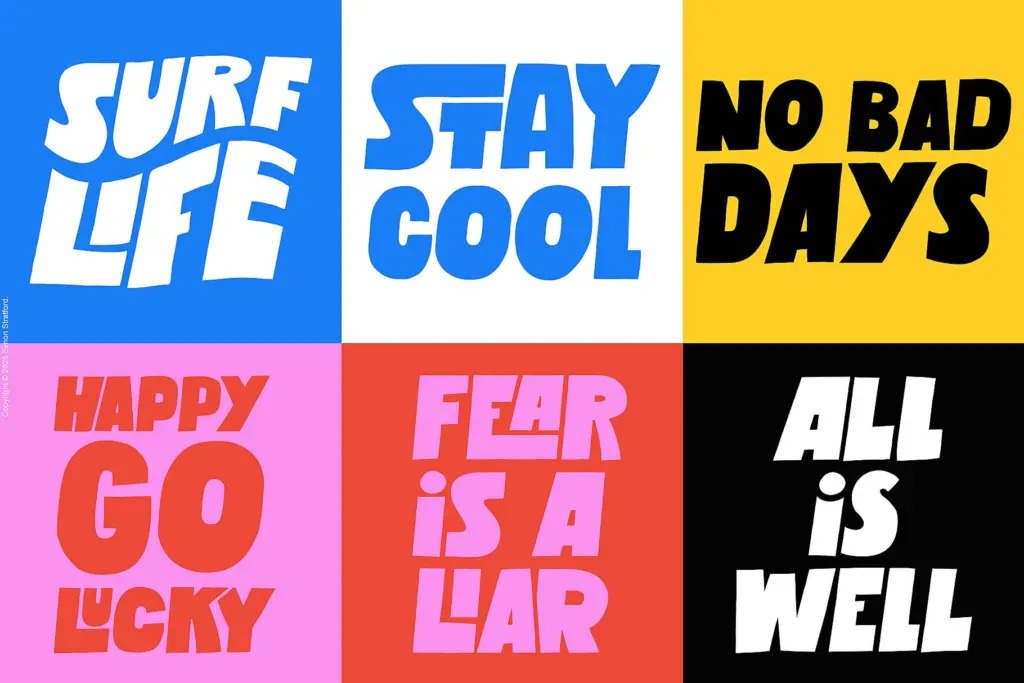
Short-form, attention-grabbing work is where this font earns its keep: gig posters, social graphics, T-shirt and merch graphics, logotypes for brands that want energy over polish. The baseline irregularity reads well at large sizes where the bounce is legible as a deliberate style choice rather than a rendering artefact. At small sizes, that same irregularity will just look messy — the letterforms aren’t drawn with the discipline needed to hold up below display scale.
It pairs naturally with a plain, quiet body typeface, since Pumped Up Kicks is doing all the noise-making on its own; stacking it against another expressive display face would be visual overload. For branding work, it suits youth-oriented, casual, or music-adjacent identities more than anything that needs to read as trustworthy or corporate. Given the uppercase-only limitation, it’s worth mocking up your actual headline before committing, since word length and letter repetition will affect how well the alternates can do their job.
What we liked, and what we didn’t
Strengths
- Alternate uppercase glyphs for every letter help break up repetition in short headlines
- The uneven baseline gives it a distinct, hand-made energy at large display sizes
- Clear, single-minded design brief executed consistently across the letterforms
Trade-offs
- No lowercase means it can't function as a general-purpose display font for longer lines
- The baseline irregularity that gives it charm at large sizes turns to visual noise at small ones
Pumped Up Kicks is a fun, energetic headline font that knows exactly what job it's for and doesn't try to be more. The alternate glyph system is a smart, practical touch, but the uppercase-only set and baseline bounce mean it's strictly a display tool with a short list of appropriate uses.
Verdict

Tmfonts reviews typefaces in depth — every font is tested in real branding, editorial and screen layouts before a word gets written. 555+ fonts reviewed and counting.