Script
3.9
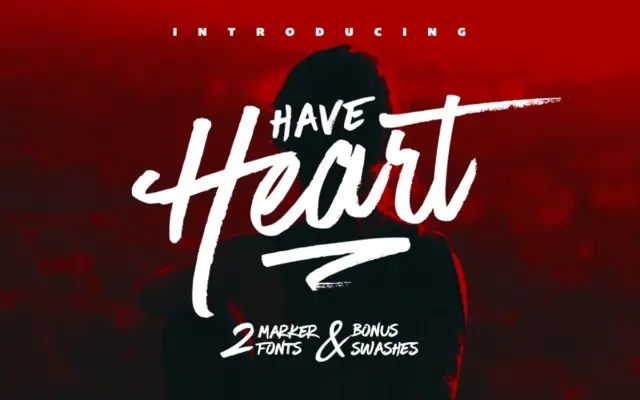
Have Heart: a two-font marker script for quick, authentic hand-lettering
Design style Have Heart reads as marker pen on paper, not a script smoothed into vector perfection. The strokes carry…
 Tmfonts

Design style Have Heart reads as marker pen on paper, not a script smoothed into vector perfection. The strokes carry…
Tmfonts
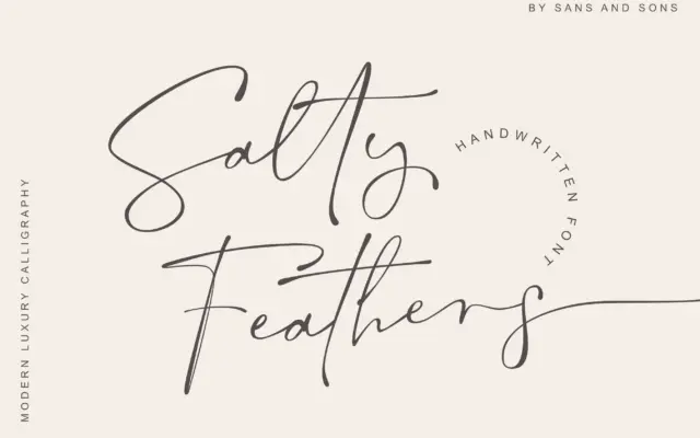
Design style Salty Feathers sits in the crowded field of modern calligraphic scripts, but it earns its place with a…
Tmfonts
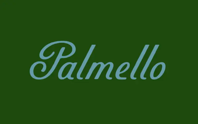
Design style Palmello is a non-connecting script, which is the detail worth understanding before anything else. Each letter is drawn…
Tmfonts
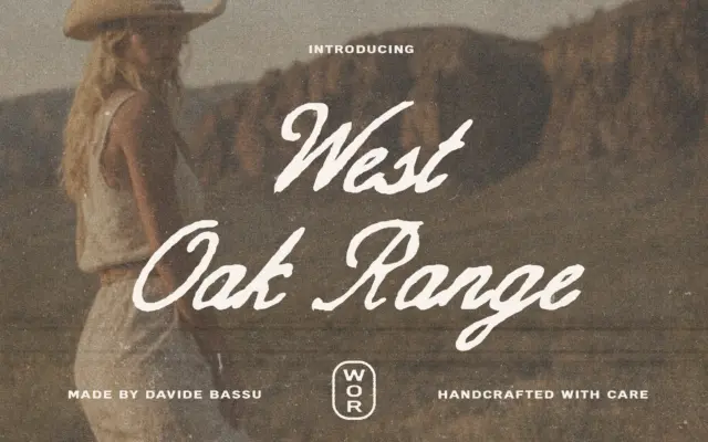
Design style West Oak Range pulls from the same well as a lot of current western-revival lettering: brush-influenced script paired…
Tmfonts
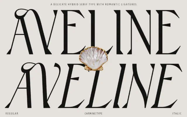
Design style Aveline sits in that hybrid zone designers keep returning to: not quite a sans, not quite a traditional…
Tmfonts
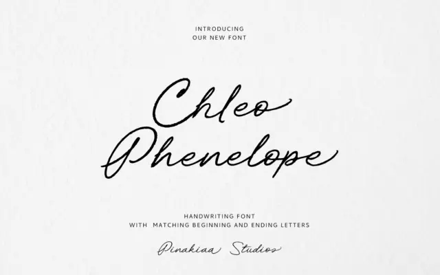
Design style Chleo Phenelope Handwriting sits in the informal end of the script spectrum — a font built to look…
Tmfonts
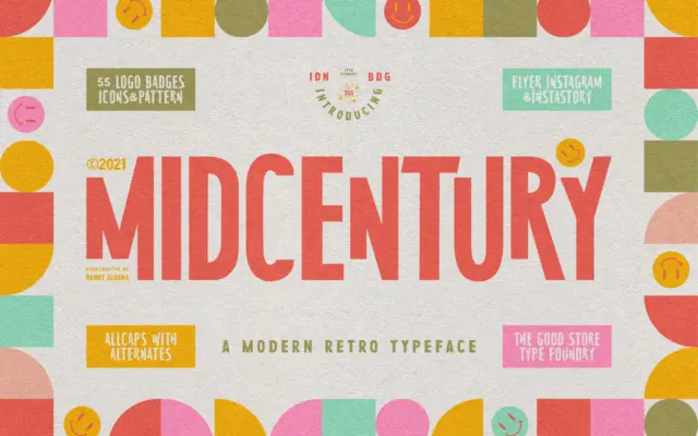
Design style MidCentury Typeface is an uppercase-only display serif that leans hard into the poster and paperback-cover graphics of the…
Tmfonts
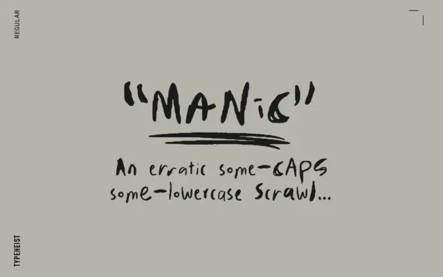
Design style MANIC reads as a scrawl first and a typeface second, which is exactly the point. The letterforms mix…
Tmfonts
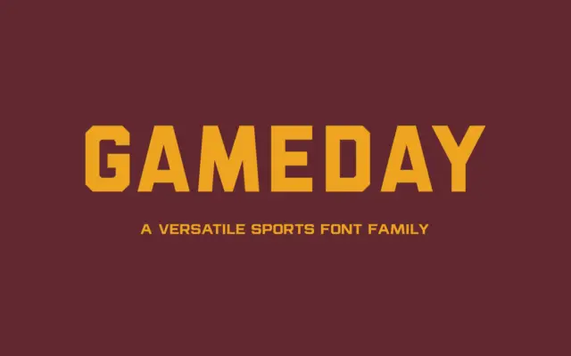
Design style Gameday sits squarely in the athletic-lettering tradition — the kind of sans you see stitched onto jerseys, stencilled…
Tmfonts