Sans Serif
3.8
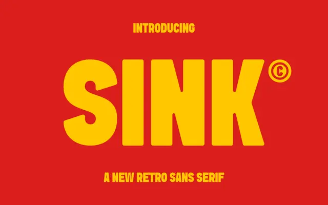
Sink: a bold retro sans built for titling and packaging punch
Design style Sink sits in that familiar territory of heavyweight retro sans faces: thick strokes, low contrast, and a general…
 Tmfonts

Design style Sink sits in that familiar territory of heavyweight retro sans faces: thick strokes, low contrast, and a general…
Tmfonts
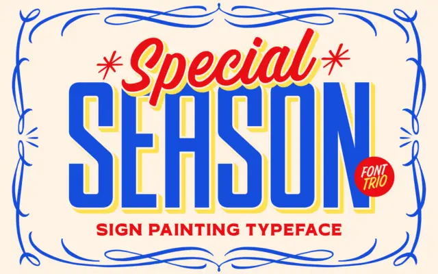
Design style TNSC Special Season borrows its logic from hand-lettered signage — the kind painted on shopfronts and delivery trucks…
Tmfonts
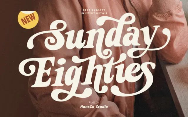
Design style Sunday Eighties leans into the thick-and-thin theatrics of 1970s and 80s signage lettering. The serifs are chunky, the…
Tmfonts
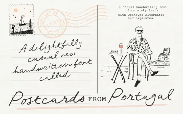
Design style Postcards From Portugal is a penned script built on an unsteady, deliberately imperfect baseline. The strokes carry the…
Tmfonts
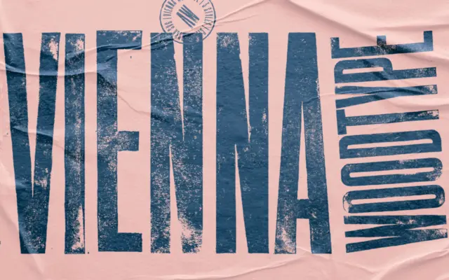
Design style Vienna Woodtype announces its process before you even read a word: these are letterforms carved into linoleum, hand-printed,…
Tmfonts
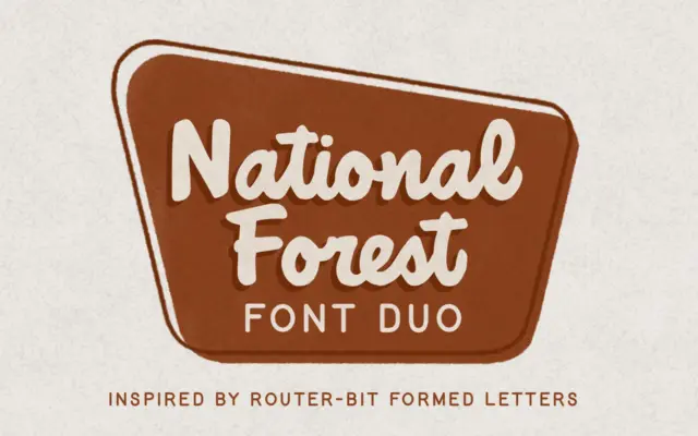
Design style National Forest takes its cue from the carved wooden signage found at national park entrances and trailheads, the…
Tmfonts
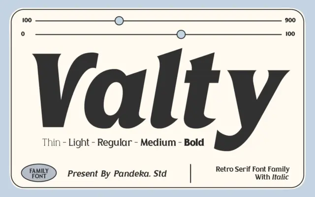
Design style Valty leans into a late-80s, early-90s mood — the kind of bold, slightly rounded letterforms you’d expect on…
Tmfonts
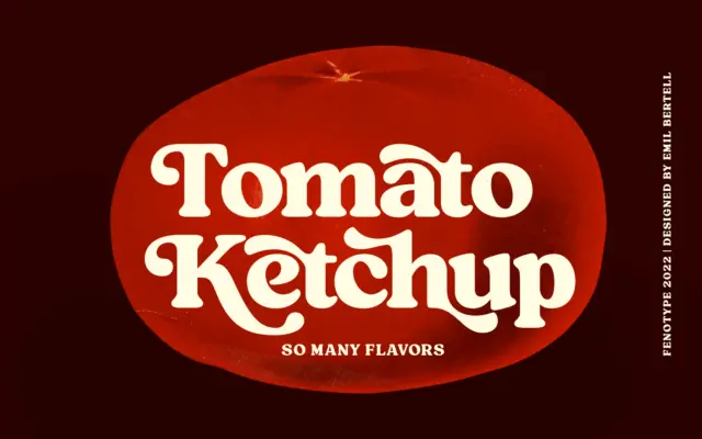
Design style Tomato Ketchup is a heavyweight vintage serif with the kind of stocky, confident stroke you’d expect from a…
Tmfonts
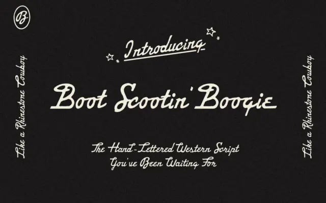
Design style Boot Scootin’ Boogie Script is a hand-lettered script that leans hard into a Western, honky-tonk mood. The strokes…
Tmfonts