Serif
3.7
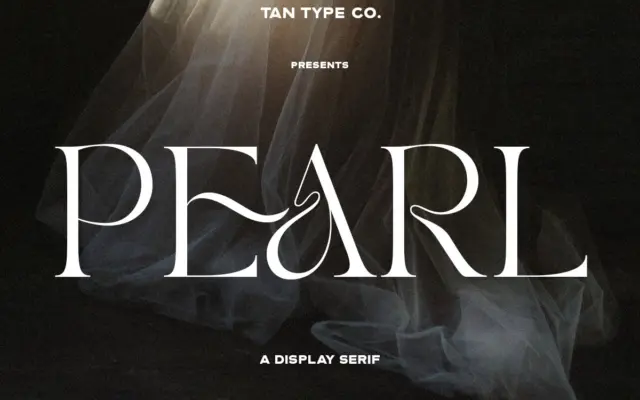
TAN – PEARL: A Curvy Serif for Classy, Fashion-Leaning Branding
Design style TAN – PEARL sits in that crowded but reliable category of the ‘fashion serif’ — high contrast strokes,…
 Tmfonts

Design style TAN – PEARL sits in that crowded but reliable category of the ‘fashion serif’ — high contrast strokes,…
Tmfonts
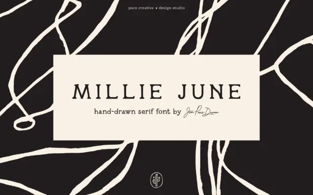
Design style Millie June is a hand-drawn serif that leans into its own wobble rather than smoothing it out. Strokes…
Tmfonts
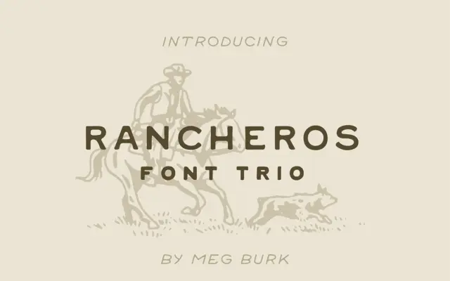
Design style Rancheros is a set of three uppercase hand-lettered display faces built around a Southwestern, hand-stamped look. Despite the…
Tmfonts
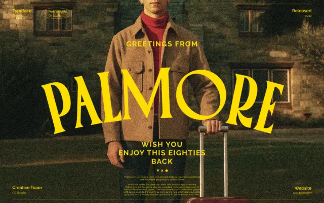
Design style Palmore sits at the intersection of condensed display lettering and rounded, almost bubbly serif construction. The proportions are…
Tmfonts
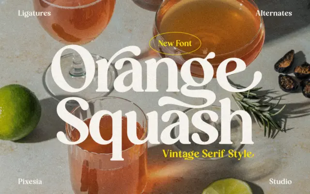
Design style Orange Squash sits in the current wave of thick-serif display faces that lean on 1970s packaging and record-sleeve…
Tmfonts
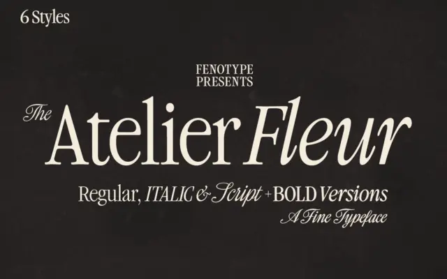
Design style Atelier Fleur takes the bones of a Garamond-style old-style serif and squeezes them into a condensed frame. The…
Tmfonts
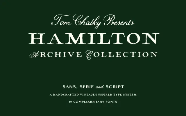
Design style The Hamilton Archive is less a single typeface than a small type system built around one idea: early…
Tmfonts
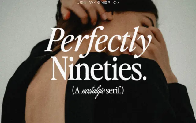
Design style Perfectly Nineties draws on the compact, no-nonsense serifs that filled magazine mastheads and fashion spreads in the late…
Tmfonts
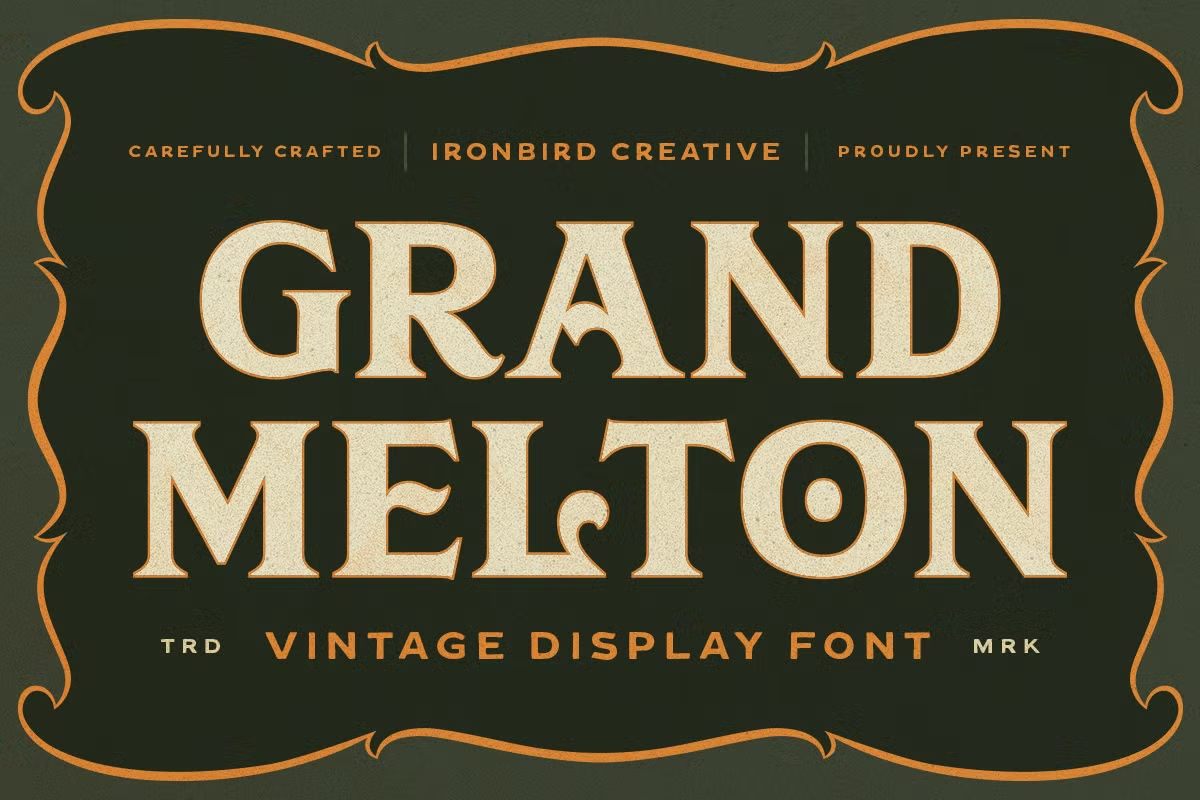
Introduction to IC Grand Melton IC Grand Melton is a really cool font that looks like it was made a…
Tmfonts