Handwritten
1.0
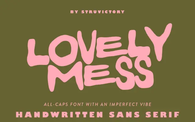
Lovely Mess: a hand-drawn all-caps sans for scrappy, offbeat branding
Design style Lovely Mess is exactly what it says on the tin: an all-caps sans-serif built from loose, hand-drawn strokes…
 Tmfonts

Tmfonts reviews typefaces in depth — every font is tested in real branding, editorial and screen layouts before a word gets written. 555+ fonts reviewed and counting.
Design style Lovely Mess is exactly what it says on the tin: an all-caps sans-serif built from loose, hand-drawn strokes…
Tmfonts
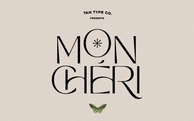
Design style Mon Cheri sits in that familiar TanType territory: geometric-leaning sans letterforms with a retro sensibility, pitched somewhere between…
Tmfonts
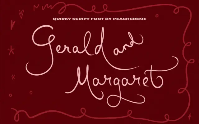
Design style Gerald and Margaret sits in the casual end of the script spectrum, closer to a felt-tip note than…
Tmfonts
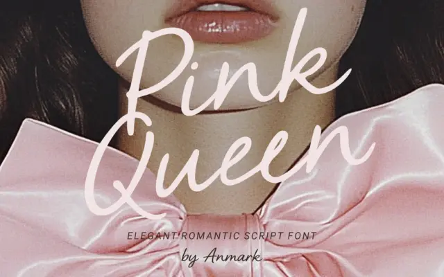
Design style Pink Queen sits squarely in the crowded field of soft, feminine wedding scripts, and it does the job…
Tmfonts
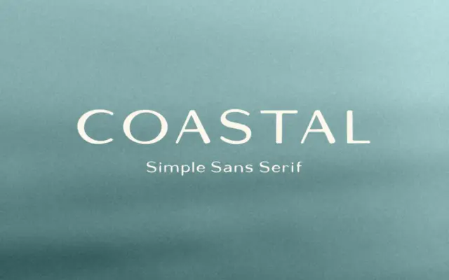
Design style Coastal is a hand-drawn sans serif with the slightly loose, uneven quality that comes from letters built by…
Tmfonts
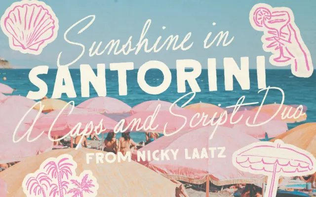
Design style Santorini Sunshine pairs a loose, slightly imperfect script with a rough-edged all-caps sans, both pulling from mid-century signage…
Tmfonts
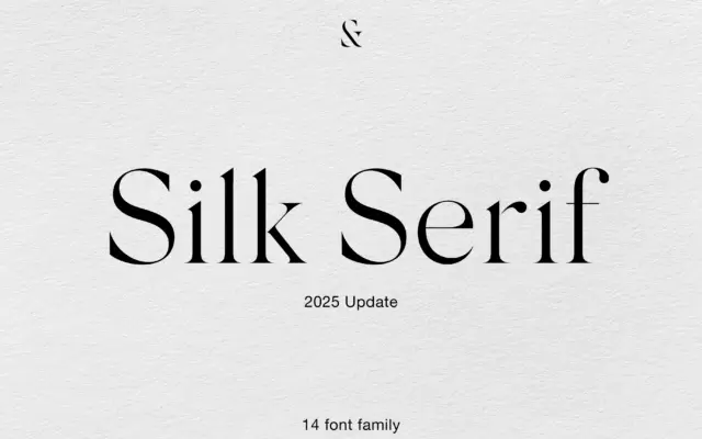
Design style Silk Serif belongs to the high-contrast family that has become shorthand for fashion and beauty branding — thin,…
Tmfonts
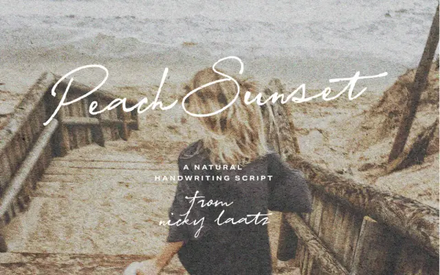
Design style Peach Sunset Script sits in the casual-handwriting camp rather than the formal calligraphic one. The strokes have the…
Tmfonts
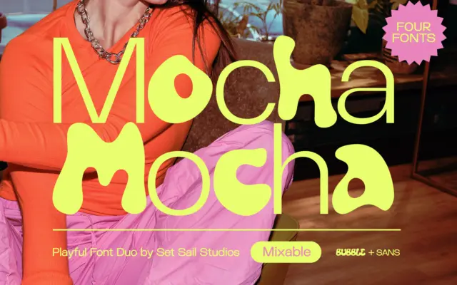
Design style Mocha is a four-font set built around a simple contrast: a plain-spoken sans and a rounded, hand-drawn bubble…
Tmfonts